


2023 Q2 Forecast: Duke of Hazzard
What goes up comes down...

What goes up comes down...
That lyric byline is clickbait, sorta, maybe. ;-p
If you haven’t joined my site yet, you should.
https://www.zenalytics.info/home
Tomorrow morning I’ll be hosting a live discussion and Q&A session there about the Q2 Forecast. All the information can be found on the site. It’s free to register, and so is the event. Recordings will also be available on the site after.
Lessons Learned from 2023 Q1:
You miss out on valuable learning opportunities if you don't review old analyses and trades. Below are the notable points for me this time around.
Never Forget- Price Action is King
I can't even count the number of people on Twitter still screaming for new lower lows, and this rally is or was a bull trap and didn't make any money from the bullish momentum. I'm not saying that new lows are impossible or the rally is/was a trap, but I am saying that it ultimately doesn't matter. I'll go back to one of my earliest written comments.
"Price action is king. Topic over.
Just kidding. Well, not about price action being king. That’s honestly the most important thing you need to know in this business. What is price action? Simply put, it’s buying and selling plotted over time. Every indicator, every line you draw, and every pattern you “see” is created by or is measuring price action. Whatever price action is doing right this second trumps EVERYTHING you add to the charts. The sooner you can understand that, the sooner you’ll be more profitable and spend less time learning the hard way. It doesn’t matter what models you study (Wyckoff, Price Cycles, Fibonacci Sequences, Elliot Wave Theory). It doesn’t matter what patterns you identify (flags, pennants, wedges, head and shoulders, trendlines). It doesn’t matter what indicators or oscillators you apply (moving averages, RSI, Volume Profile, Market Cipher). I know that sounds a bit excessive, but I’m trying to drive the point home. Price action DOES NOT have to respect those things. All the stuff you can put on your charts can be rendered ineffective every👏single👏time👏 just because people keep buying or selling. With that out of the way, we can now move on and talk about some ways I like to read and interpret price action."
What good does it do you to hold onto your ideas if you miss out on perfectly good and valid signals that present themselves in opposition to your currently held idea?
Just trade the chart.
There is any number of objective technical reasons that one could have utilized to take a long position in early January.
A clear low, high, higher low, and higher high in price, a textbook bullish trend definition.
A clear low, high, higher low, and higher high in price with a close above the range high.
A price rally on increasing buy volume.
A price rally with momentum breaking over a horizontal resistance.
A price rally with the RSI breaking over a horizontal resistance and into irrational (FOMO) bullishness with no bearish divergences.
You could pick one or ALL of those at once for this rally. I even posted in my weekly newsletter that I was entertaining all sorts of breakouts. I got irrationally long, but that's ok because I could define the risk clearly. If the charts show a bullish bias, there's no reason not to be long.
It doesn't matter if you think things are manufactured or manipulated. If there are clear and objective reasons to take actions that have easily definable risk parameters, there's no reason not to take trades despite the narratives or macro environments.
Trust the Process
Trading within clear and objective frameworks allows one to know a lot about a situation ahead of time. This creates a level of security. You know you can rely on the numbers and facts, not just your potentially faulty intuition.
One such process I have is around the January Effect. Here's what's returned if you google this.
"The January Effect is a phenomenon in the financial markets where stock prices tend to rise in the month of January. This effect has been observed primarily in the US, but it is also seen in other countries also.
One theory behind the January Effect is that investors, especially institutional investors, engage in tax-loss harvesting at the end of December, which involves selling stocks that have declined in value to offset capital gains and reduce taxes owed. This selling pressure can push stock prices down at the end of the year. However, in January, investors may return to the market and buy stocks, causing prices to rise.
Another theory suggests that the January Effect is driven by optimism and positive sentiment that comes with the start of a new year. Investors may be more willing to take risks and make new investments, leading to increased demand for stocks and a rise in prices.
While the January Effect has been observed in the past, its impact has diminished over time, and some experts question its continued relevance."
The prevailing theory is "So goes January, so goes the year."|
You cannot do much with information by itself but apply a strict rules-based framework, and then you can evaluate whether this occurrence is real and tradable.
Here's a simple systematic approach:
Note the January High.
If any month, February, March, April, May, or June, closes above the January high, open a long position and close out on Dec 31 of that year.
If no month before July closes over the January high, do nothing.
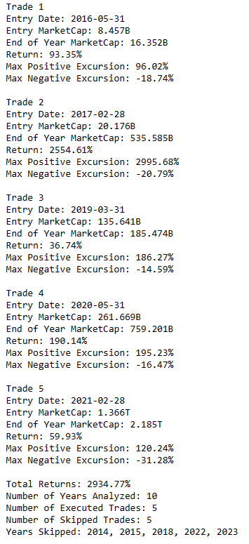
Here are the results tested on the Total Crypto Market Cap.
5 wins, no losses.
Here are the results on BTC.
6 wins, no losses.
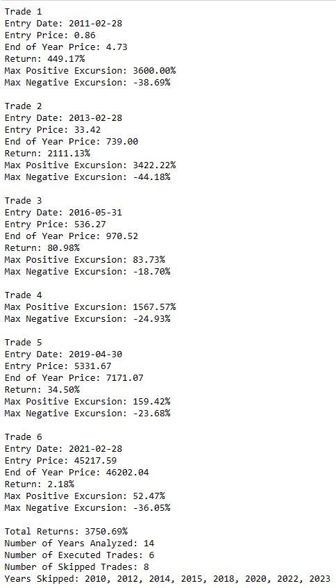
It doesn't matter what happened in the years when the trade condition wasn't valid. All you'd need to concern yourself with is the conditions when it was, and you have some pretty solid information to evaluate taking a position.
Even though there are no losses doesn't mean you can't experience one now, so how can you use this information to assess the risk?
The max negative excursions (or how negative a trade got before closing out) floated around -20% for the Total MarketCap and -30% for BTC. A monthly close below those levels on the respective charts would be a place to consider the invalidation of the trade idea.
Now you have a ton of useful and objective information that can inform your positioning, which also informs you about the probabilities of a successful outcome.
March closed above the January high.
2023 Q2 Forecast
Each chart has an associated link so you can open the charts yourself. This is a way for you to save a copy to your tradingview account and manipulate the charts however you desire. You can flip it to non-dark mode and make a printout. You can change the symbol and see how the forecast/overlay impacts other assets (or doesn’t impact them). You can add your own drawings and set alerts so you don’t forget to check in on the progress. Do your own analysis and find interesting things and correlations I haven’t considered.
I'd appreciate it if you kept the links for your own use out of respect for my time creating them for paying subscribers. Unfortunately, I can't stop anyone from using them. I also can't know if they are, so do as you wish.
Chart Components
Cycle forecast overlay colors will always represent the same timeframe. Monthly = Red
Weekly = Blue
Daily = YellowThe white zigzag arrow pivot points track the asset's price action anchored near the prior forecasted cycle highs and lows that are no longer visible on the chart.
The orange highlighted boxes are periods of deviation in price action from the forecast. If the zigzag is moving down through the box, the forecast indicated an upwards leg. If the zigzag is moving up through the box, the forecast indicated a downward leg.
The yellow vertical line marks the separation between in-sample and out-of-sample data. Data to the right of the line is not used in the creation of the forecast.
It is important to note if you compare past quarterly forecasts to newer ones, the more current overlays will likely have a different plot of the cycles from the prior forecast. This is because different cycles may be more active now than they were at the time. This will cause the repainting of the past data. I usually leave the quarterly forecasts unchanged while they unfold over time, but I keep an eye on and update separate daily and intraday charts as new data arrives.y
Total Crypto Market Capitalization
Market Cap of all cryptocurrencies.
https://www.tradingview.com/chart/5pWgVJ2C/
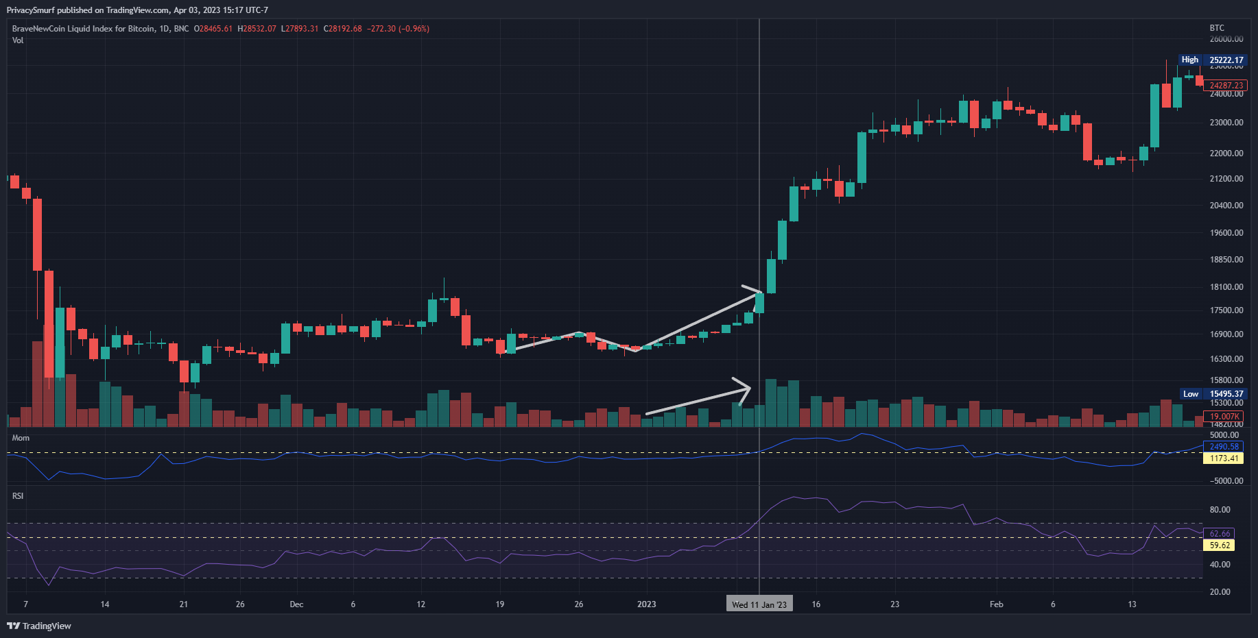
From 2023 Q1:
“… Bullish alignment with the daily cycle in mid January will lead me to look for signals for potentially another bear market rally leading to rejection again near early February…”
This was a quarter of massive buying in a stark reversal of the 2022 Q4 forecast.
Below is the 2023 Q2 Forecast.
The white zigzag arrow crosses through a period of deviation (orange box) from a forecasted downward phase that was supposed to last through early to mid-January. Following the arrow further, the rest of the quarter finished each leg per the prior model despite great volatility.
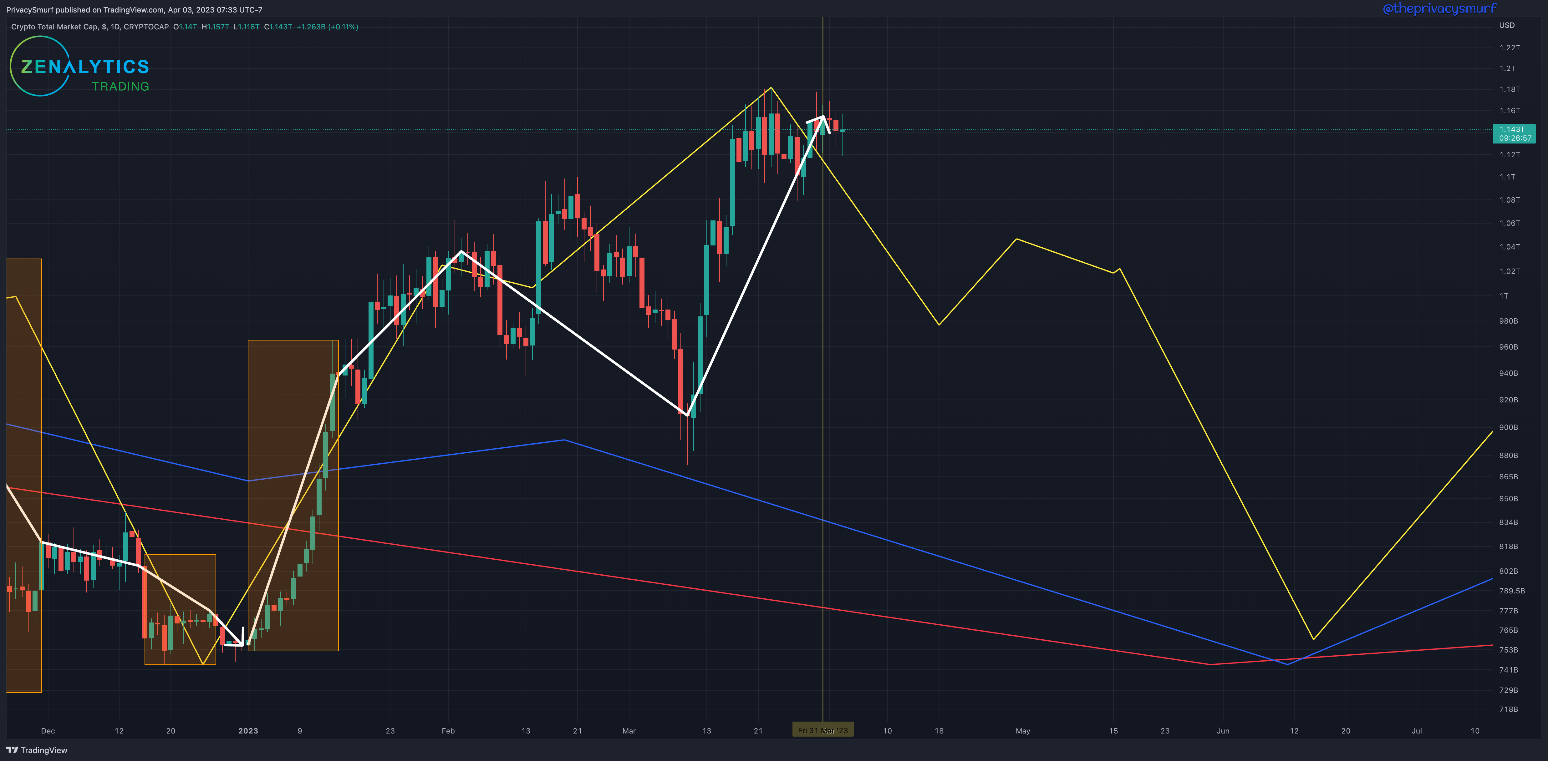
Takeaway:
While the chart looks like a full-on decline, I think we may not get that entirely (although it is possible). Early in the quarter, April resumes a bearish alignment across the timeframes. This period may experience consolidation (instead of a decline) before another breakout higher through the end of the month. Daily price charts across the market are already showing weakness and bearish trade signals, but prices haven't responded yet. If technicals are still exhibiting weakness by mid-May, I'd expect the cyclical reflection in price to be an actual decline and not a consolidation.
Any bullish divergences that appear between price and oscillators on timeframes 6HR and higher starting in late May and June are probably the best and last signals for cheap buys for the year. Daily, Weekly, and Monthly cycles are all in bullish alignment at that point. With this influence behind the market, it will be easier to go up than down.
Speculation in a vacuum:
The first down leg is consolidation around 1T.
The second down leg is a retracement no lower than 800B.
The ideal setup is low under 1T for speculative buy early in the quarter and a lower low to buy in late May or early June with bullish divergence on price action oscillators like Momentum, RSI, or MACD.
BTC/USD
Here the Bitcoin Liquid Index is representative of BTC prices as it contains consistent historical price data.
https://www.tradingview.com/chart/Xix2g0F6/
From 2023 Q1:
“…Bullish alignment with the daily cycle in mid January will lead me to look for signals for potentially another bear market rally leading to rejection again near early February…”
In a typical bull market fashion, BTC took center stage. It gained in market cap dominance, increasing from 40% to nearly 50%
Below is the 2023 Q2 Forecast.
The white zigzag arrow crosses through a period of deviation (orange box) from a forecasted downward phase that was supposed to last through early to mid-January. Following the arrow further, the rest of the quarter finished each leg per the prior model despite great volatility.
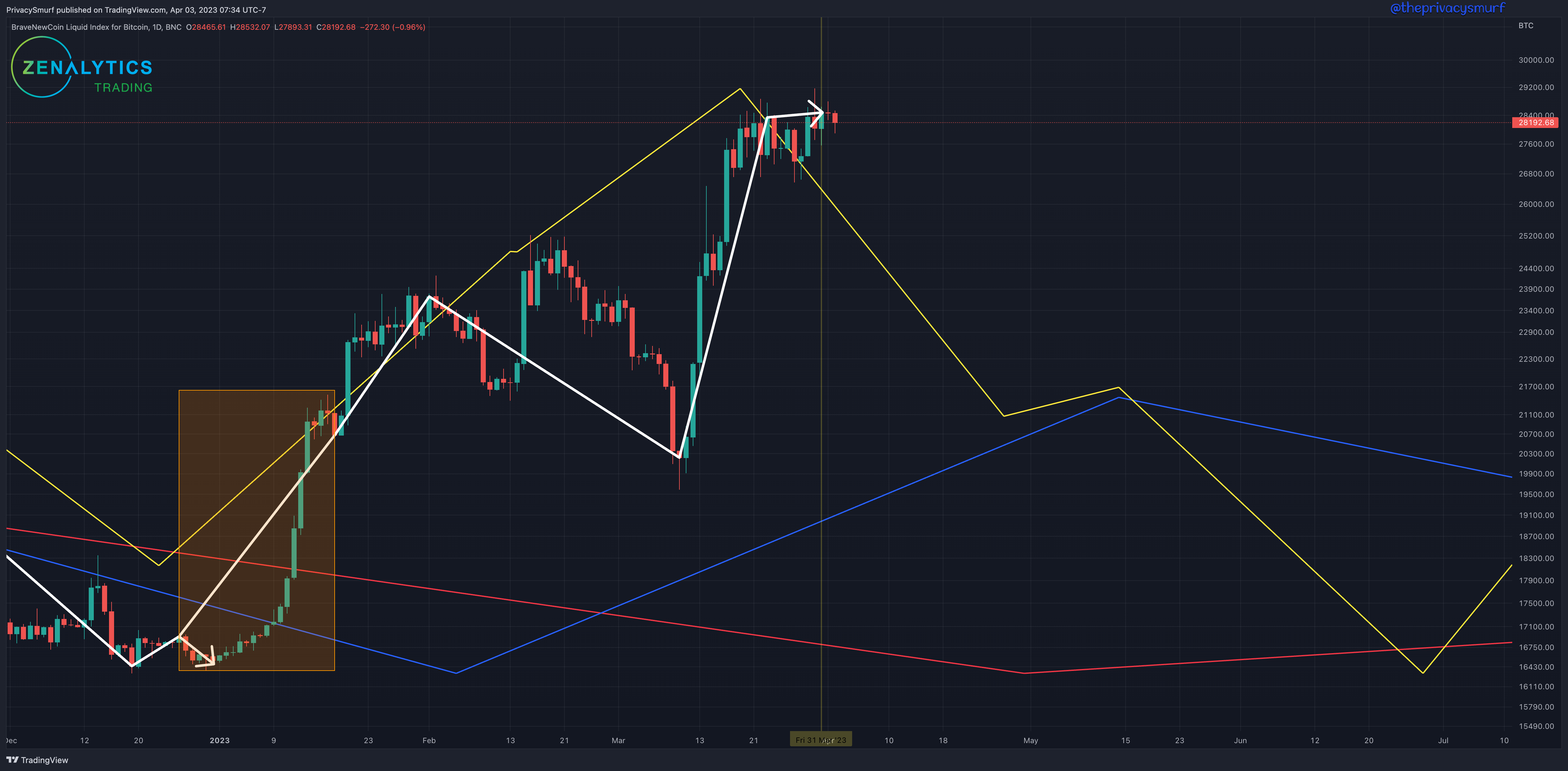
Takeaway:
The model for BTC is similar to the Total Marketcap, and the differences are what leads me to suspect there will be consolidation earlier in the quarter and not an outright hard decline. There is mixed alignment across the timeframes. Daily and Monthly start down, but Weekly is still up. Then all briefly realign in a bullish presentation in early May. This is when I'd be looking for new highs or to be challenging prior highs. The Daily and Weekly turn down in late May to June I wouldn't think to be an overall downtrend in BTC but more likely a rotation to ETH and altcoins. BTC may still be going up but slower than others or remain in consolidation at or above new highs.
Speculation in a vacuum:
The first down leg is consolidation around $24K.
Rally back to highs by mid-May
Consolidate around highs or a retracement no lower than $21K.
The ideal setup is no lower than $24K early in the quarter to buy the nearly 300-day range high, which was recently broken and spike to new highs in mid to late May for short-term profit taking and rotation of profits to ETH and alts.
ETH/BTC
Last quarter I said, "modeling of the ETH/BTC cycles has been among the most consistent medium to long-term forecasts," which was true, showing no deviations until this past quarter. I really have to stop saying stuff like that. Got me in trouble with CRO, too. That tweet and model didn't age well. Oh well. Understanding this relationship and how to trade between these two assets or trading with Altcoin/BTC or Altcoin/ETH pairs can be highly profitable and useful for giving you something to do with your BTC and ETH bags in the meantime.
https://www.tradingview.com/chart/AXdpbYqf/
From 2023 Q1:
“…I suspect this [downward cycle alignment] will put ETH and subsequently alt performance in lockstep with BTC with a bias towards declining values.…”
The ETH/BTC price action deviated hard from the models for the last bit of the quarter shown in the orange box. Daily modeling projected an increase from February to the end of March. A bullish spike in the middle of March led to a hard retracement and new 200-day lows. Overall the weekly cycle remained the largest influence on prices.
Below is the 2023 Q1 Forecast.
Note there is no red monthly cycle present. ETH/BTC doesn't have enough price history to forecast it accurately.
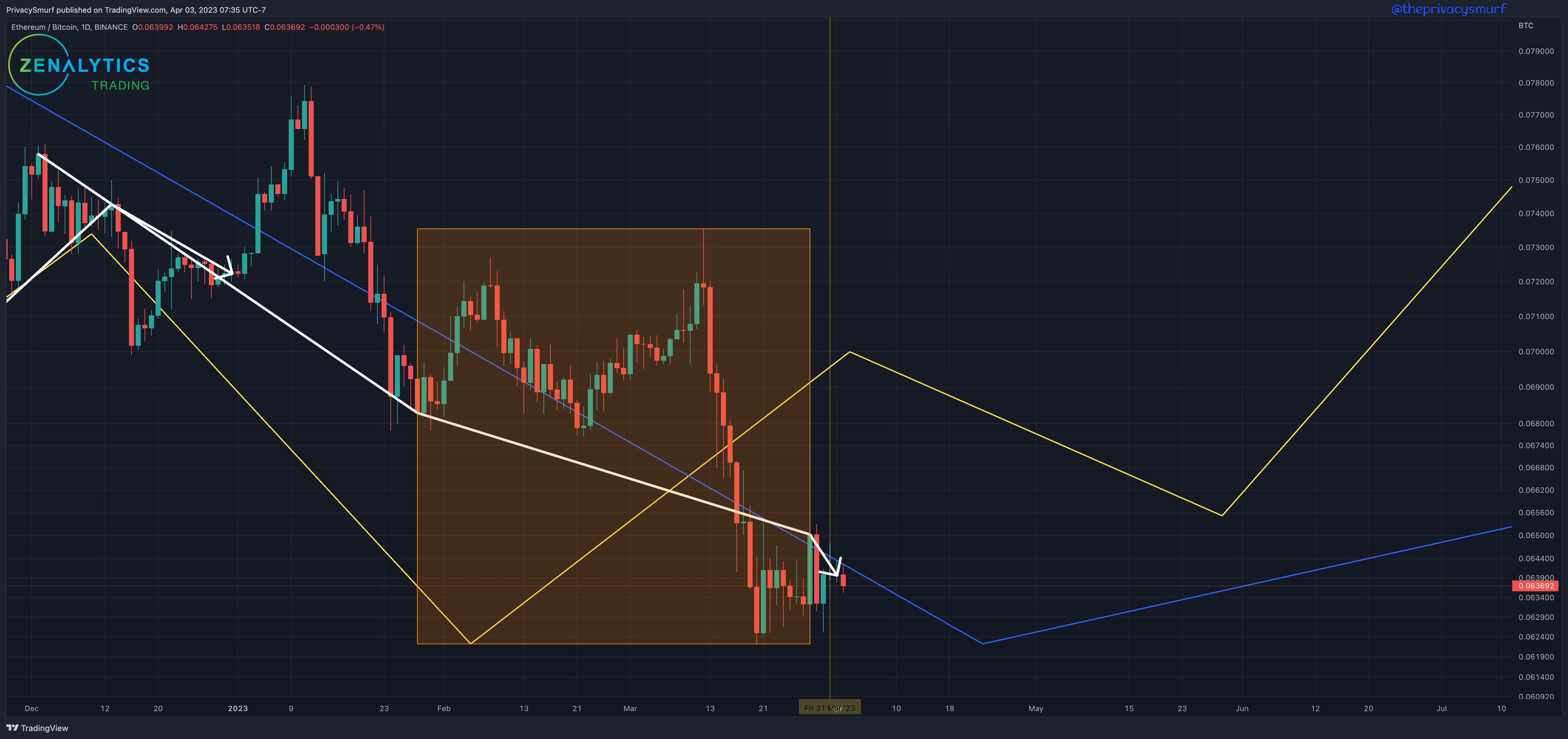
Takeaway:
At the moment, modeling still shows no relevant short-term daily cycles. The longer Daily and Weekly cycles are both presenting a downward alignment going into mid-April. I suspect this will put ETH and, subsequently, alt performance in lockstep with BTC, biased towards declining values. The weekly cycle begins to turn up around late April but daily doesn't join in the upturn until late May. This window of misalignment is the time I'd be looking for new lows and a bullish divergence between price action and price action oscillators like Momentum, RSI, or MACD to begin rotating back into alts as they will start to outperform BTC.
Speculation in a vacuum:
Choppy behavior and new lower lows under .062 sometime before mid-May.
Bullish divergence on higher intraday and/or daily timeframes as signals to take BTC profits and buy into ETH and strongest alts signaling reversals or near breakouts.
ETH and altcoin rally starting by late May through the end of the quarter.
Adjusted Spent Output Profit Ratio
The aSOPR is a metric provided by Glassnode, indicating how much profit, loss, or neutral spending goes on each day. Here’s a link to the video description.
Most of the time price is moving in line with the cycles of the aSOPR. The thing to note, IMO, is not necessarily the cycle but the downside deviations of the aSOPR from the upwards cycle phases. My take on this is that profitable spending should be increased in these moments. Still, people are either forced to sell/capitulate, or folks are not confident in the state of the market during these deviations, and they choose to take a risk and sell at a loss to buy lower. Someone made a handy and free indicator called “Glassnode BTC SOPR Toolkit” in tradingview that you can use to monitor levels yourself. It is shown at the bottom of the chart.
https://www.tradingview.com/chart/l1wcaT5z/
From 2023 Q1: (not posted)
*** Unfortunaltely, I wasn't able to post this dataset. For this I wanted to go back and show the historical forecast because it was actually pretty good, but that's not super useful so we'll just move on with the current data. ***
Below is the 2023 Q1 Forecast.
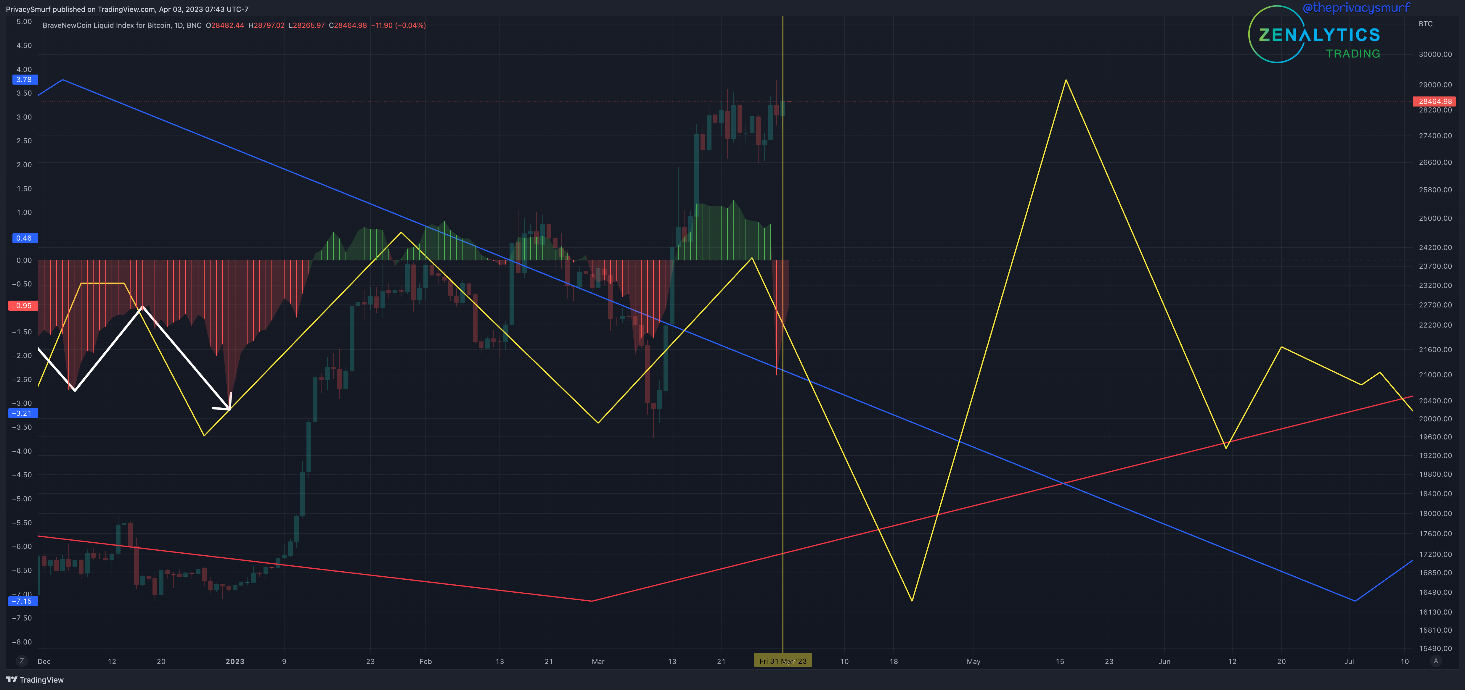
Takeaway:
As this is an on-chain dataset specifically for BTC, it has a similar presentation to the models of BTCUSD. Daily cycles are down through April and up through mid-May. Monthly cycles have increased since last quarter, suggesting a long-term transition to profitable transactions. I would expect the low readings to get shallower and shallower on the aSOPR as time moves on this year. Weekly cycles remain down through the quarter, so the downward phases may still be sharper declines when they align bearish with daily models.
Speculation in a vacuum:
Negative readings on the aSOPR until ate APRIL.
Positive readings through til late May.
A decline towards the zero line and possible shallow negative readings by the end of the quarter.
Financial Stress Index
The St Louis Federal Reserve puts out this index, quantifying and measuring the amount of stress in financial markets. This wiki shows how the index is composed.
https://en.wikipedia.org/wiki/St._Louis_Fed_Financial_Stress_Index
The relationship to the BTC price is usually inverse on the correlation indicator at the bottom of the chart. More (higher) stress is typically associated with lower prices and less stress on the market. This data is put out weekly, and it is also a week behind, so from a timing perspective, it’s not ideal. Still, having the cyclical activity to forecast ahead of time, we can reasonably assume when to start paying closer attention to this relationship.
***link pending***
Below is the 2023 Q1 Forecast.
It just so happens that this quarter, the monthly close is out of sync with the weekly close. Since this dataset is disclosed a week behind, I'll be amending this page to reflect the quarterly forecast on Saturday, April 8th, 2023. This model is rendered on incomplete data, so I'll wait to make an assessment until that date, although there probably won't be too much of a change.
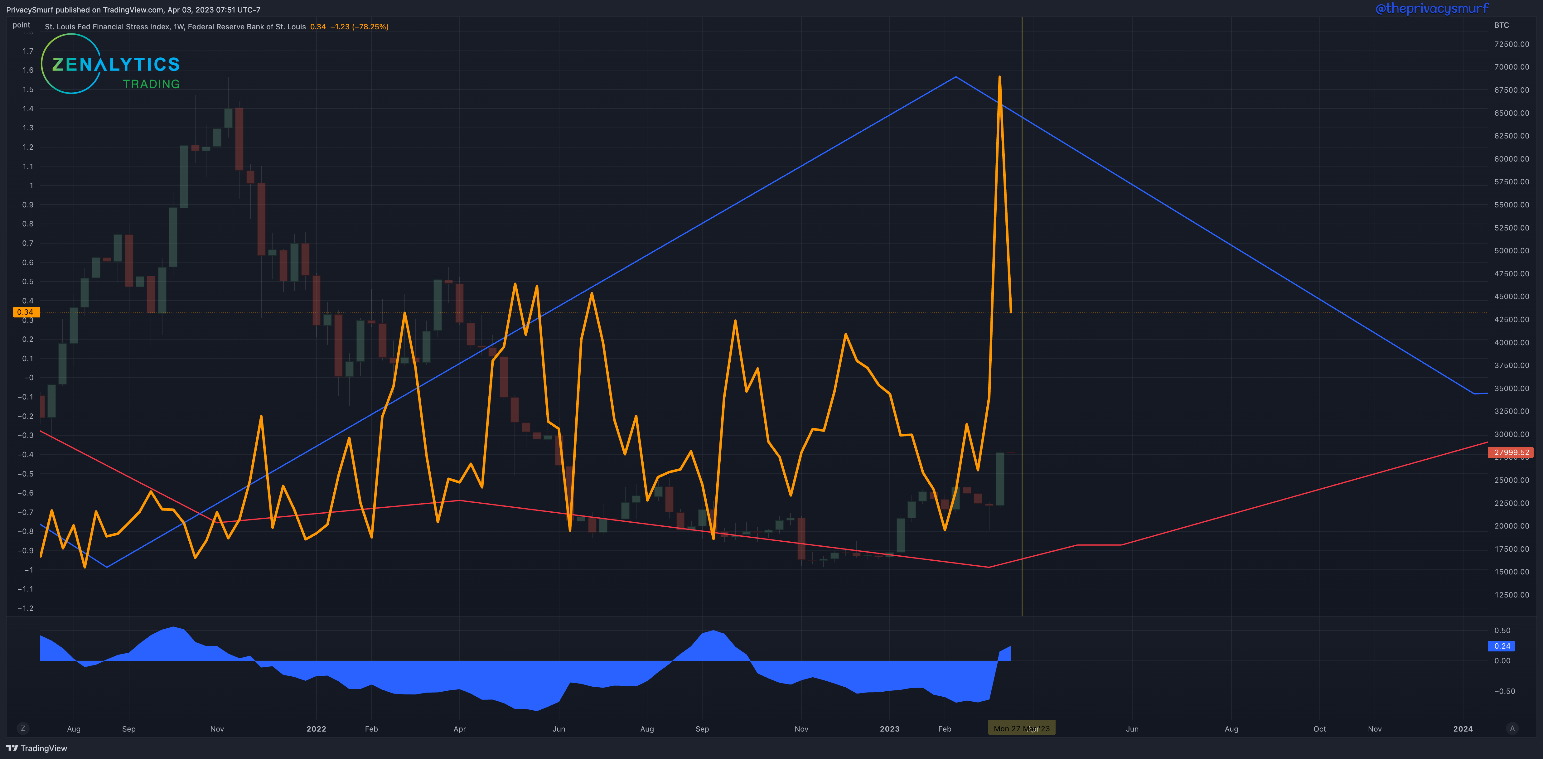
Takeaway:
Update coming Saturday April 8 2023
Speculation in a vacuum:
Update coming Saturday April 8 2023
30yr Bonds
The typically inverse metric for BTC.
https://www.tradingview.com/chart/zPis3Mt9/
From 2023 Q1:
“…correlation is a key factor. If the correlation remaining positive we could see both BTC and Bonds go up in price…a rally in bond prices through the early part of the quarter...”
Interestingly, we are enduring the longest period that BTC is positively correlated with 30yr bonds. This is shown by the shaded section highlighting the positive values on the bottom right of the chart on the correlation coefficient, which measures the relationship between BTC and the 30yr bond futures contract. Is this the start of BTC being recognized as a safe haven asset regardless of the dollar price value?
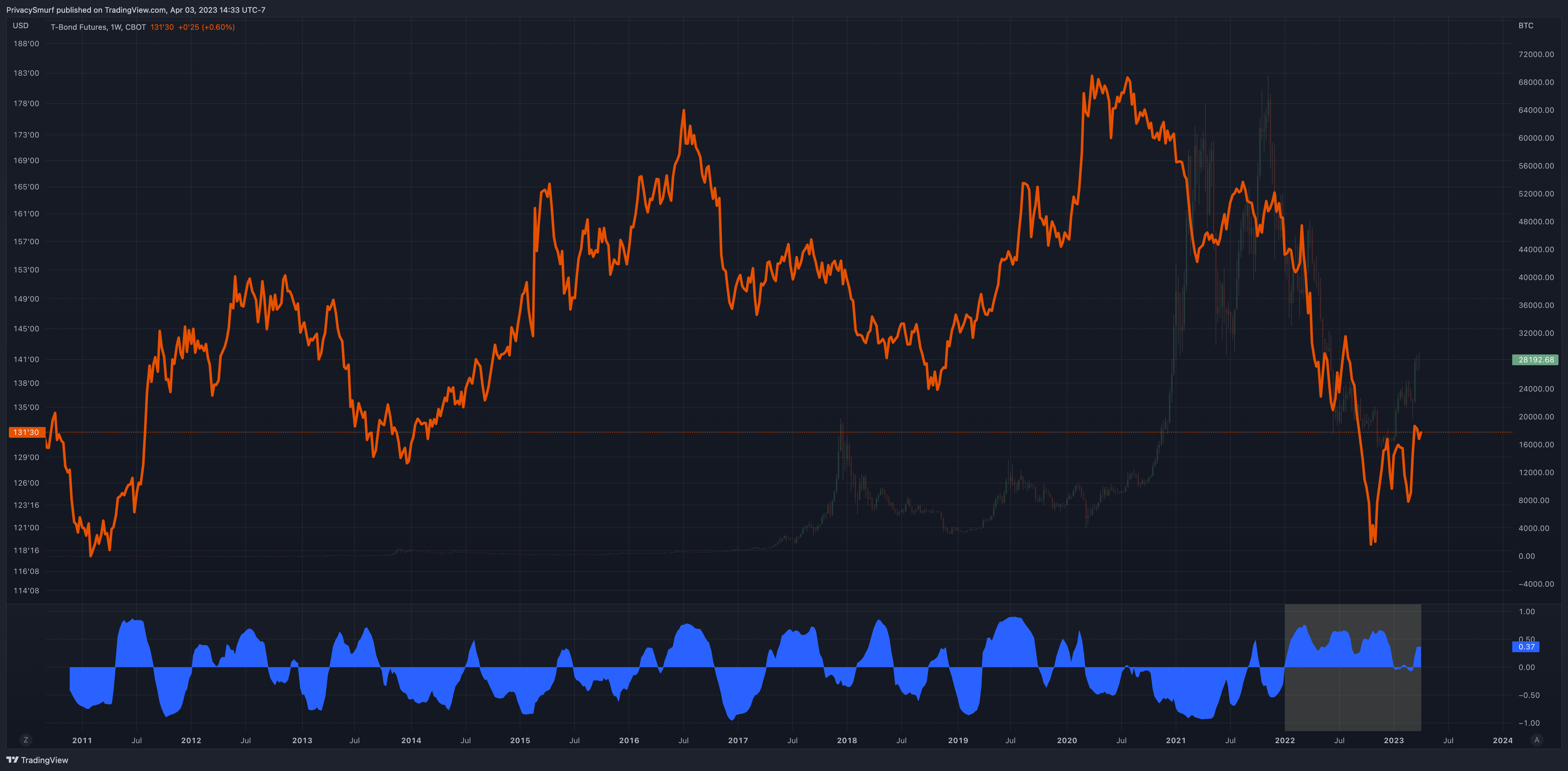
Below is the 2023 Q1 Forecast.
There was a deviation to the downside shown in the orange box from the models of last quarter. However, they still stayed in line with the typical notions that bonds perform inversely to crypto as a risk-off asset, as BTC was pumping at the time of this deviation.
Takeaway:
Longer daily cycles are absent from the models, and only shorter daily cycles are presented, suggesting a possible lack of short-term strength. Weekly and Monthly cycles are still bullishly aligned through the end of the quarter, so phases of alignment between the three, and I would expect more bullishness. The downward daily legs may be choppy consolidation. The daily model timing is also similar to BTC daily timing in places. If the correlation between the two remains positive, and a technical trade timing signal is not present on BTC but IS on the bond chart, you could take the BTC trade on faith that it will match. The same would work if a signal is present on BTC but not on the bond chart.
Speculation in a vacuum:
Very choppy but ultimately bullish through the quarter. I'd honestly not be trading this market except for a risky breakout trade with a tight stop.
We are in a pretty weird place/time where by sheer force of will, bulls are propelling the market higher. That can only go on so long without the Fear of Missing Out (FOMO) of retail speculators jumping on board. That's where we are right now. The decision point. Technical weakness has built up in the market. Waning momentum shows that institutional bulls have slowed buying.
Will retail volume flood in and kick off the bull market early?
Will retail be too scared because of the macro environment and let the short-term bears take back control as the short-term bulls continue profit-taking from the q1 bear rally?
Will institutions turn back on the money fountain and start back buying?
I don't really know. The historical natural flow of the market would suggest that we'll have a brief pause, but the next wave may be the first wave of the new macro crypto bull market.
As indicated at the beginning in "Trust the Process," there's a pretty reliable bet one could take that the year will end profitably.
@theprivacysmurf