

Midweek Wednesday #4: Thursday Edition
Midweek Wednesday #4: Thursday Edition
On a 'Thursday in the Danger Room'

Ode to the bullish trend.
BTC/USD
Daily Chart
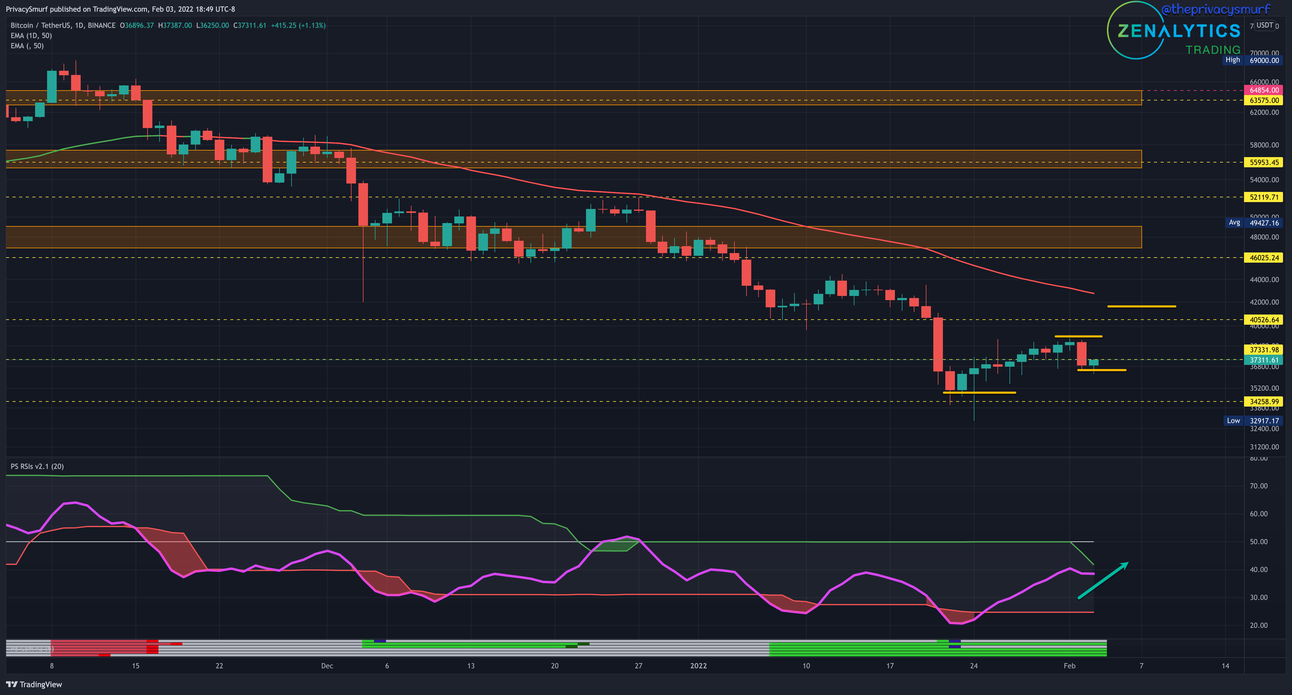
The updated picture from Sunday shows we might be setting that higher low if the green continues. The latest close is just under resistance at $37331. The bullish divergence setup is still valid on a few oscillators shown by the green lines on the Smurf Correction Strength Meter displayed at the bottom of the chart. With the RSI trending up still is nearer to the top adaptive band as it sinks below the midline. This is a good setup for bullish price continuation. Closing above $40k will be a huge step in the right direction.
2HR Chart

There’s a lot going on here but stay with me as I play through the chart. From the middle of the chart, The RSI was showing compression as the top and bottom bands sandwiched the RSI around the midline. This is typically representative of choppy/whipsaw price action. As the daily trend is bearish I’d be looking for short setups. On presented itself around noon on the 31st. THe price was at resistance when bearish divergence, which is price increasing with oscillators in decline, indicated by the 5 red lines on the Smurf Correction Meter at the bottom of the chart and the green ascending arrow at price and red descending arrow under the RSI. The trigger of a trade setup occurred while at resistance while also plotting a bearish engulfing candle. This is an ideal setup and entry to take. Both profit targets (white arrows) were achieved to the short side. A bullish divergence setup appeared soon after at support followed by a bullish engulfing candle. This is a risky entry I wouldn’t take as the trend is down but it is likely to hit the targets since the market is sitting in a range at the moment.
20min Chart
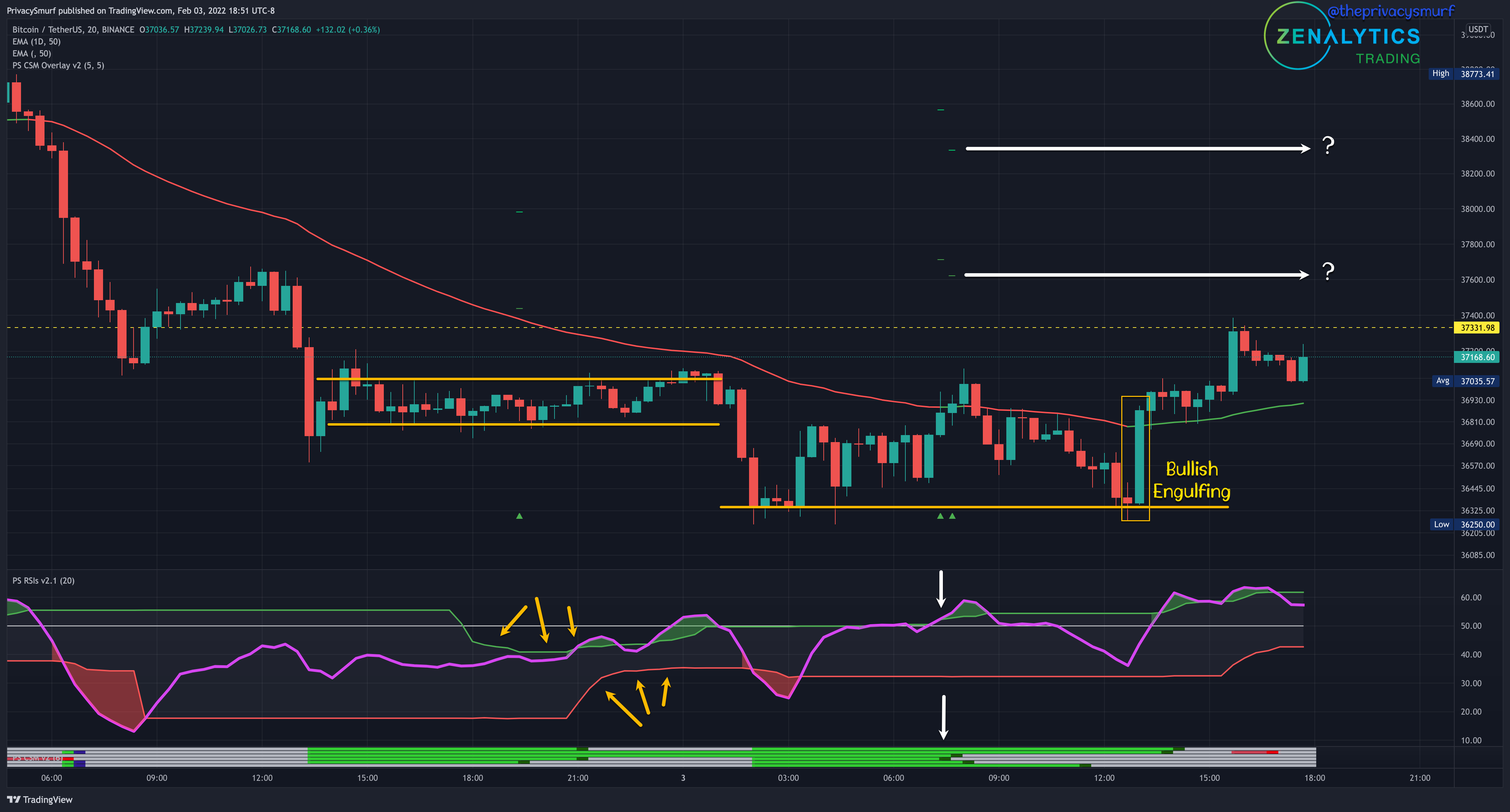
Now we have the most up-to-date chart. On the left we see the tight range of price and compression forming on the RSI. This potential of this volatile price action was the reason for delaying the post the other night. The immediate short-term picture would likely be dramatically different overnight. The decrease in price but increasing oscillators set up bullish divergence on all oscillators. The triggers occurred (white arrows) with the break above the top band of the RSI and midline. Overall this is the ideal setup for a bullish trade, but the daily trend is down so it inherently carries more risk and I’d be looking for some other type of price action signal to increase the odds. Immediately after the trigger is a bearish engulfing candle back under the 50-period EMA, a bearish indication so I’d be avoiding this trade. Further down the line there is an explosive bullish engulfing candle that starts from the low support and closes above the EMA. The RSI is breaking above the top band and midline. This is the price action signal I’d be looking for. The daily trend is still down so this trade carries more risk and I’d enter with a smaller position size than a typical trade and likely exit a majority of the position at the first of the two targets (question marks).
ETH/USD
Daily Chart
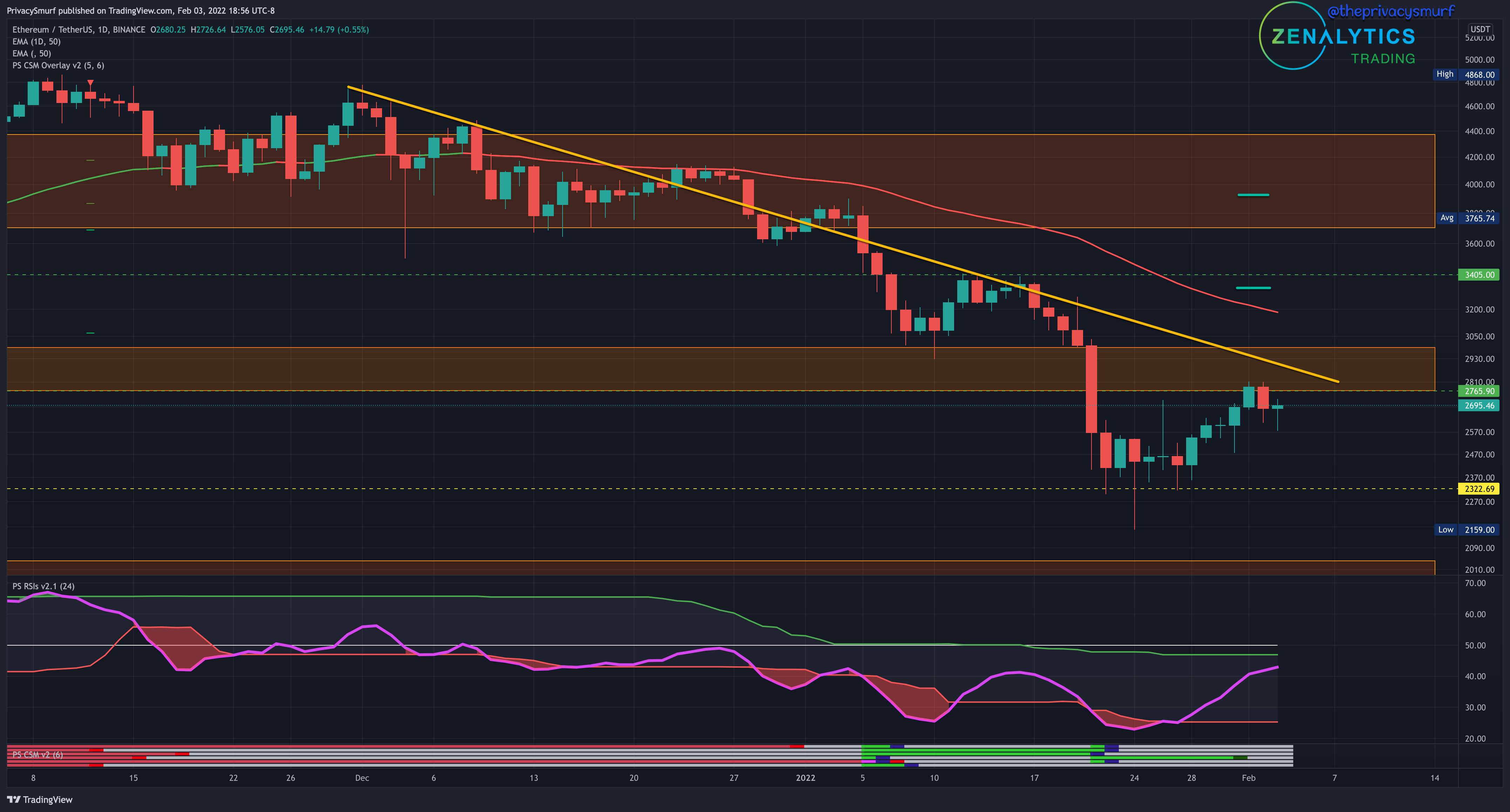
The Sunday update range of 2300-2700 has been pierced to the upside but is holding so far. One oscillator has triggered the bullish divergence trade setup but I’m extremely reluctant to take a single signal with the way the downtrend has been playing out. The RSI is forming the ideal placement of the top band under the midline. A break of the top band and midline may be the bullish technicals needed to push the price above the ceiling. The targets of the bullish divergence as the short green horizontal lines. I’d not be taking any daily chart bullish positions until the trend has shown some price action-based reversal signal with a higher low and higher high ideally with the latter closes above the 50-Day EMA.
2HR Chart
There weren’t a lot of ideal setups occurring in this timeframe. Short entries being the trades to take with the least amount of risk lacked aligning confirmations. The red bearish divergences indicated on the Smurf Correction Strength Meter were never set up together. The bearish engulfing candle would be a better entry signal with the weaker divergence trigger but moved with a wide range making an entry very far away from the divergence trade stop loss creating a bad risk to reward ratio. I’d stay out of this short.
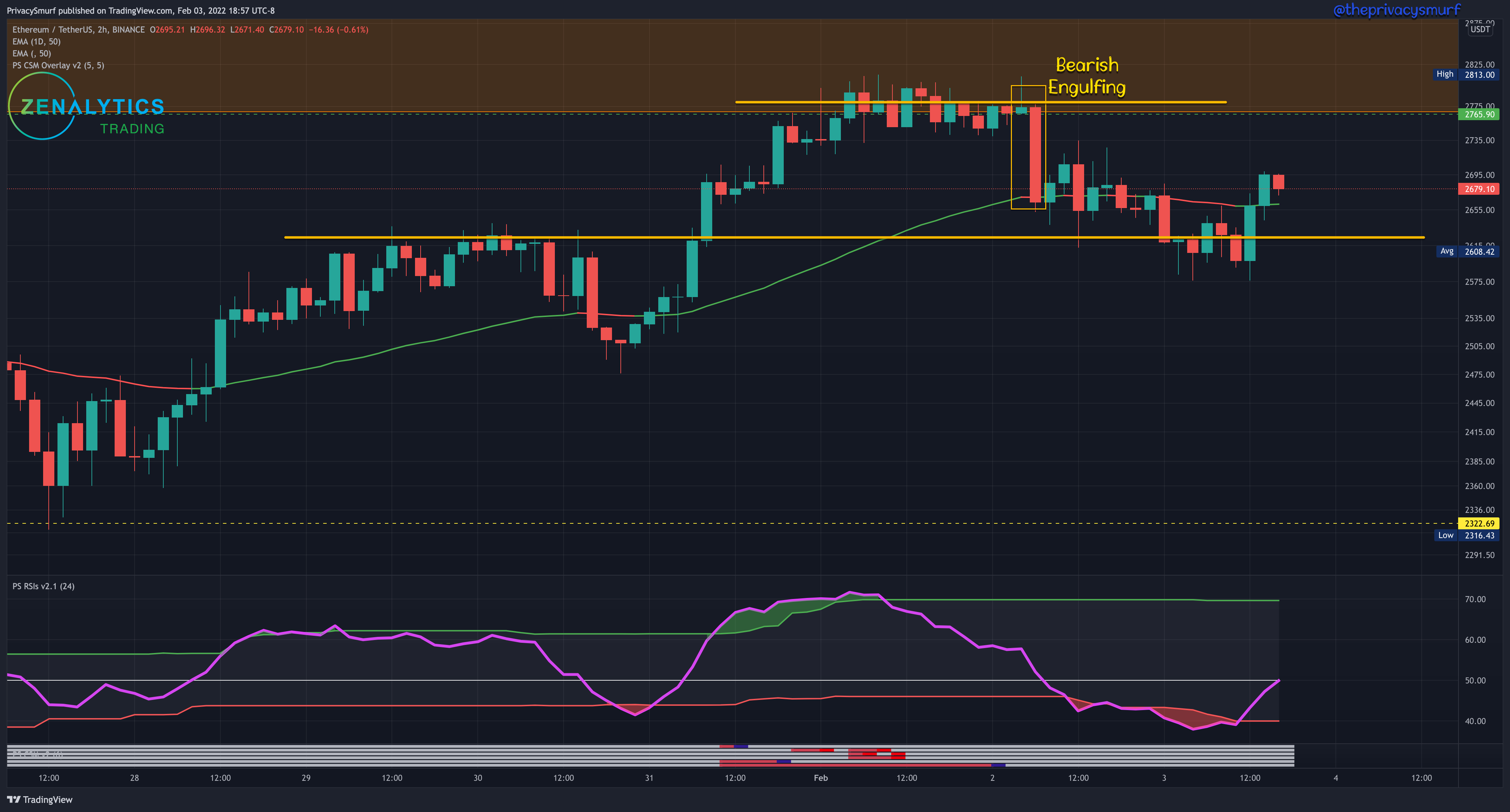
20min Chart
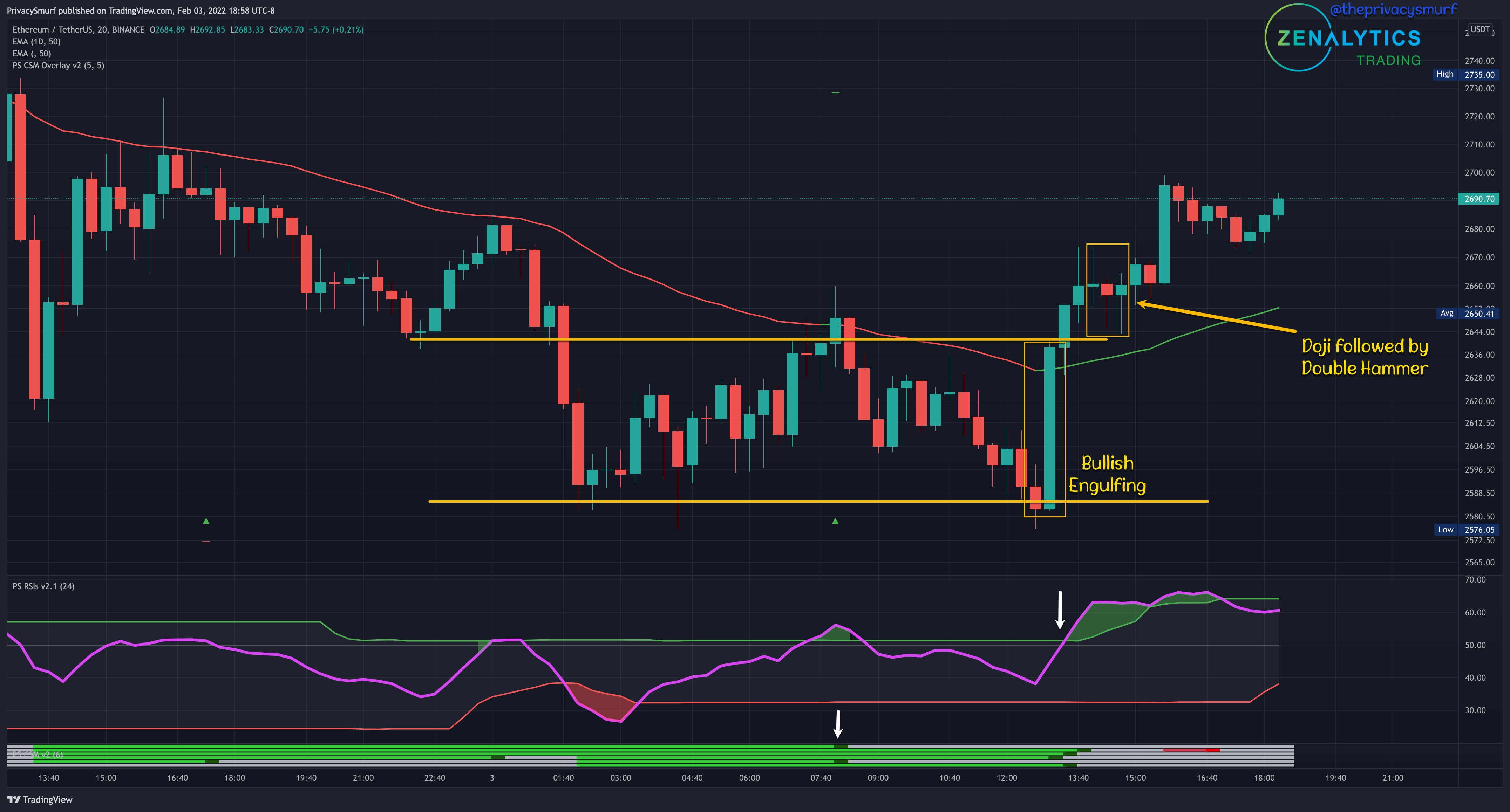
Now we have the most up-to-date chart. We have a similar situation here regarding adverse risk to reward ratios but we have better follow entry signals creating different trade opportunities. The daily trend is down so this is already a risky trade. A full bullish divergence trigger signal came in just after 7:40 on the 3rd. The RSI was above the midline and the top band and the close was above the 50-period EMA but being a countertrend trade I’d be looking for further price action confirmation signals. That did not come and was followed by a bearish engulfing candle. The price fell back under the ema failing at that resistance. Back at the low support, an explosive bullish engulfing candle came with an RSI cross over the midline and top band and the price closed above the EMA. Despite that, it was still under resistance and the last highest high so risk is not in favor of a counter-trend trade. A few bars later an indecision Doji candle is followed by a double hammer candle setup. I like these for reversal signals but in this case, it is a bullish price continuation signal. They closed above the last highest high and wicks came down to test the broken resistance as support. Here is the bullish trade I’d take. Even in all that up and down price action the entry price is slightly above the entry from the bullish divergence trigger candle, but the price action setup is VERY different and risk is much more in favor of a successful long trade.
With bullish setups on all these timeframes, we are dangerously close to being in confirmed reversal territory on the daily chart. Thanks for your patience. I was working away from the house this morning and my darn computer decided to update and restart and I couldn’t reestablish a remote connection to post. I’ll add the post on oscillators tomorrow along with the Smurf Sentiment Index (a custom fear and greed indicator). Dont forget I need comments on what oscillators you use and questions to answer on Saturday. Drop me a comment.
Side note, Bollinger bands aren’t classified as oscillators. An oscillator is a plotted measurement, that is usually bound to a range that they move back and forth up and down in (oscillating :-p). They are typically NOT plotted on a price chart with candles. They will be something added outside of the price chart. Like the RSI, Momentum, MACD, and that sorta stuff.
See you tomorrow!
@theprivacysmurf