

Showcase Saturday #1: Altimaniacs
Showcase Saturday #1: Altimaniacs
Totally insaney

The first week is in the books. Hope it’s been good for you. Showcase Saturday will be a basic big picture to a little picture of some altcoins selected by YOU. Each week you can add a comment with a coin you want a look at. I’ll tally the coins up in a spreadsheet and select 5 to analyze. I’ll be picking 3 of the most suggested and 2 randomly chosen of the coins with only 1 vote. This way I think is a decent way to give your special coin a chance of getting highlighted even if it’s not mainstream. Ideally, it needs to be a coin with some price history. I can’t really provide technical analysis on something that’s only been in existence for a few weeks. :-p
This newsletter subset will be posted on Saturdays twice each month and is only available for paid subscribers.
***THIS IS THE FINAL FREE POSTING!*** After this is posted free subscribers will ONLY be getting the SUNDAY SYNOPSIS at a frequency of every other week. The next free posting for free subscribers is on Sunday, June 20th. The Sunday Synopsis will be a valuable market outlook but you are missing out on the bulk of what will be contained in this entire newsletter. The cost is very undervalued as my partner keeps telling me, but I’m sure I can convince her I won’t be spending too much time away from her to write it all. If you’ve enjoyed these first few newsletters or have realized some monetary gains from the posts I’ve provided throughout the various social media platforms I think the paid subscription here will really be an added benefit to you and your continued trading/investing career. I have put and will continue to put a lot of work into providing quality content, into teaching understandable and reliable methods, and into breaking down complex concepts to help traders and investors alike to excel in this space, to be profitable and self-sustainable, non-reliant on so many of the tools and products that you’ve been told you need to succeed.
Also, a share won’t hurt. Thanks, everyone. I’m glad you are here with me. Chat soon! Cheers!

To make this work I’ll be selecting most of the trading pairs against BTC. They will have a bit more price history and probably a bit more availability. The goal for me is to stack satoshis and to do that I have to take profit into BTC. Also, as I mentioned in Micro Monday #1, BTC is the honey badger of crypto. If it wants to bring the market up or down it will regardless of what these charts look like.
AAVE
The weekly chart of AAVE is maintaining a bullish market structure. The market structure support is at 6201 sats. That looks to be decent support as it aligns with the 50-week EMA. There is bearish divergence though marked with the down arrows. That is concerning as a trigger of that divergence could very well mean a break of the EMA and market structure support and price decrease down to 2237 sats where the next support is. A weekly close below 6201 and I’d be anticipating further bearishness. This week is also currently printing as a bearish engulfing candle.

The daily chart is bearish. A bearish market structure was established on Jun 10 with the daily close below 8601 sats and continued to break an older market structure support at 7750 sats. RSI is measuring below the midline which is bearish and the price is trading below the 50-day EMA. Any bullish price action because of this older support zone I’d be expecting resistance around that EMA and likely lower prices after.

The 4HR chart also isn't providing much bullish sentiment. While the RSI is extremely oversold it’s not displaying any bullish divergence. Momentum is in line with the price decrease. A bullish rally may be shortlived with resistance at 8410 sats and ultimately the 50-period EMA. If I had to speculate I’d guess that the price rally to 8410 resistance would coincide with a test of the midline at the RSI and lead to potential failure back to the lower support prices (rinse and repeat) until bullish divergence can form.

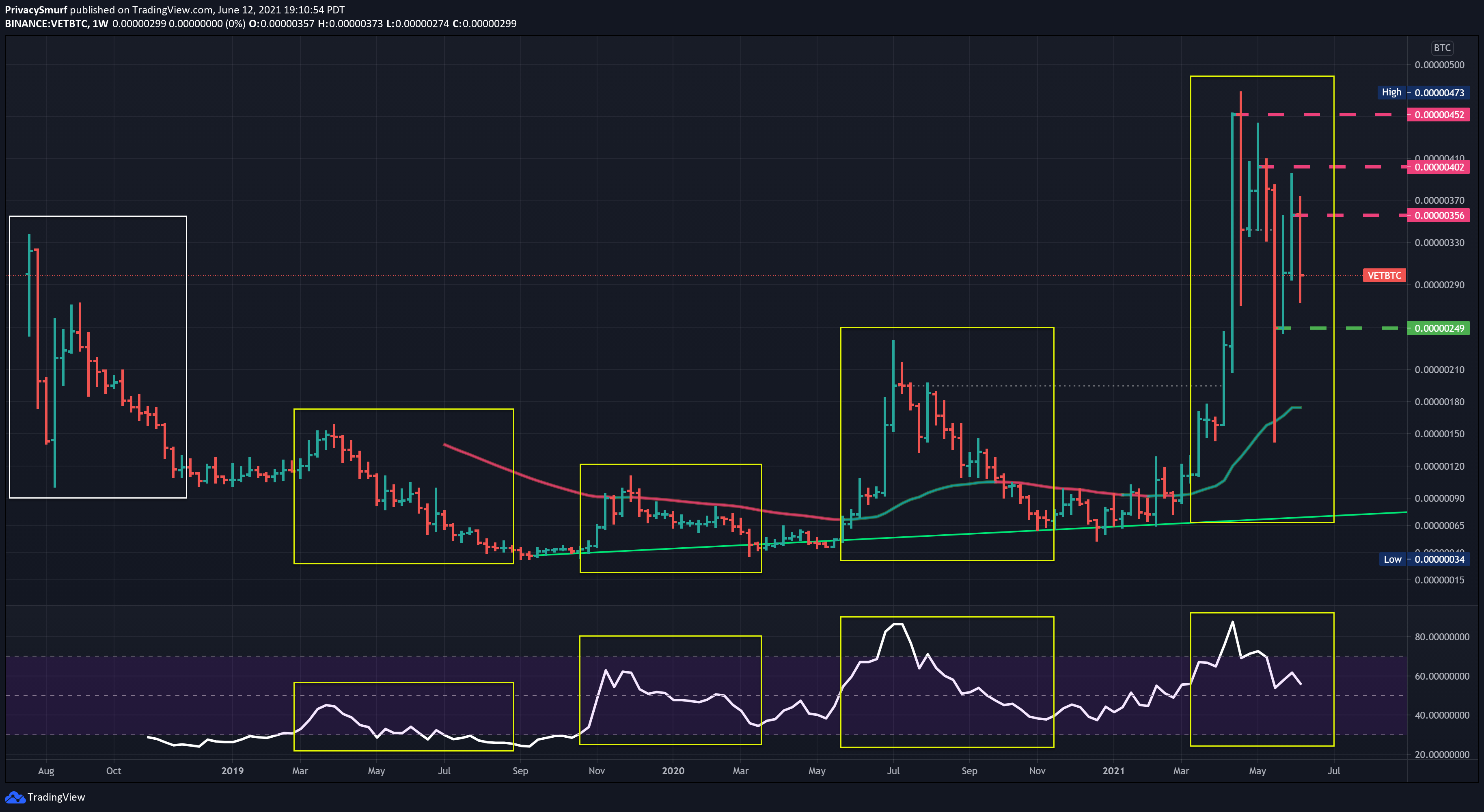
VET
The weekly chart is pretty simple, bearish with a market structure support at 249 sats and resistance at 356 sats. A weekly close below 249 sats would bring about a potentially interesting pattern.

I’ve highlighted the repetition here on VET chart. The peaks of each cycle on the RSI are top out in line with price and continue a gradual slide in price retesting prior cycle highs. A weekly close below .249 and there could be continual decline over an extended period as prices may retest a 200 sat level before a new bullish cycle.
The daily chart doesn’t need much adjusting or drawing as the weekly structure support and resistance are holding up well. It’s a bearish trend but I’d be hesitant to make any plays until price could make a choice either above 356 sats or below 249 sats. An ascending trend line from way back is converging with the recent descending trendline. The point of convergence is around Jun 19 so I’d anticipate some erratic price action prior to that at some point. This is a picture I’d sit on the sidelines and take pass on trades.
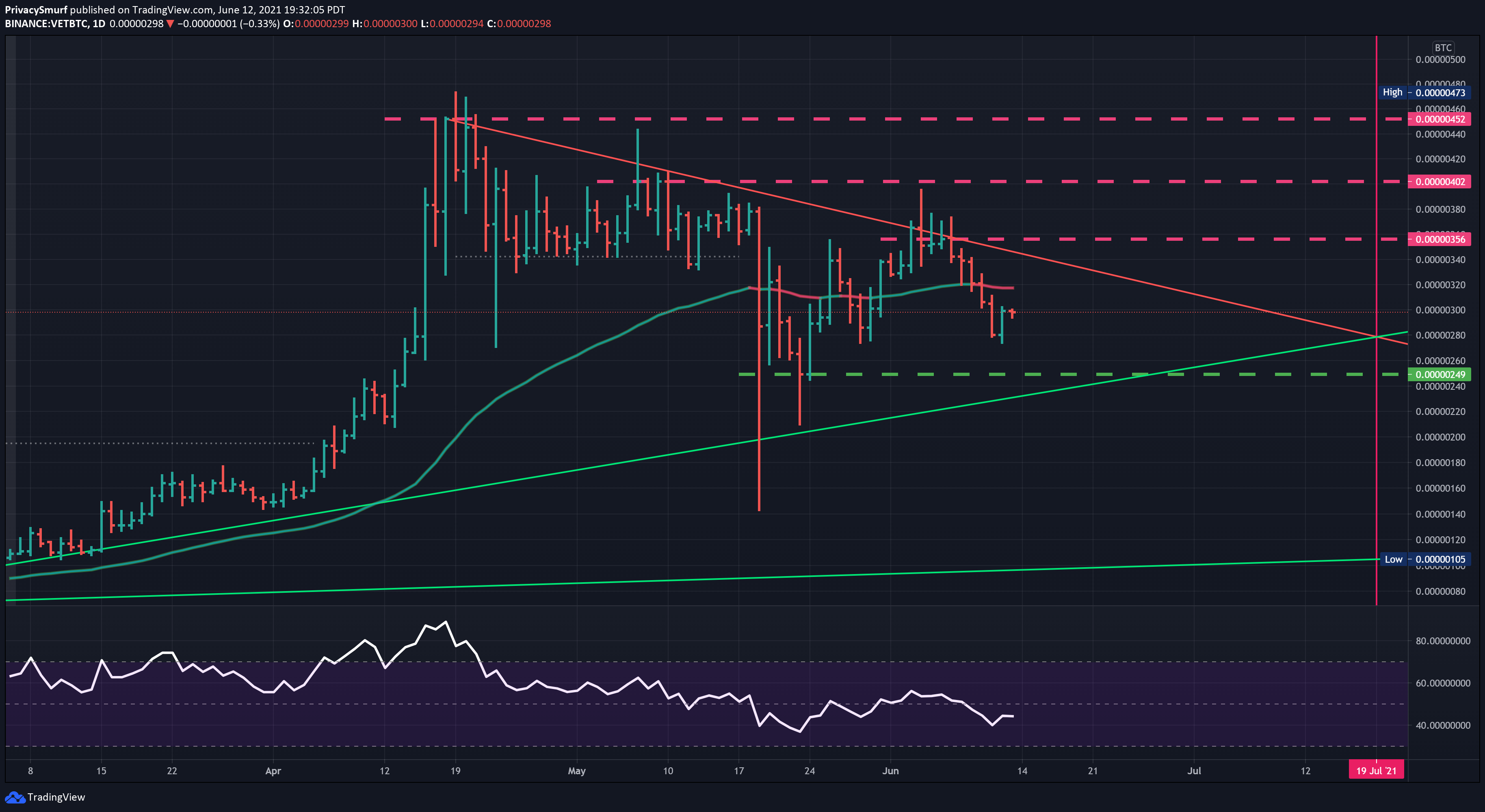
With such an up in the air daily chart and no clear bias I’d not step down to the 4HR for trades as there’d be inconsistent signals.
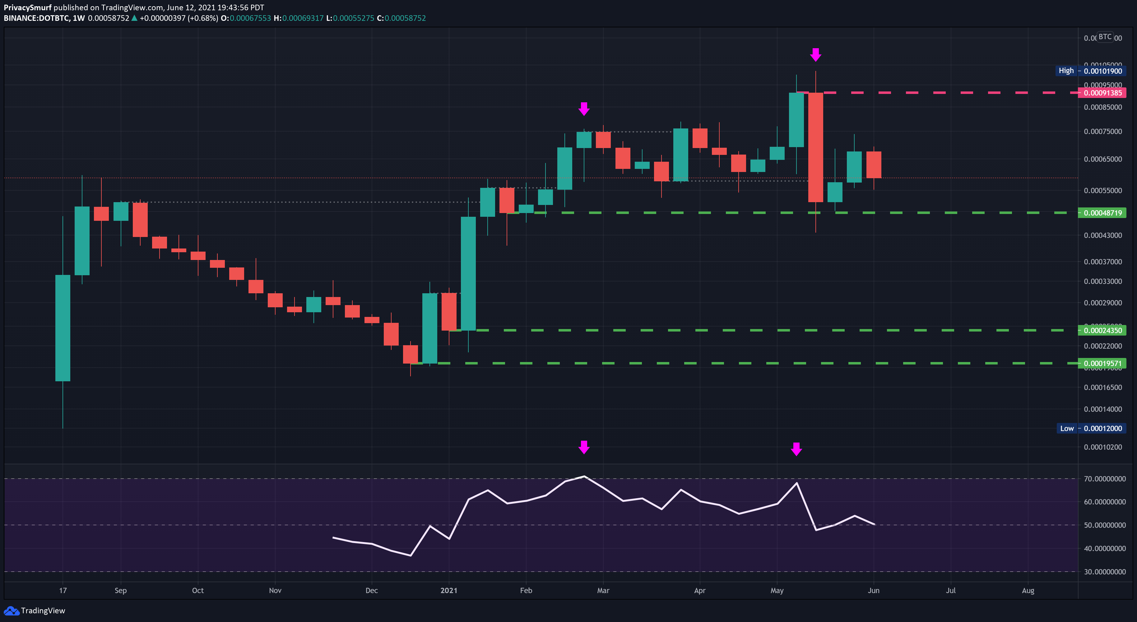
DOT
The weekly chart here is a bullish structure but a bearish divergence has formed with that ATH close 3 weeks back. There’s a long way for price to fall if a close occurs under 48719 sats. Another down week and the RSI will be measuring below the midline as well. Notice the bearish engulfing candle as well at the all-time high close. Compare that to the bearish engulfing candle at the 5th week on the first all-time high close. May be able to pick this up at a discount in the future.
The daily chart presents a less bearish overall picture as the price has been ranging mostly between the two yellow lines except for that price spike but DOT is currently retesting an older ascending trendline. Failure and I’d anticipate price down to that weekly market structure support at 48719 sats. This is another chart I’d stay away from until price could make some move and confirm directionality above or below the yellow lines.

If for some reason sitting on your hands is impossible monitoring the price action candle setups on the 1HR or 4HR chart may provide opportunities to take long trades from the EMA to top resistance OR bottom support to the EMA. Alternatively, short trades could be found monitoring the 1HR or 4HR chart and looking for entries at the top resistance to EMA OR EMA to bottom support.
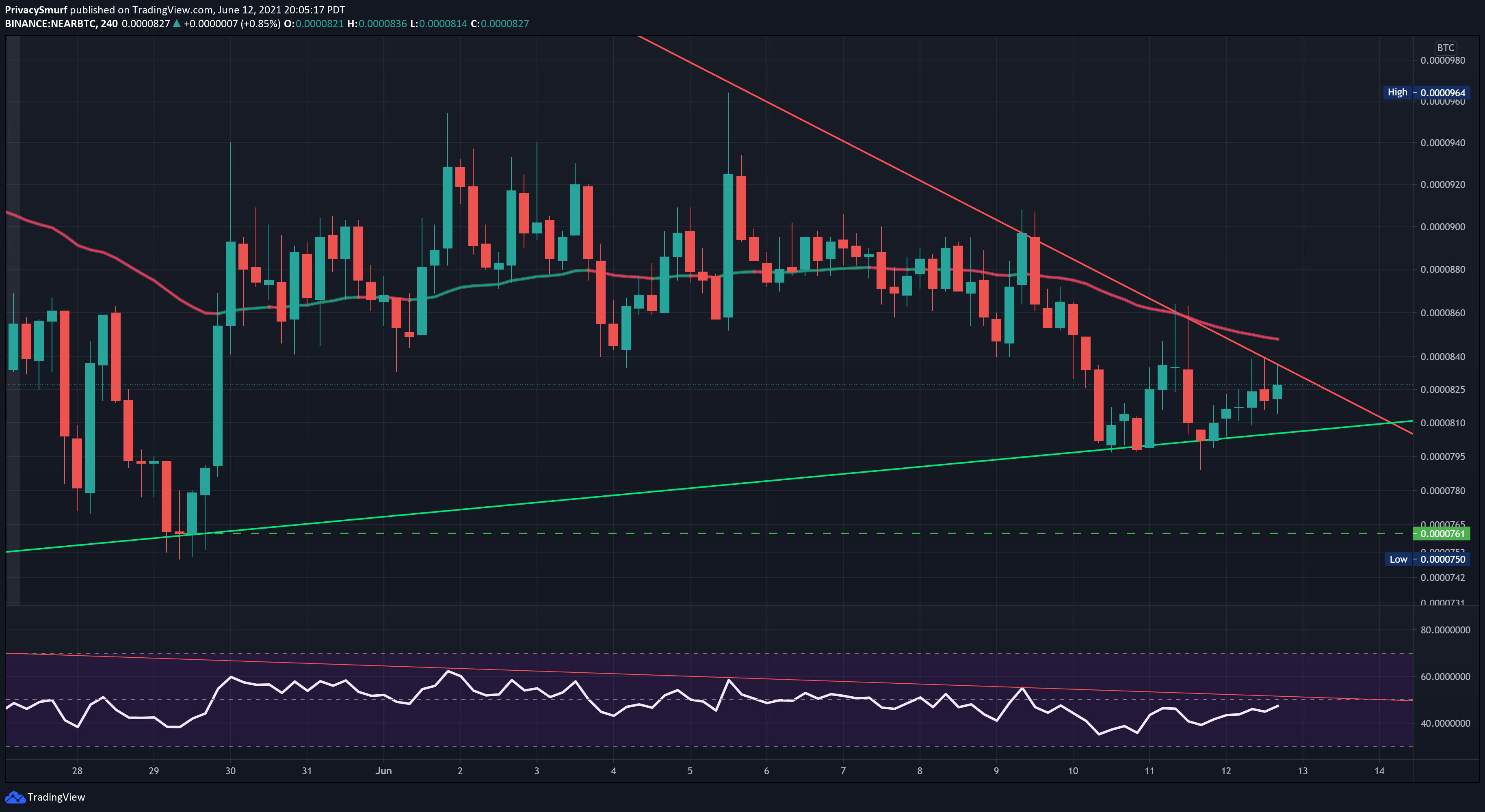
NEAR (selected at random)
There’s not a lot of weekly history here but pretty clear price ranges. As price is firmly in the middle of those ranges it’s not particularly a position of value for investment. Also, the RSI is being rejected from the midline. That’s not a promising indication of bullishness in the near future.

The daily chart we can add a couple more spots of support and resistance at the yellow lines. The price is trading bearish below the 50-day EMA and being compressed against an older descending trendline. Failure and I’d be watching for some stability around the lower support. I’d not be wanting any long trades on this timeframe unless the price could get above the EMA and test it as support. That price action would probably get the RSI above the midline as well.
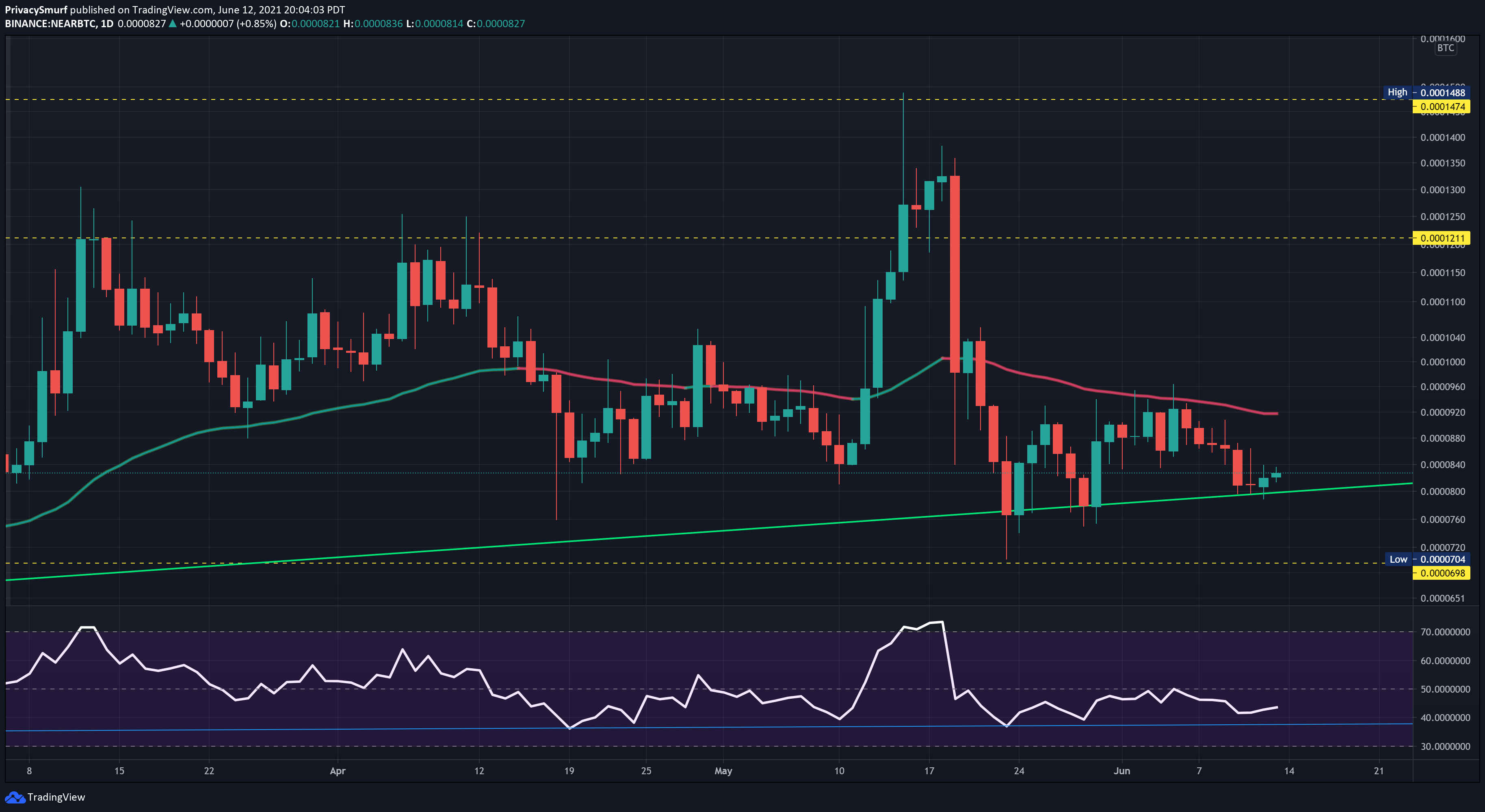
The 4HR chart is definitely something to wait for. Two converging trend lines, consolidation around the EMA, bearish RSI. This is not a great place to be. I’m slightly leaning bearish but moments like this can really be a coin flip. Better to just sit and wait. If there’s a bullish breakout and test though it could be decent with a price up to ~900 sats. Still, this one for me is a pass.
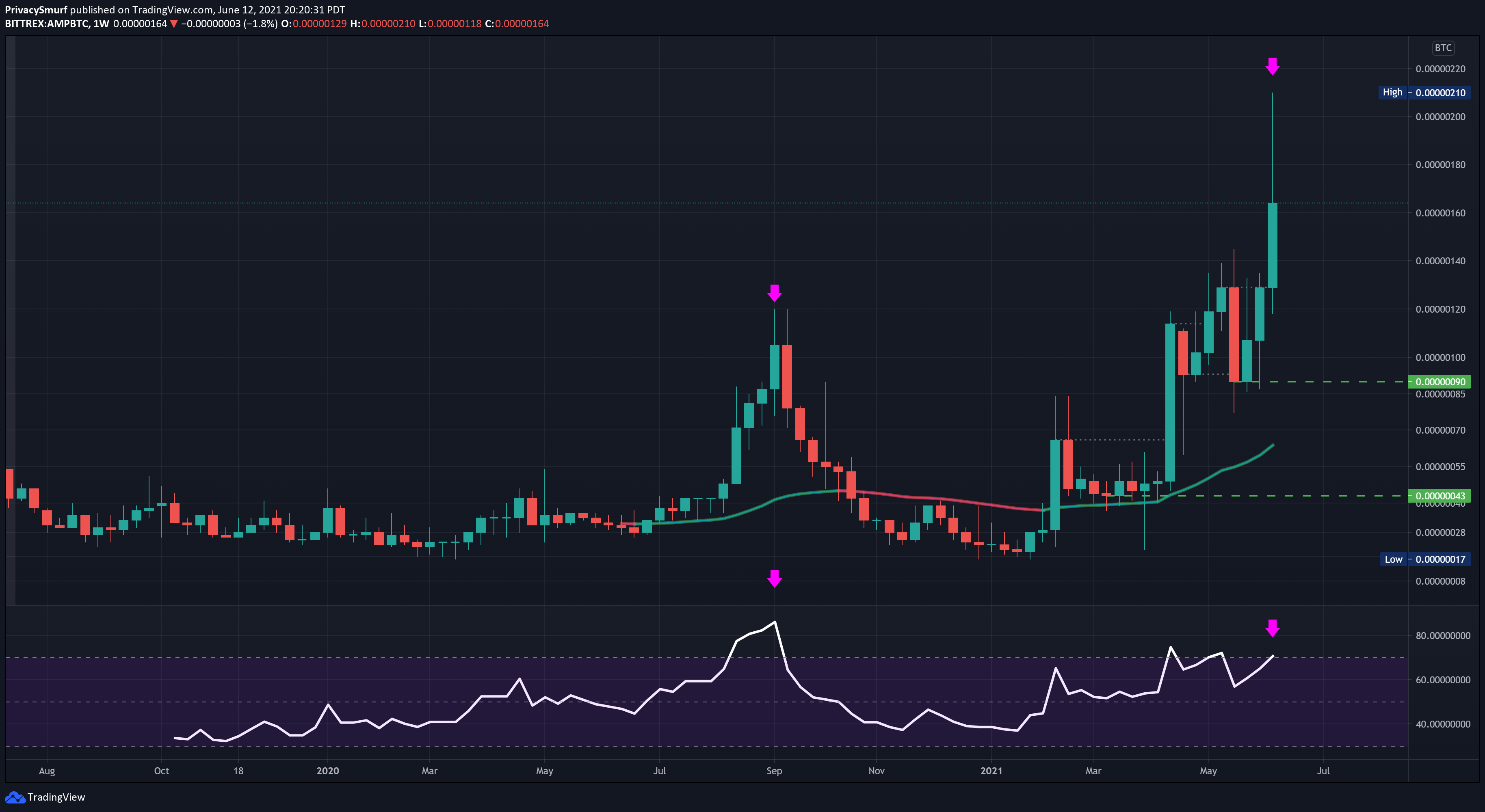
AMP (selected at random)
Apparently, Tradingview only has this under Bittrex and Poloniex. I’ve got a Bittrex account though I think it’s got like nothing on it. Oh well.
Well well well. The first really bullish weekly chart. Congrats AMP. As the current weekly bar is still open I’m not putting a top resistance to this yet. Never know what can happen in a day’s time in this space. The only crummy part of AMP is the bearish divergence forming on the RSI. That’s not a wonderful sight but it’s just a setup and not a cause for concern just yet, more bars need to be plotted to determine if this is topping based on this chart.
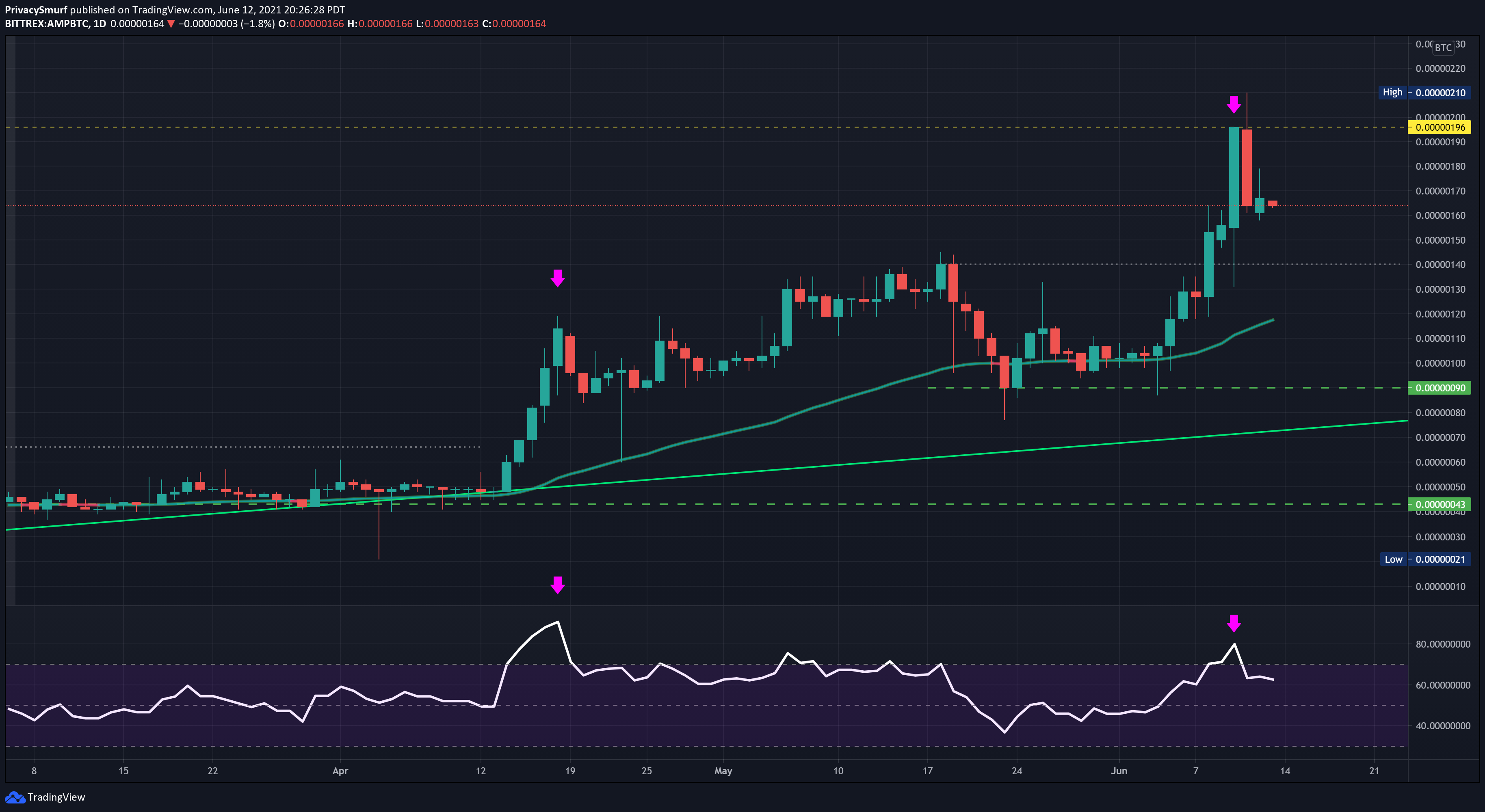
The daily chart gives us a bit more info and a more bearish bias. There’s the same bearish divergence setup, a resistance price of 196 sats, and RSI returning from the overbought region. There’s most likely gonna be some support at the previous market resistance at 140 sats. They can act as support but can be unreliable. I wouldn't be looking to buy there unless price action patterns gave me a reason to on the 4HR chart when/if the price gets there.
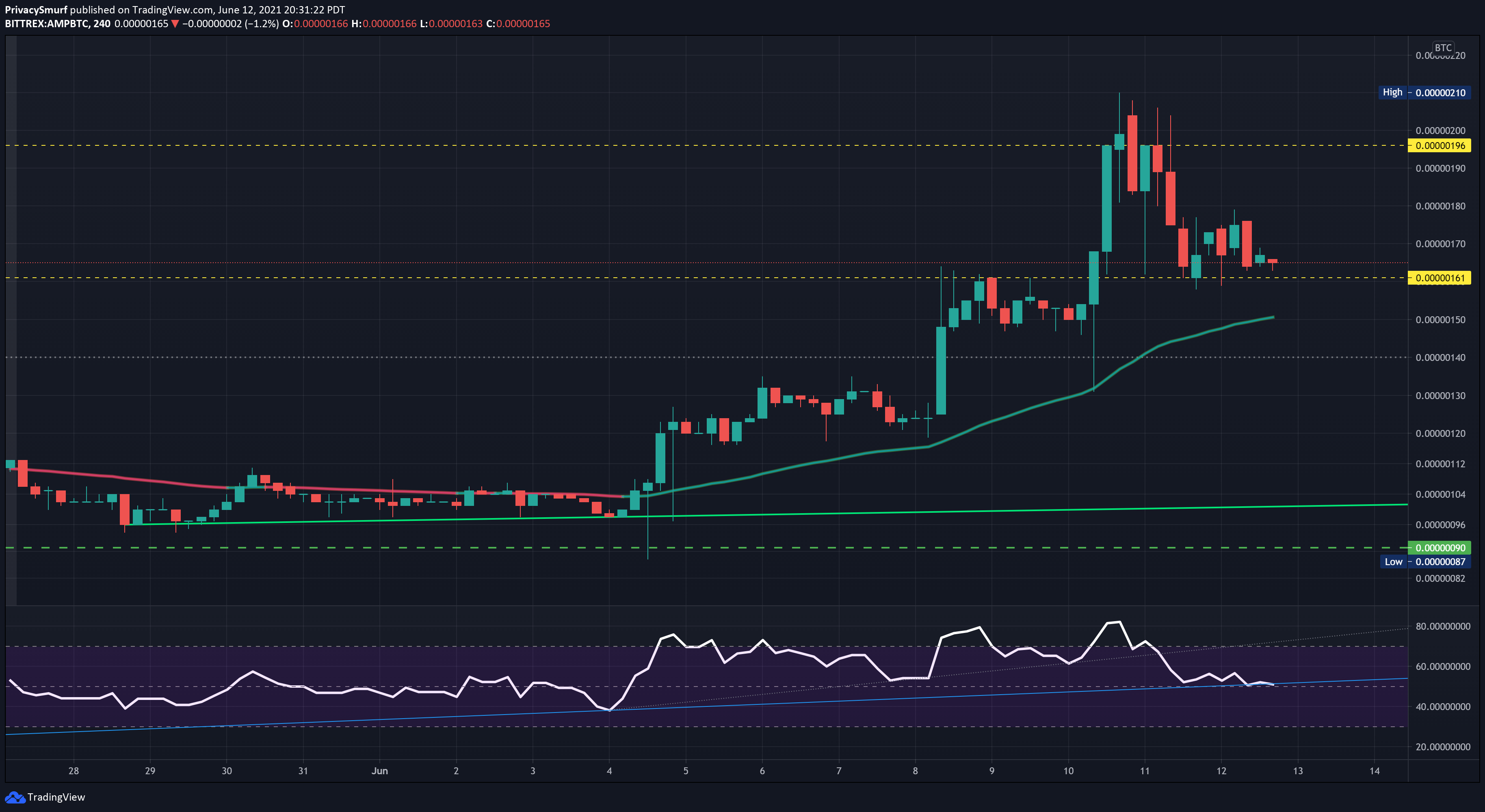
The 4HR chart is bullish but struggling. With the RSI about to cross below the midline, I’d be waiting for a test of the 50-per EMA before evaluating an entry. Maybe the price will drag along this support floor for a bit and give the EMA a chance to catch up for a nice bounce play and entry it price action candle dictate an entry signal. I’d keep my exit target and stops close as the higher timeframes are starting to look as if they are turning bearish.
That’s all for this post. See you tomorrow with the Sunday Synopsis. Remember, if you want to receive it each week along with all this cool stuff you have to join the paid section. See ya.
@theprivacysmurf