

Sunday Synopsis: #9
Sunday Synopsis: #9
Come wit' it now. Bulls on parade.


Working remotely unfortunately I don’t have my annotation software to doot up the charts all pretty so this won’t be up to the normal graphical standards. Sorry. I think you’ll get the idea regardless. I’ll also have some daily charts on here with Monday plotted on them. This will be sort of a different Sunday post.
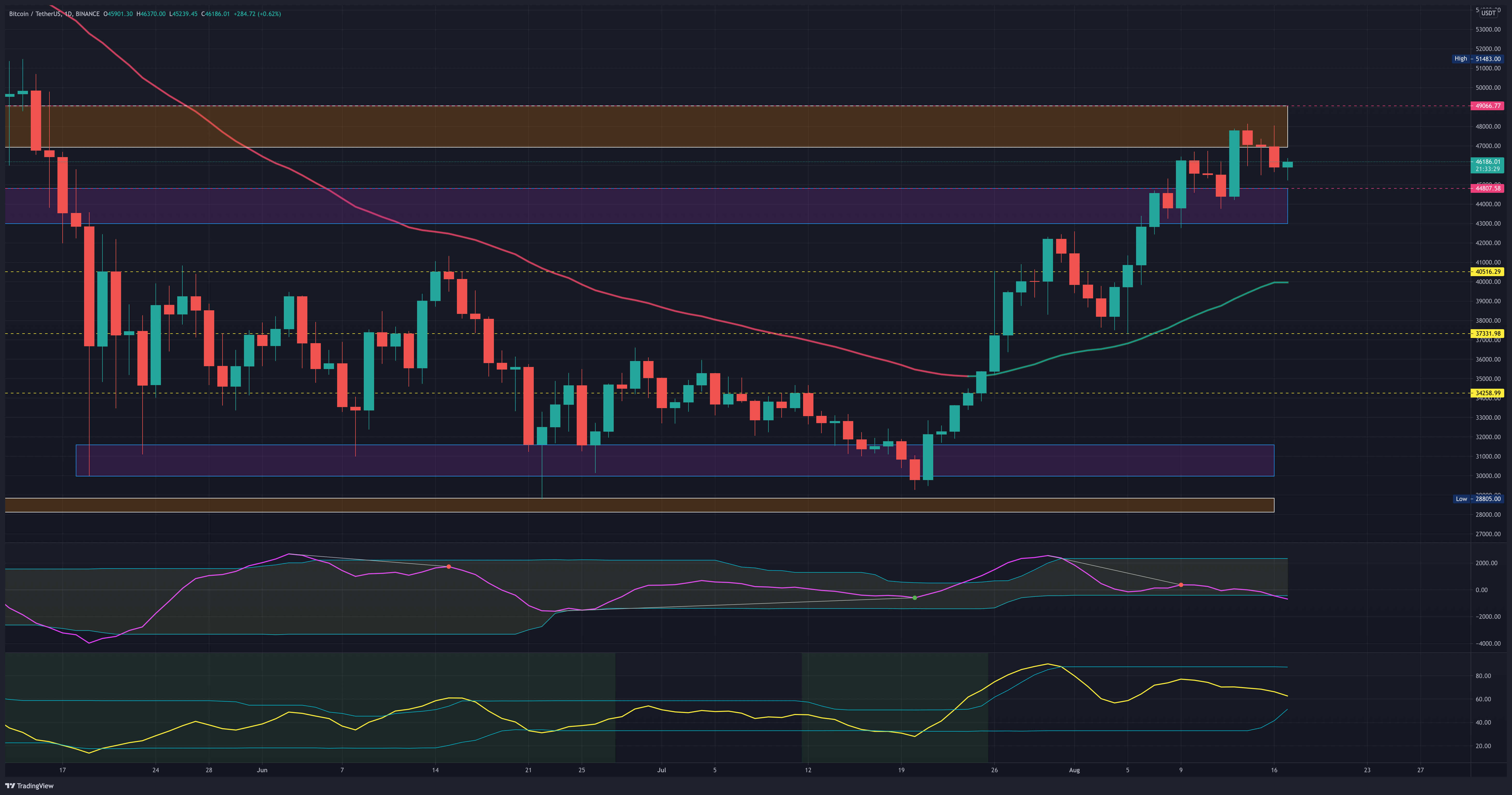
The bulls have been in the house this past week. The week closed over the initial low close pivot at $45217 that failed and preceded the 2nd half of the retracement. The next resistance is the weekly close at $49098. This is the final weekly resistance before we head back up to the highest weekly close at $59921. A retracement here would likely find support around $39-$41k.

The latest daily chart shows that a retracement from this resistance is likely. The price has continued up creating new highs while the cyclic RSI (in yellow on the bottom) has measured lower highs. With this bearish divergence, I’d be looking for bullish price action setups in the $43-$45k range. The 50-day EMA and the next lowest support is at $40.5k. It’s a gut feel (so not something to make trades on) but I don’t think we’ll be retracing that low. Cycles are starting to flip bullish on the smaller timeframes. A test of 50K is quite possibly on the horizon potentially around the end of the week.
The weekly chart of ETH shows resistance just under the weekly high close held although the bulls have kept the price from retracing too far away. I would expect $3000 to offer some support on a further retracement but the weekly chart isn’t giving us enough data to make an assumption of directionality.

The daily chart shows the increasing closing prices and a decreasing cyclic RSI on the bottom oscillator. This bearish divergence would lead me to believe price will retrace. Another gut feel but the price cycles on smaller timeframes are also trending up on ETH so I wouldn’t expect too far of a retracement. The $2884 price tag is the next lowest support but oscillation between $3000 and $3200 is price action I’d expect into the end of the week. Paying attention to momentum and other price action oscillators will be important to know if $3000 will hold or not when visited.

ETH relative to BTC stalled out this past week. That’s not exactly surprising since both assets are stuck at their relative ceilings teasing breakouts. The mark at 0.065822 will likely act as some support as it is tested. This chart is essentially telling me that both assets are increasing in lockstep with each other at the moment. There’s no real indication on which asset to be weighing heavier.

The daily chart shows the cyclic RSI is in line with the price and is plotting decline measurements so a support test down to the 50-Day EMA around the 0.066 mark may come before another test of the higher resistance.

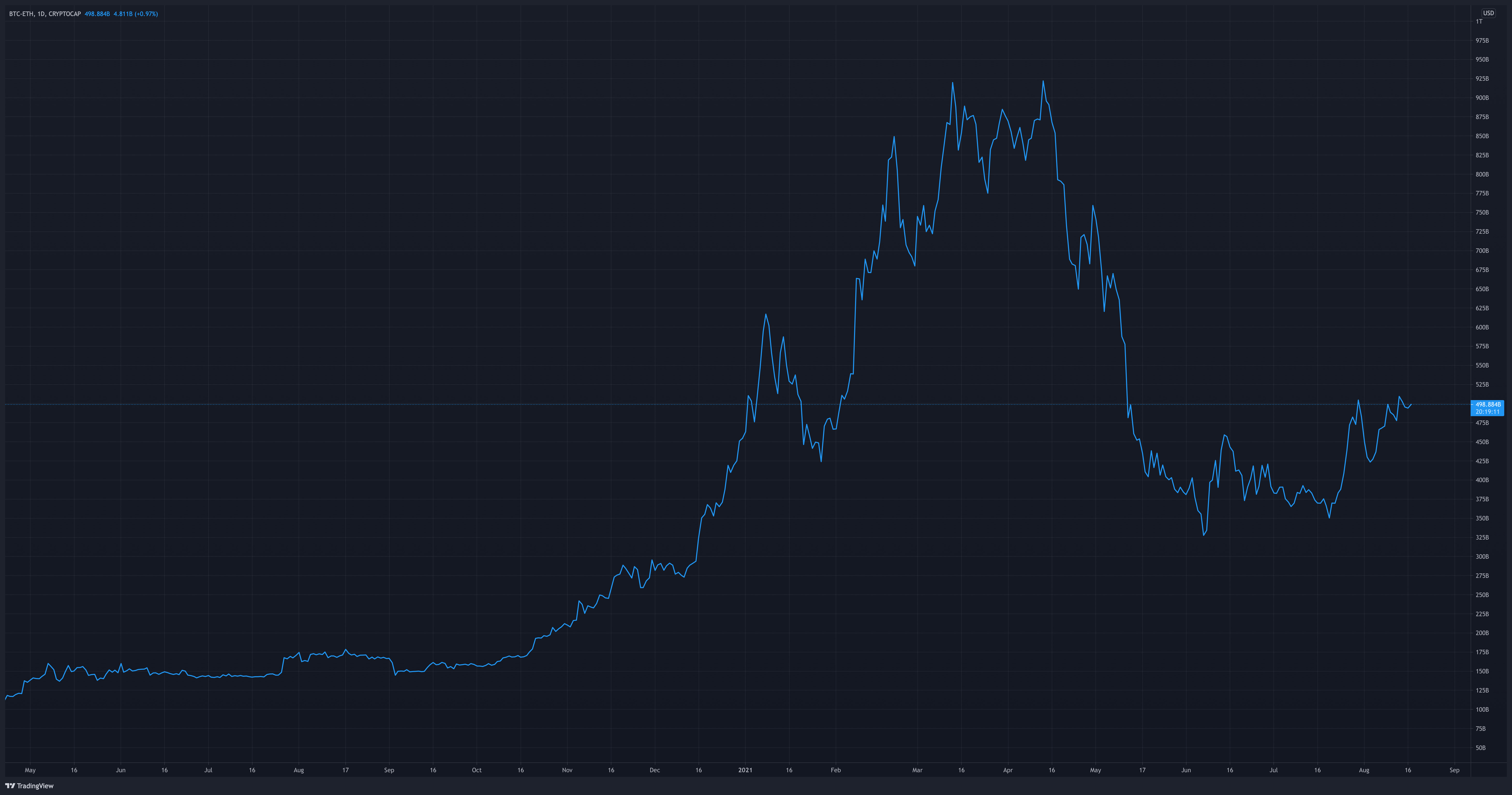
Now for some cool stuff. While I like the ETH/BTC chart something that I think is really neat and probably something you don’t hear about much is the BTC - ETH Market Cap Spread. A spread is simply the difference between two values. So the BTC - ETH Market Cap Spread is the market cap of ETH subtracted from the market cap of BTC. Plotted on a chart is the cleanest and simplest visual representation of the value relationship of these two assets in my opinion. The scale scale on the right shows the difference between the two market caps. Since we are subtracting from BTC, the larger market cap asset as this line plot moves up the BTC market cap is moving up and away from the market cap of ETH. Looking at this chart currently the BTC market cap is ~500B over the ETH market cap.
Let’s take it a step further. Just knowing the spread is nice but there can be some important things gleaned from the movements. Below I’ve plotted BTC/USD which is the bottom line and ETH/USD which is the top line. The boxes I’ve drawn on the chart are highlighting moments when the charts were diverging. If you look at those periods of time you will see ETH on a bullish USD run at a much faster rate than BTC.

Taking it a step further loading the BTC - ETH market cap spread to analyze it for predictive cycles. The data charted below shows the BTC-ETH market cap spread in the jagged black line and the cycle forecast is the smooth wavy line. You will see that each of those enclosed periods of time aligned with a cyclical low. The largest decrease in the spread is the downtrend from April 13 - May 4 which revolves around the cyclical low marked in the small middle black box. At this chunk of time performance of BTC/USD closed -16% and ETH/USD closed +40%.
In the first box, BTC closed -25% and ETH closed +16%. The long-term cyclical low in the box at the middle of the chart both assets were pretty stagnant but that’s not unexpected at long-term cyclical lows. The arrows drawn on the cyclical forecast are moments that potentially hold periods of time where ETH closes the gap in the spread. The second and third arrows hold the most intrigue to me because typically ETH lags in gains compared to BTC. Alts don’t typically make their parabolic top in line with BTC but AFTER. Those are times to have your portfolio weighted heavier in ETH and altcoins or use BTC profit to buy alts for their quick bursts as BTC is waning.
I hope I didn’t lose anyone on that. I know it’s a lot to take in. The good thing about this medium is you can read it over and over. You can even ask questions in the comments. I do wish I could have made the charts look a little bit cleaner but maybe I’ll make a video with this at a later date so it looks prettier and flows a bit better.
Have a great rest of the week!
@theprivacysmurf