

Topical Thursday #10: Fib-based Market Structure
Topical Thursday #10: Fib-based Market Structure
It's the finished lego masterpiece.

This post is a picture-heavy one. I think typed words would get way out of hand here. I’ve also got a video to which I’m adding commentary, but I’ll post the background video here demonstrating the live-ish process (using a historical daily chart in replay mode). When the commentary version is uploaded I’ll drop a quick message with the link.
If you’ve ever been around to hear me chat about technical analysis you’ve probably heard me say the most important things to learn are three market features. These are the legos, the building blocks of the market.
Support and Resistance
Trend Identification
Momentum
An understanding of these 3 elements can more often than not keep you on the right side of the markets even if you don’t have some fancy trade strategy. They are also something you can (and should) bring to any trading strategy you have. Taking trades in line with the trend, with support to back you up, and increasing momentum in your favor will increase the likelihood of profitability in most trade setups.
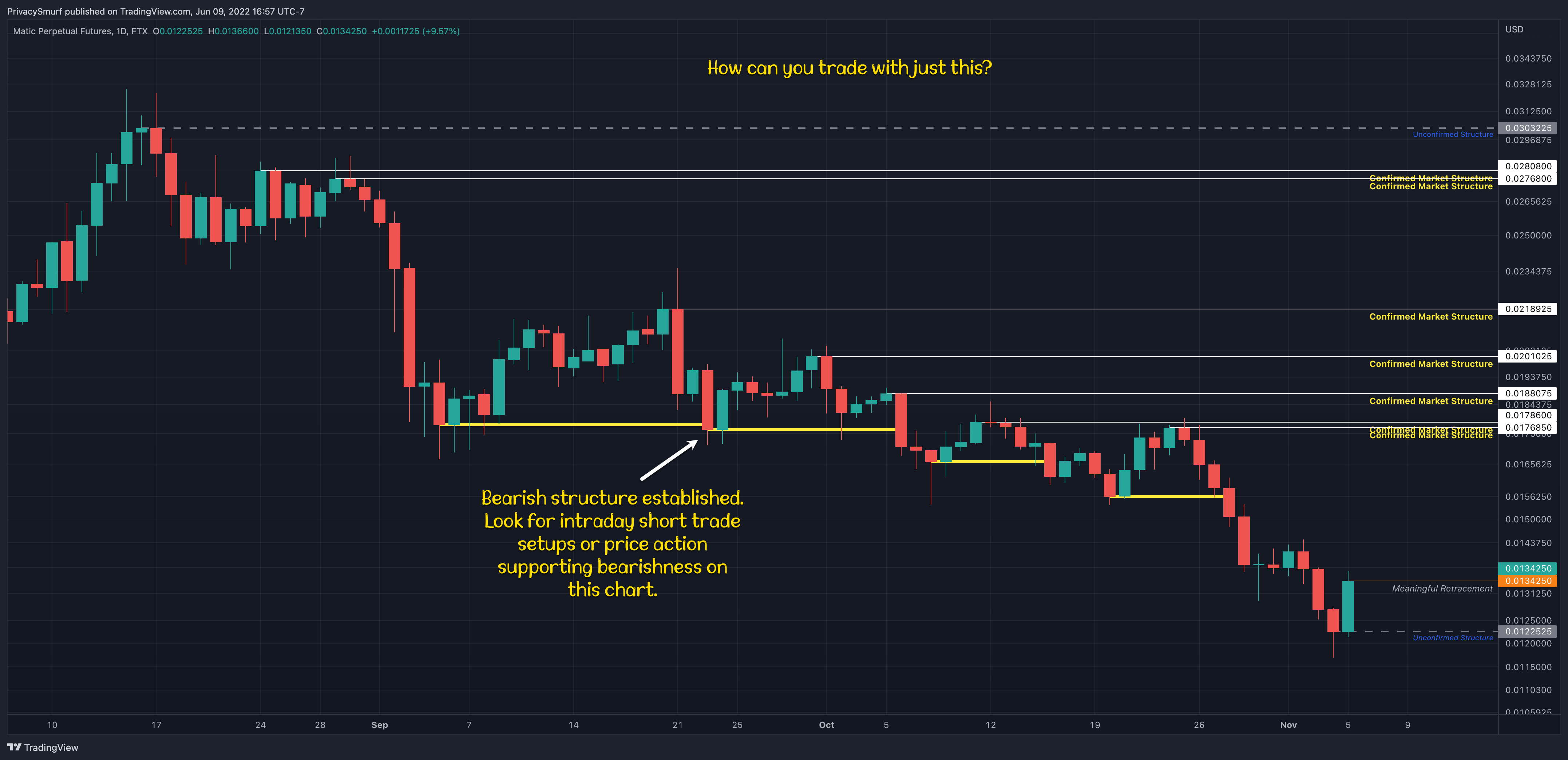
These legos are the components of Market Structure. If you need a simpler explanation market structure is the construction of the trend.
Bullish market structure is a series of higher highs and higher lows.
Bearish market structure is a series of lower lows and lower highs.

Borrowing an image here from a Twitter post I found with a quick google search. (tweet)
There’s no one right way to define the market structure and as with most analytical concepts, it’s about providing greater context and confirmation to the charts. It can be flawed no matter what way you are using it. I try to be as objective as possible and create rules that are easily replicable in any circumstance. Here’s how I do that.
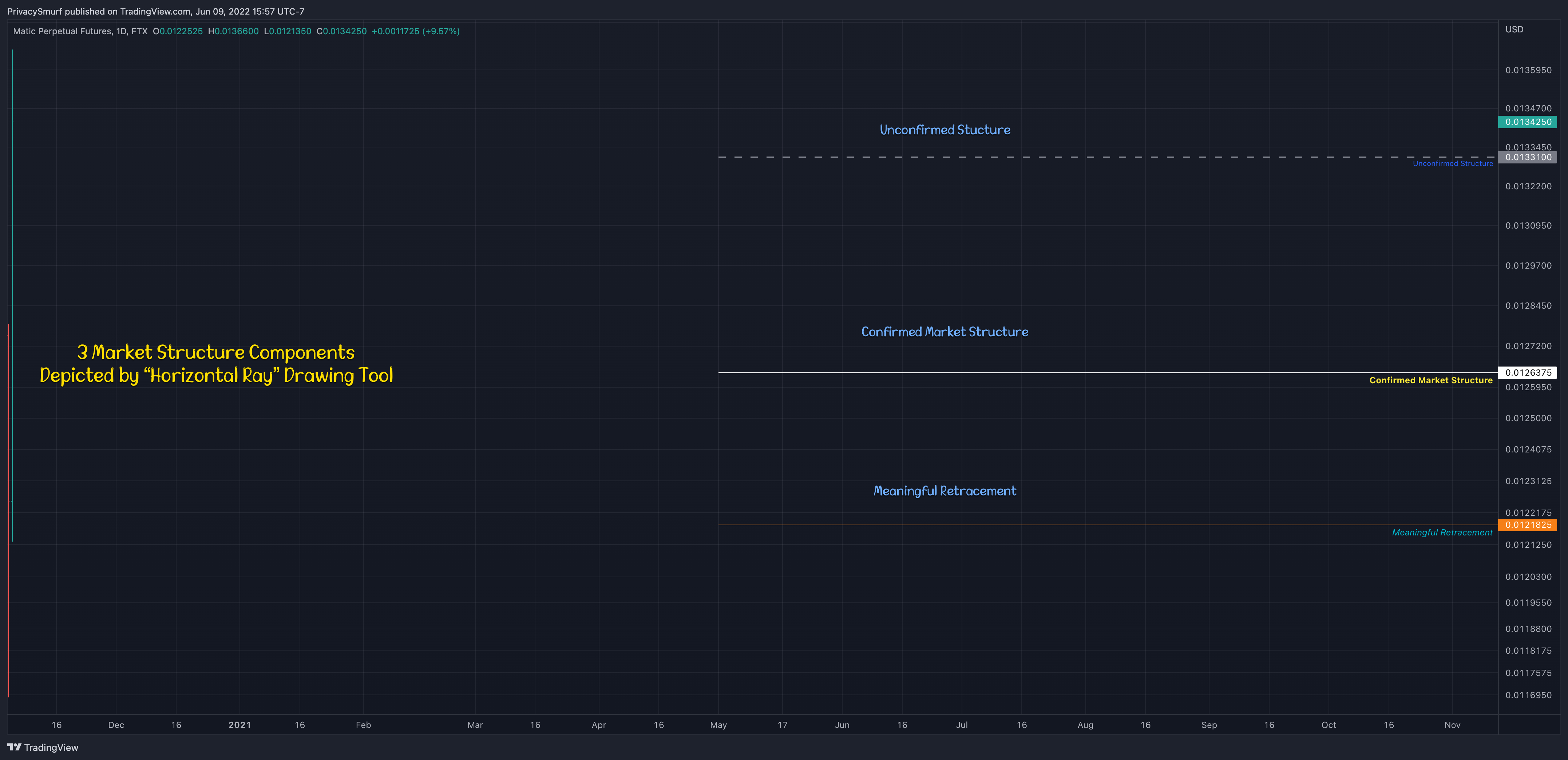
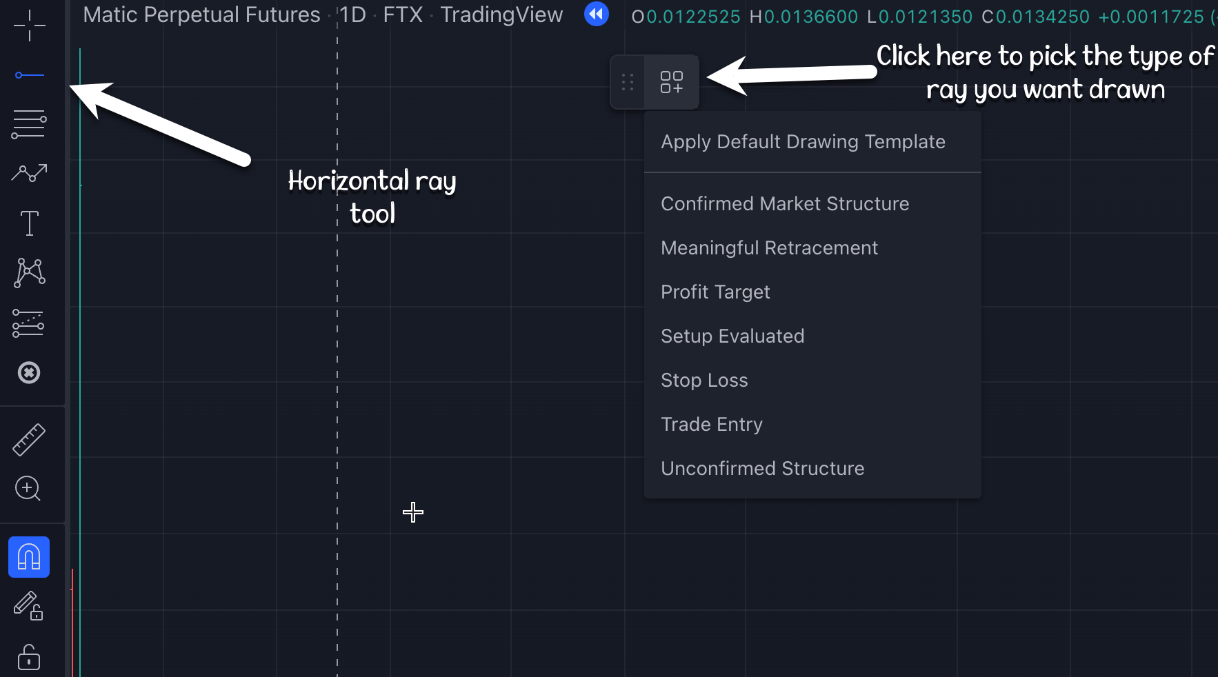
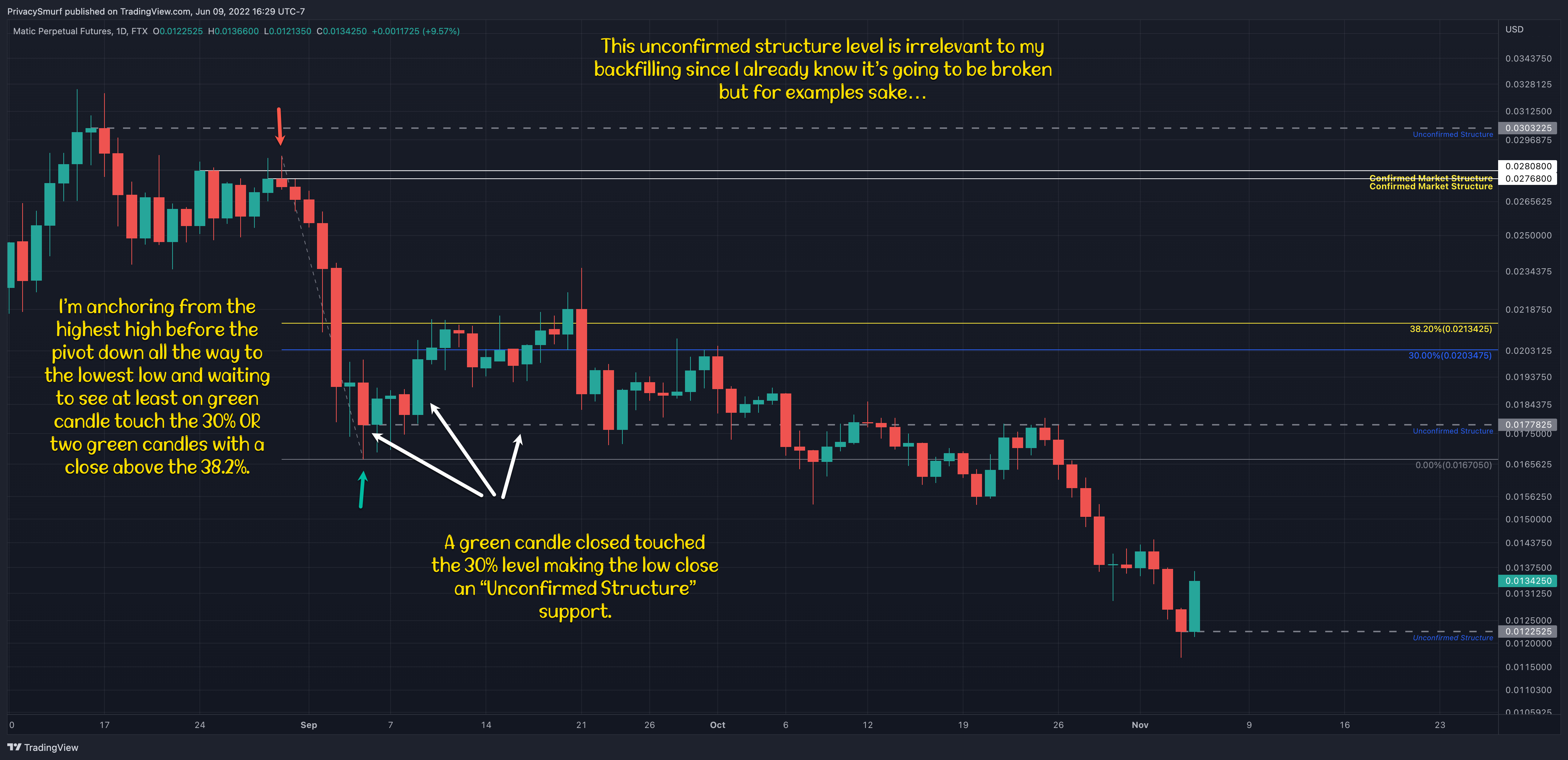
There are 3 levels of structure shown with the “Horizontal Ray” tool in Tradingview. Unconfirmed Structure, Confirmed Structure, and Meaningful Retracements.
Example:
Unconfirmed structure is when the market has been moving down and pivots up with at least 1 green candle. As long as there is no new lower low close the lowest close is an unconfirmed market structure. If the market then continues up with at least 2 green candles and closes above a level (specified below) the support is validated and becomes Confirmed Market Structure.
Let’s pretend the market has been moving down and pivots up with at least 1 green candle. If the green candle high touches a specified level the close counts as a meaningful retracement, which by my measure means the market has corrected deep enough to not be considered random fluctuations. These are often associated with pullbacks of a strong trend and can provide potential bounce plays.

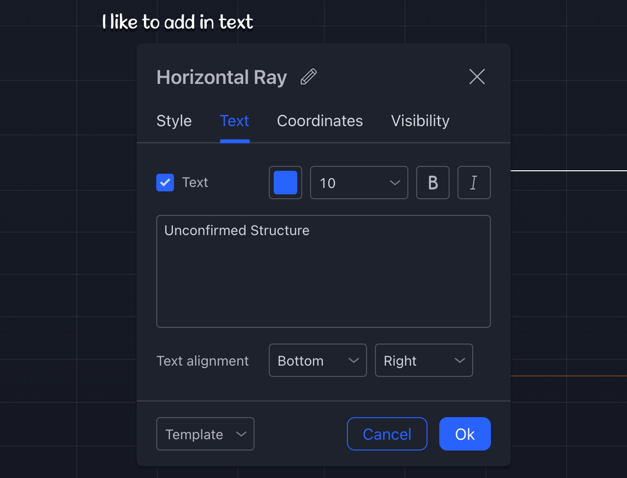
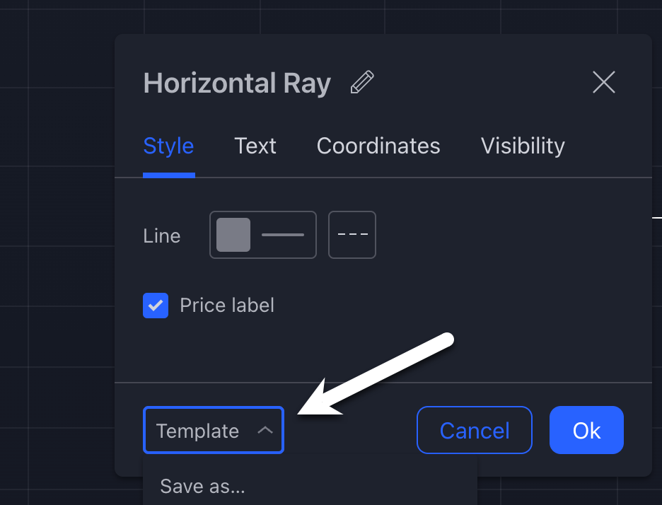
I save each different setting as a drawing template so I don’t have to recreate them over and over.
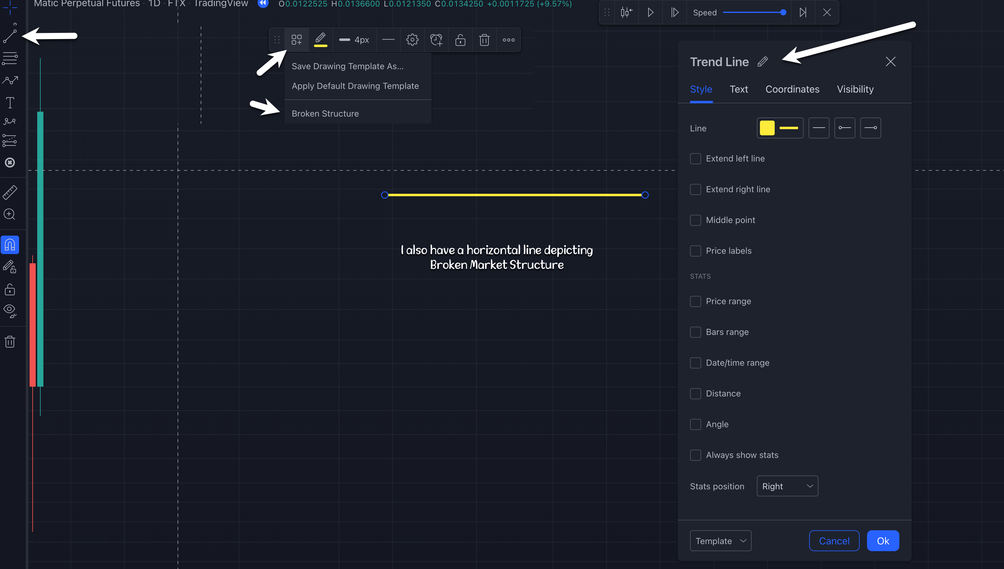
The other component is a “Horizontal Line” to show Broken Structure. It’s not super critical but it can be nice to see the recently broken structure IMO.
The final part is how I pick the levels. I use the “Fibonacci Retracement” tool. It’s not because I think it’s magical, it’s just an easy tool to plop on the chart for measuring from highs to lows. I am looking for retracements of 30% or 38.2%.
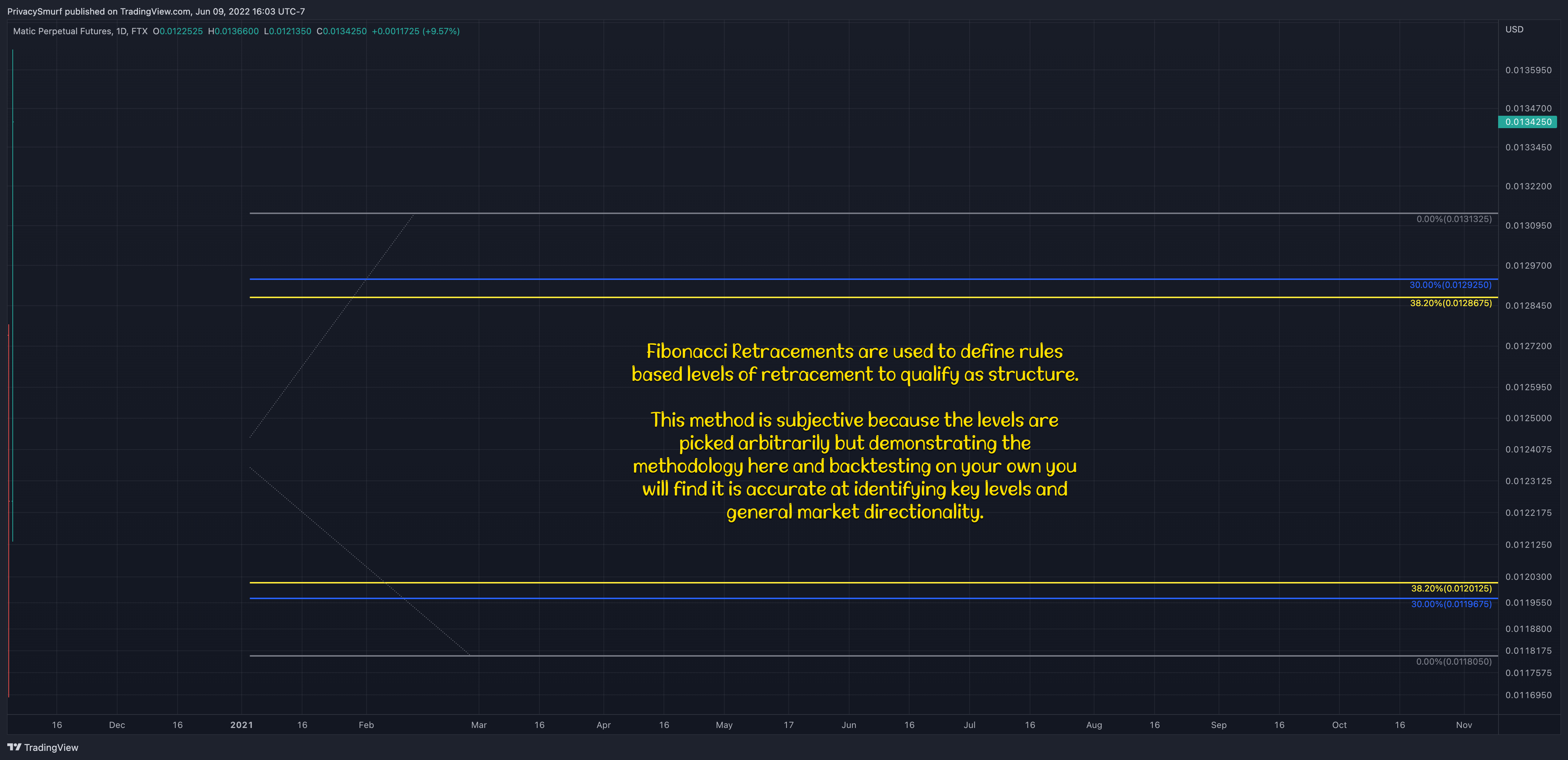
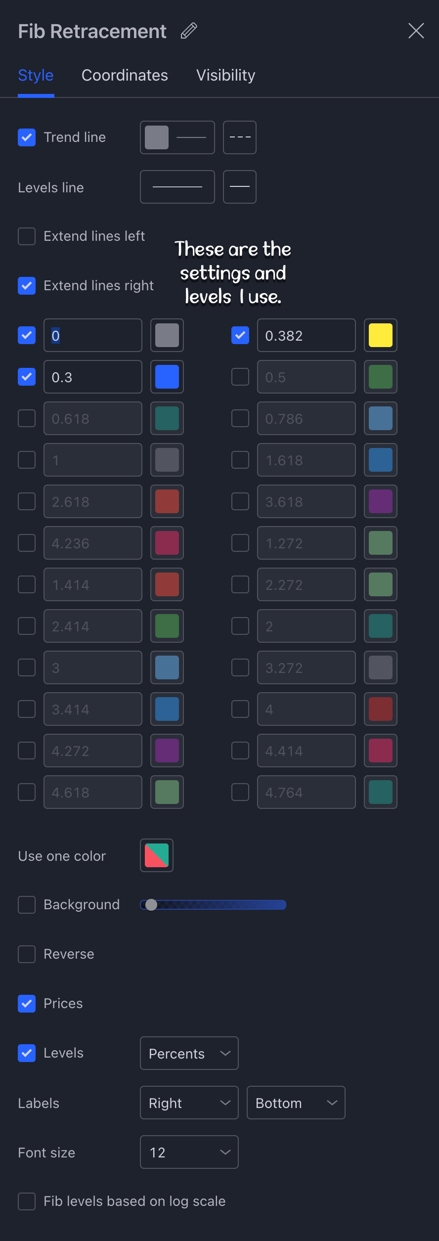
I also save this tool as a template.

Now comes all the hard work. When I load up a new chart I have to start somewhere. I’ll just pick the most recent lowest low close and the most recent highest high close and plot those first as unconfirmed structure and backfill the levels. When I’m backfilling I don’t go through the process exactly because I’m looking at historical data and I know ahead of time if levels have been broken or not so just try to follow the concept and not the process. The video post will walk through the process from start to finish in real-time.
I’m always anchoring my support/resistance rays on closes. I’m always measuring retracements from highs and lows.
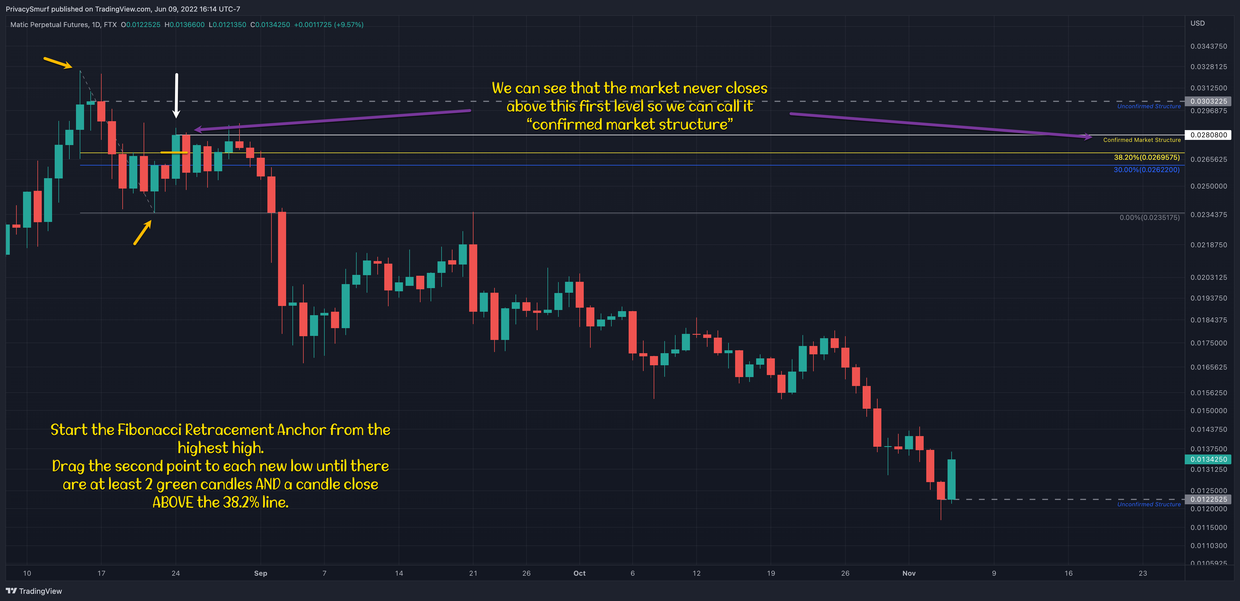
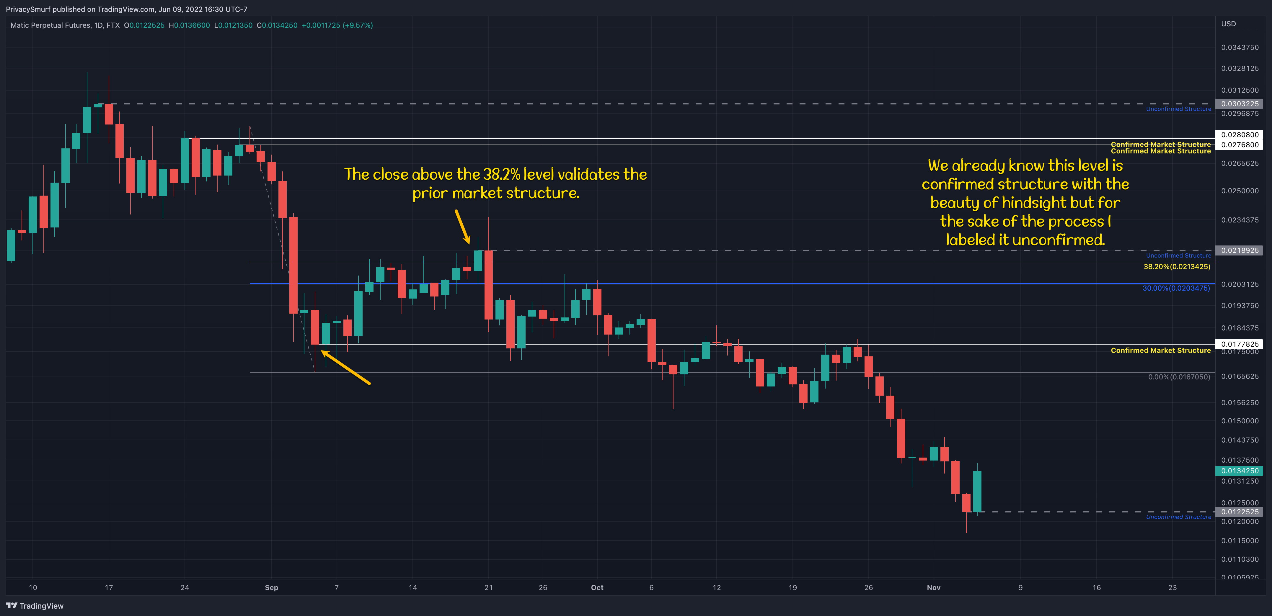
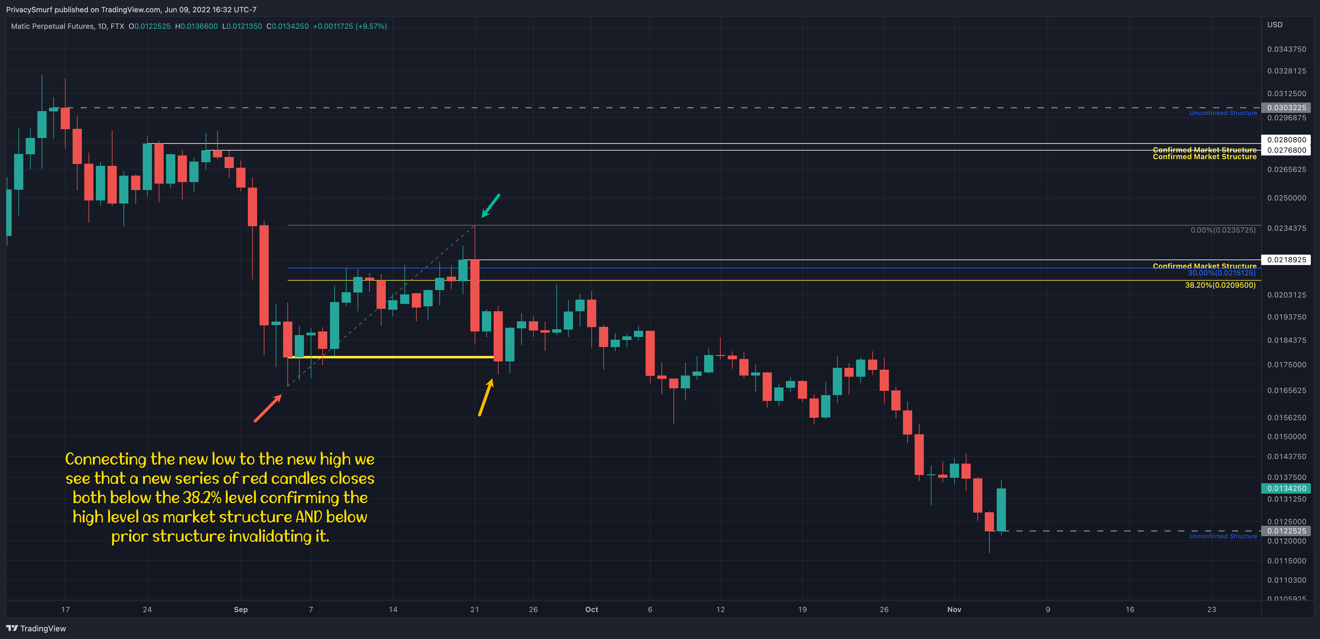
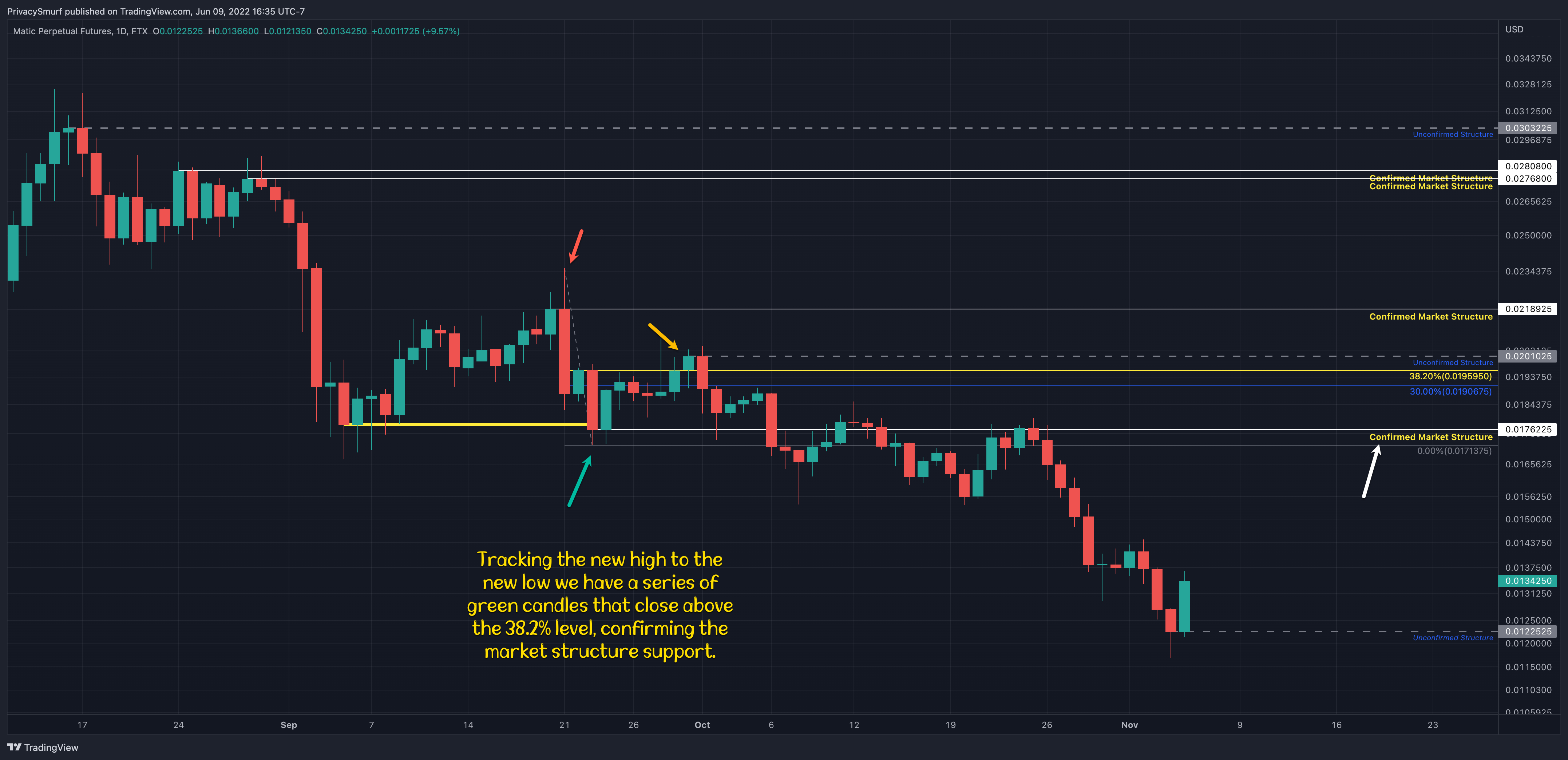
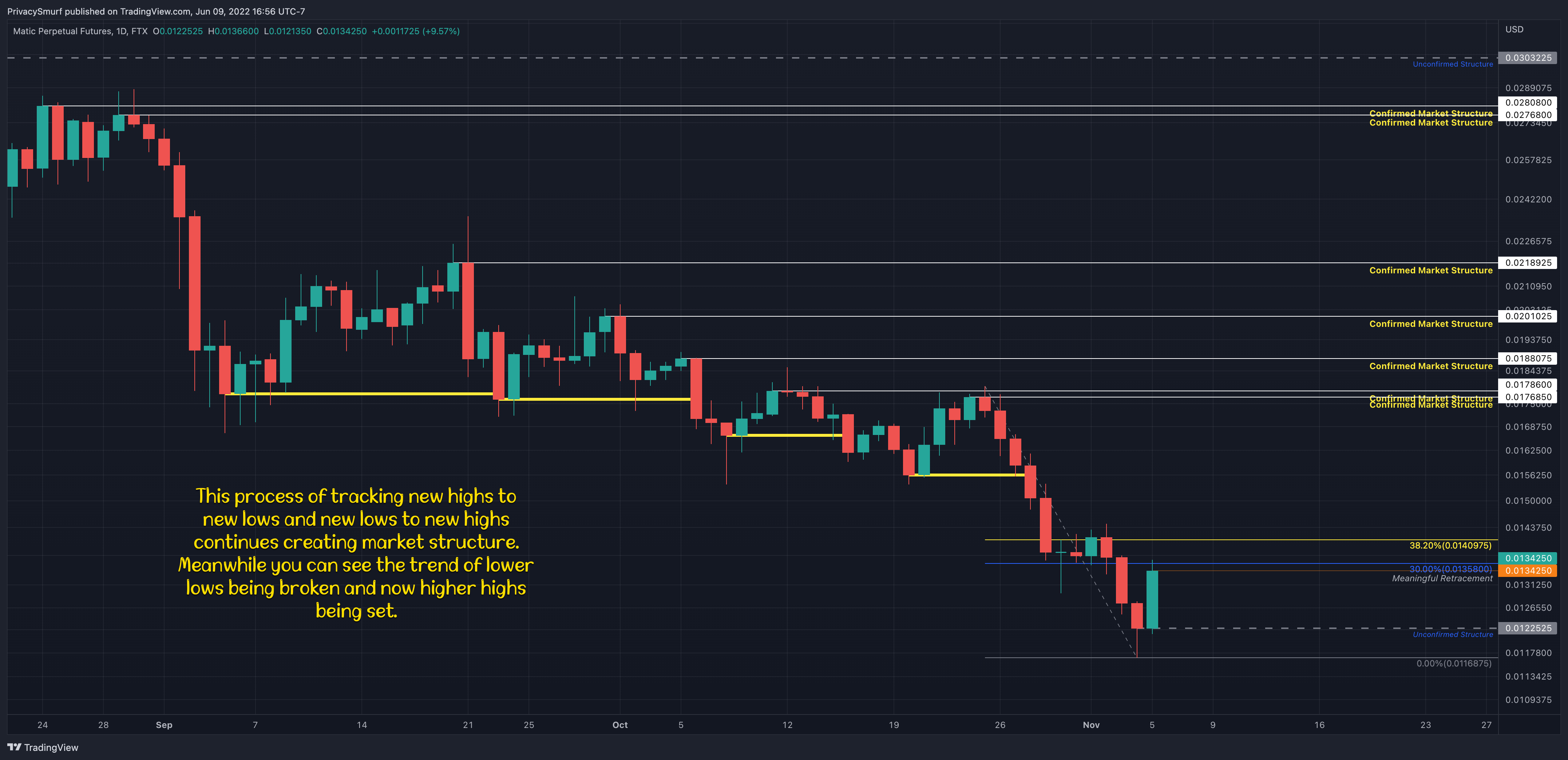
Once the backfilling is done now I have an idea of how to operate into the future on the chart. I have key levels to look for resistance or support and I know which direction the market is moving in. When a level is broken I know that momentum is potentially shifting or being confirmed.
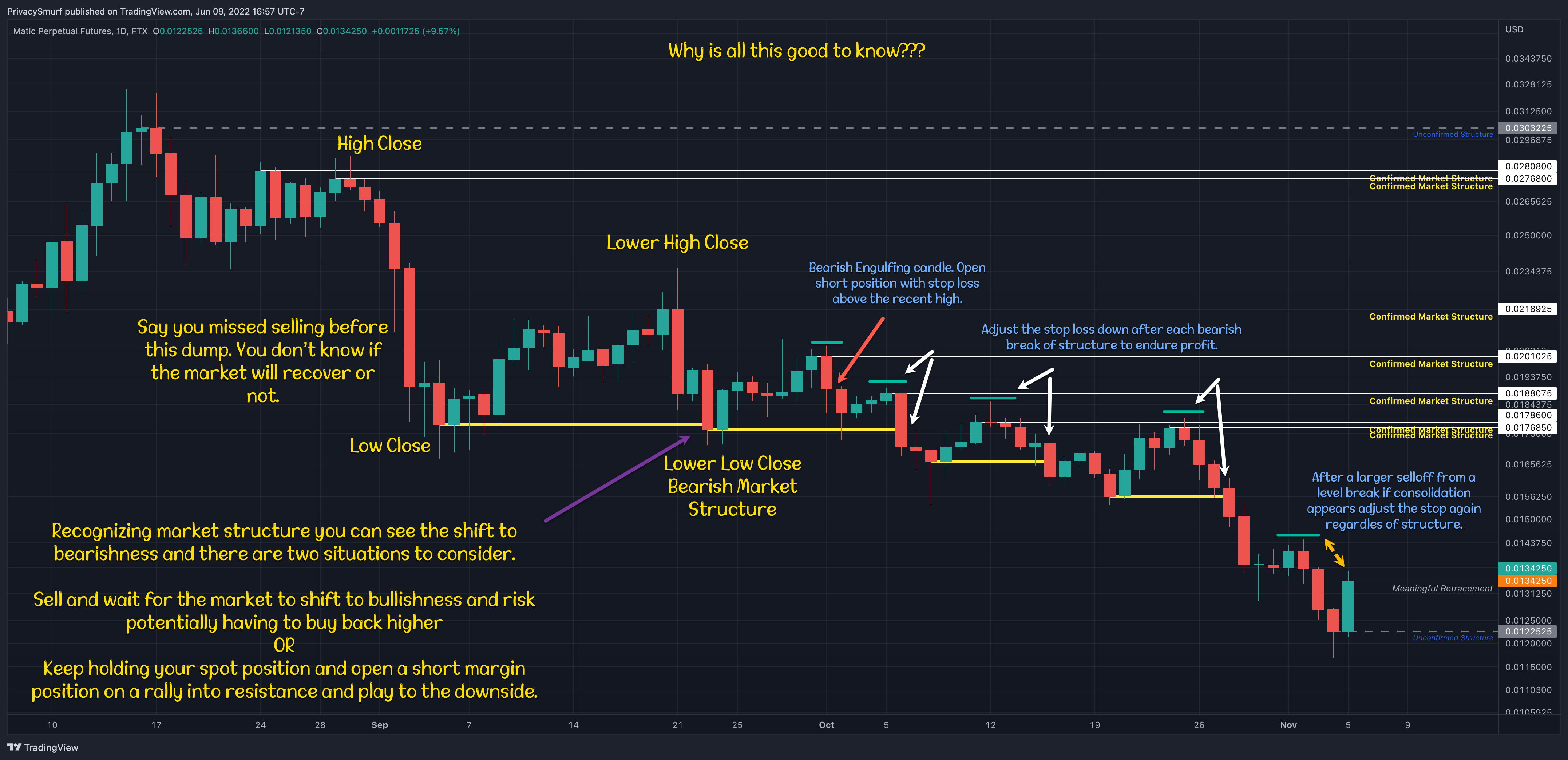
This entry would have captured nearly 30% (with extremes going to a 4:1 reward to risk ratio) and would have helped mitigate your lost portfolio value when you close the trade and use the profit to DCA into your held asset with money you didn’t have to provide.

Here’s the video without any commentary. It’s 40 minutes long. I recommend increasing the speed. I’ll drop the version with my commentary and why I’m doing things and what I’m doing/thinking tomorrow. Either way voice or no voice it’s helpful to see the process live.
I’m drawing out the market structure as it appears on the chart while I’m playing out the candles in replay mode. It’s as close to the real process as possible. I wouldn’t recommend doing so on a timeframe lower than the daily because IMO it’s too time-consuming. I personally draw out structure on the weekly chart to look for long-term investment prices to buy in at and on the daily charts of the majors, BTC and ETH, just to keep in tune with the overall daily picture. Often times people are way too late recognizing when a correction is no longer a correction and it’s just a bearish trend. Market structure identification can help mitigate that.
I know it’s a lot but if you practice it will come in handy. I’ll also review it every single week in the Sunday Synopsis.
@theprivacysmurf
Thanks for the breakdown, very helpful
Awesome! Thanks, Terry!