Trading Range Tuesday

This week we have added in Maker (MKR) it’s had a decent boost in volume lately and also trades well in ranges.
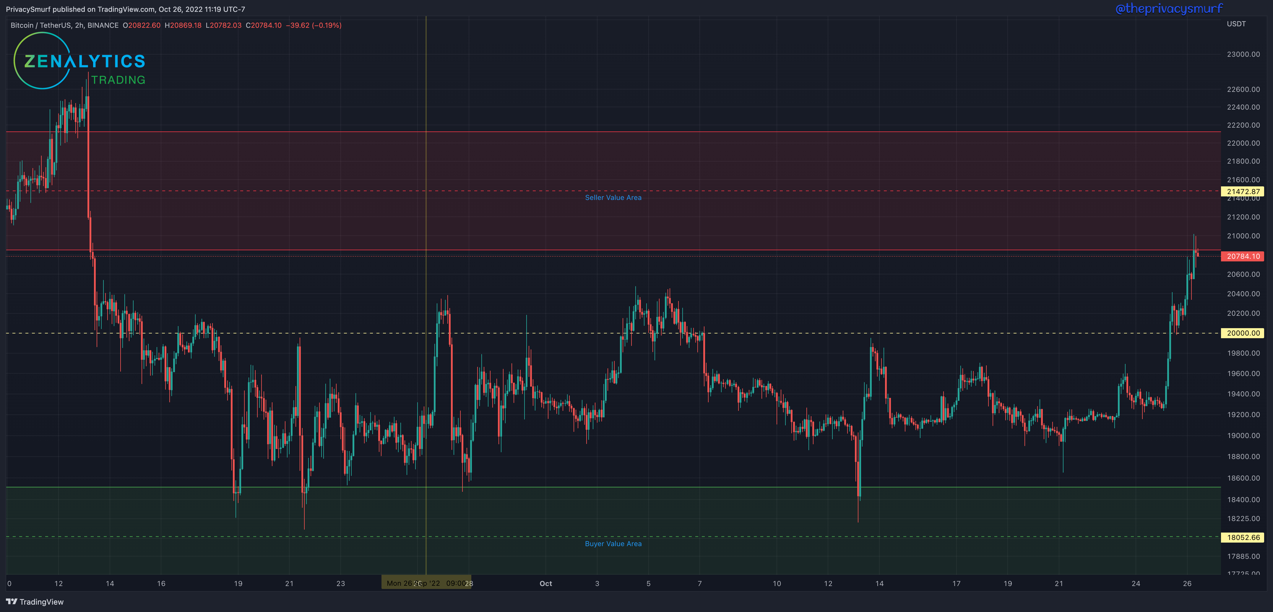
I also added a vertical line depicting the time of the last posting of trading ranges so you can see how things have played out since that point. There are multiple trading opportunities when you look at the market in this way.
Some images have the wrong color and label, but I think I’ve fixed all the actual chart links to be correct. Sorry. I hate reannotating images. 😛
The Breakdown:
I’ve included chart links for you to copy to your tradingview account. If you do so, they WILL NOT update if I make any adjustments in the future.
The images will have a support zone labeled Buyer Value Area. This is a region where I’ll be looking to take a long trade if technical indicators are showing some signal of a reversal/bounce, often in conjunction with a price action candle (here’s an old post I wrote about the ones I like to use, Candlestick Patterns).
The images will have a resistance zone labeled Seller Value Area. This is a region where I’ll be looking to take a short trade if technical indicators signal a reversal/crash, often in conjunction with a price action candle.
The images will sometimes have a zone labeled Trouble Area. This is a region between support and resistance levels where the price has had a hard time passing through and has consolidated in/around before. These are often places I’ll either start trailing my stop to save my profits if the directionality turns on me OR places I can make quick scalps on smaller timeframes when I’m waiting for prices to get to value areas to make higher probability trades.
The images will have a vertical line depicting the timing of the last posting of ranges.
Each level can be used for long and short trades: Longs from support bounces or shorts from support failures; Shorts from resistance holds or longs from resistance breakouts.
All trade setups one takes should ideally have some technical indicator confirmation aside from just price action around the level but to each their own.
Zones aren’t exact by any means, so just eyeballing the picture, you can draw your own on your charts if necessary. I’ve marked the middle of the zones with a yellow price label.
BTC/USDT
https://www.tradingview.com/chart/J84B7KdZ/