


TT: Market Structure
Well-put together, everybody knows.

Here’s the next installment in the educational series. Here’s where we are. Only two posts in, but before long, you have all the foundational elements you need to build your trading brick house.
The Foundation That Can Make or Break Your Trading Career
Market Structure is the invisible framework that governs every price movement you see on your charts. Master it, and you'll have a significant edge in the markets. Ignore it, and you'll likely become another cautionary tale.
What Market Structure Really Means for Your Trading Success
Let me start with the foundation you need to understand. Market structure is like the skeleton of price movement. It gives shape and direction to everything that happens in the markets, revealing the underlying intentions of buyers and sellers.
The Simple Truth:
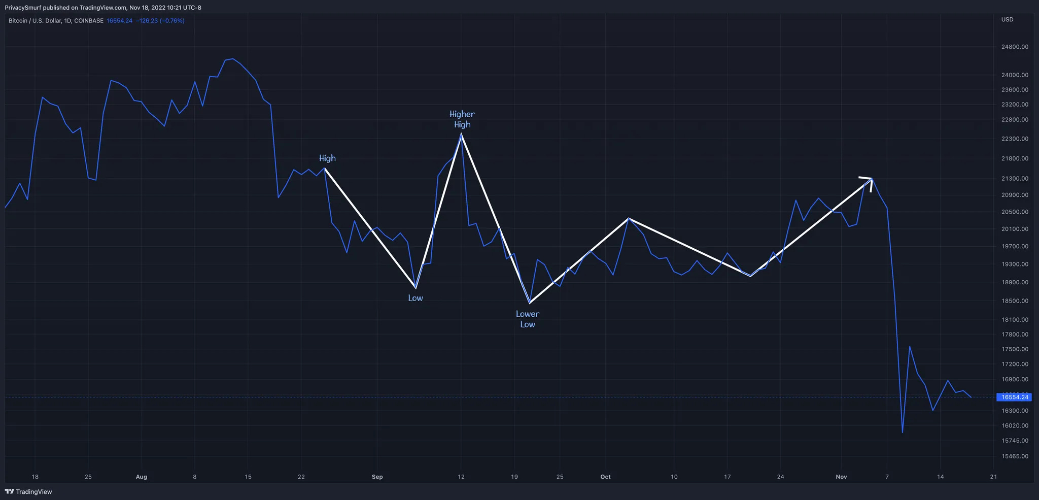
A bullish market structure creates a series of higher highs and higher lows
A bearish market structure forms a series of lower lows and lower highs
But here's where most traders get it wrong. They think this simple definition is enough. It's not.

The chart above demonstrates the basic pattern, but the real power lies in understanding why these patterns form and what they tell us about future price action.
The Three Pillars That Support Every Profitable Trade
After years of analyzing markets and teaching traders, I've identified three fundamental elements that act like building blocks for successful trading. Think of them as the foundation of a house and without them, everything else crumbles:
Support and Resistance - The price levels where buying and selling pressure creates turning points
Trend Identification - The directional bias that tells you which way the market wants to move
Momentum - The speed and strength behind price movements
Here's what's fascinating: you don't need a complex trading strategy to be profitable. If you can align these three elements (taking trades with the trend, backed by solid support or resistance, with momentum in your favor) you'll dramatically increase your probability of success.
How Market Structure Reveals Hidden Support and Resistance Levels
Think of the market as a battlefield where bulls and bears are constantly fighting for control. Every time the price changes direction, it's because one side has overpowered the other. These turning points become critical reference levels for future price action.
When you see higher highs and higher lows forming, it tells you that bulls are winning the war. Each time the price falls and then recovers to a higher level, it demonstrates that buyers are willing to step in at increasingly higher prices. Conversely, when bears take control, they push prices to lower lows and prevent any meaningful recovery.
Here's the key insight: A level that was once support might become resistance later, and vice versa. However—and this is crucial—these levels are hypothetical until proven by actual price action.

The chart above shows how previous highs and lows create a roadmap of potential support and resistance levels.
Trend Identification: Reading the Market's True Intentions
Before we dive deeper, let's establish what a trend actually means. A market trend represents the market's perceived tendency to move in a particular direction over time. But here's what most traders miss: trends only describe what has happened, not what will happen next.
The probability of trend continuation varies based on the strength of the underlying structure. When you see a clean series of higher highs and higher lows, the probability of continued upward movement increases. But when that structure breaks, the odds shift dramatically.
I use what I call a "3-point lightning bolt" pattern to objectively identify trend changes. This pattern requires three distinct points that create a clear directional bias. For example, in a bearish structure, you need a high, followed by a lower high, and then a lower low. This sequence suggests a higher probability of continued downward movement.
Bearish Structure Breakdown:
Starting from a significant high, the market creates a lower high (showing weakening buying pressure), followed by a lower low (confirming selling pressure). This pattern suggests the probability of further decline has increased significantly.

The bearish structure chart demonstrates how each successive peak fails to reach the previous high, while each valley drops below the previous low.
Bullish Structure Formation:
Conversely, bullish structure emerges when the market creates higher lows (showing buying support) followed by higher highs (confirming buying strength). This pattern indicates an increased probability of continued upward movement.

The bullish structure chart shows how each dip finds support at higher levels, while each rally reaches new peaks.
Sometimes markets enter consolidation phases—periods where neither bulls nor bears can establish clear control. During these phases, prices move sideways, creating roughly equal highs and lows. These periods often precede significant directional moves, making them critical for positioning.
The consolidation chart illustrates how prices move within a defined range, setting up for an eventual breakout in either direction.
The Critical Warning Every Trader Must Understand
Now, here's where I need to be brutally honest with you. Market structure is simultaneously one of the simplest and most dangerous tools in trading. It's accessible enough that any trader can learn to identify it, but that accessibility can lead to overconfidence and significant losses.
The harsh reality about support and resistance: They are hypothetical until proven otherwise. Just because a price level held in the past doesn't guarantee it will hold in the future. Market sentiment changes. What seemed like “strong” support yesterday might crumble under today's selling pressure.
I've seen traders blow up their accounts because they assumed a "strong" support level would hold, only to watch it get obliterated by unexpected news or large institutional orders. Never use terms like "strong support" or "weak resistance" unless you have quantitative evidence from order book data—and even then, those orders can disappear in milliseconds.

The chart above shows a painful example where market structure suggested continued upward movement, but the market reversed violently, catching many traders off guard.
Here's what actually happens behind the scenes: Large institutional orders need liquidity to get filled. The mechanical nature of market structure analysis creates predictable areas where retail traders place their stops and entries. Big money players often exploits these levels, using retail trader positioning as liquidity for their large orders.
This is why you should never rely solely on market structure for your trading decisions. Always seek additional confirmation from leading indicators, volume analysis, or fundamental factors that support your structural analysis.
Your Action Plan: Applying Market Structure in Real Trading
Understanding market structure is only valuable if you can apply it consistently in your trading. Here's your step-by-step framework:
Step 1: Identify the Current Structure
Start by marking the most recent significant highs and lows on your chart. Look for the 3-point pattern that defines the current trend direction.
Step 2: Assess the Probability
Based on the structure you've identified, determine the higher probability direction for the next move based on current indicator measurements. Remember to think in probabilities, not certainties.
Step 3: Wait for Confirmation
Don't trade on structure alone. Wait for additional confirmation from momentum indicators, volume, or other technical factors.
Step 4: Plan Your Risk Management
Identify where your analysis would be proven wrong and place your stop loss accordingly. Never risk more than you can afford to lose on any single trade.
Step 5: Monitor for Changes
Market structure is dynamic. Continuously monitor for changes in character that might signal a shift in the underlying trend.
The Timeframe Advantage: Choosing Your Perspective
Market structure works across all timeframes, but its effectiveness varies based on your trading style and goals. For longer-term analysis and major directional bias, focus on daily and weekly charts. These higher timeframes filter out market noise and provide clearer structural signals.
For shorter-term trading, align your entry timeframe with the structural bias from higher timeframes. If the daily chart shows bullish structure, look for bullish entry opportunities on the 4-hour or 1-hour charts.
Personally, I find the most value in using daily and 4-hour charts for structural analysis while executing trades on 20-minute to 2-hour timeframes. This approach provides the bigger picture context while allowing for precise entry and exit timing.
Your Next Steps to Trading Mastery
Market structure forms the foundation of successful trading, but it's just the beginning of your journey. The concepts you've learned here will serve as your compass in the often chaotic world of financial markets.
Remember: the market doesn't care about your analysis, your hopes, or your financial situation. It only responds to the collective actions of all participants. By understanding market structure, you're learning to read the collective psychology of the market—and that's a skill that can serve you for a lifetime.
Start by practicing structure identification on historical charts. Mark the highs and lows, identify the patterns, and observe how they unfolded. Then, begin applying this knowledge to current market conditions with small position sizes, gradually increasing them as you develop confidence in your analysis.
The path to consistent profitability isn't about finding the perfect strategy—it's about understanding the fundamental forces that drive price movement. Market structure gives you that understanding. Now it's up to you to apply it wisely.
In future writing, we’ll drill down deeper into the precise method and rules I use for defining market structure, seen in the supplemental posts for the weekly update.
@ThePrivacySmurf