

Wednesday Write-Up #13: Cellphone's Dead
Wednesday Write-Up #13: Cellphone's Dead
One by one I'll knock you out.

Just a quick reminder. All these charts have an associated chart link below the bold titles. That link is my shared public layout that you can either bookmark in your browser and check on at any point in time to have my up-to-date charts OR save a copy to your own tradingview account to edit the charts as you see fit. Keep in mind if you save a layout copy for yourself it WILL NOT continue to update as I make modifications to my charts in the future.
My camping trip was another good one out in the wilderness. I was out of service, not battery, but what difference does it make? It is so nice to be disconnected from everything at times. It really helps me to be out of touch so I can actually get some good reflections in. I’ve got a lot of new ideas and things to bring into my products. I hope you’ll enjoy it all.
BTC/USDT Daily Chart
https://www.tradingview.com/chart/jjSdFW4b/
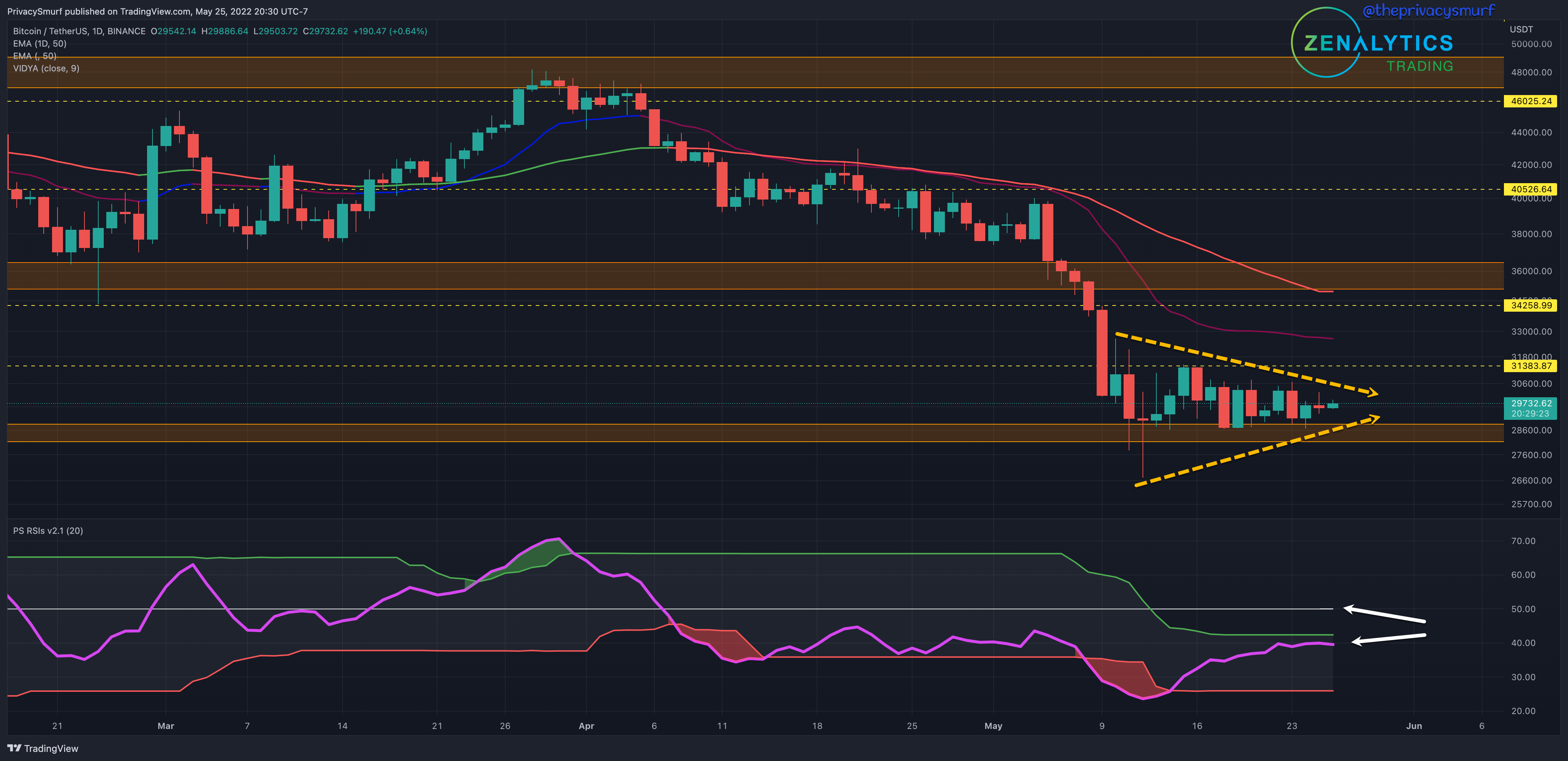
Not a ton to really update here. It’s been a bore to watch the daily chart. It is possible that BTC is building to some sort of break from this consolidation (yellow arrows). The proximity of the RSI to the top adaptive band and the midline (white arrow) would suggest a higher probability of uncharacteristic movement to the topside if a bullish break comes out. I’d be looking for a test of at least $33-$34k. The RSI is however curling and leveling off at the moment. It’s possible that we still have some time to wait for this to play out. A fakeout to the downside first then a bullish break may be what we see.
ETH/BTC Daily Chart
https://www.tradingview.com/chart/gTkSjkj6/
I updated this daily chart if you click the link, but I’m going to wait until the weekly close to make any assessments.
ETH/USDT Daily Chart
https://www.tradingview.com/chart/xbB6lkZu/
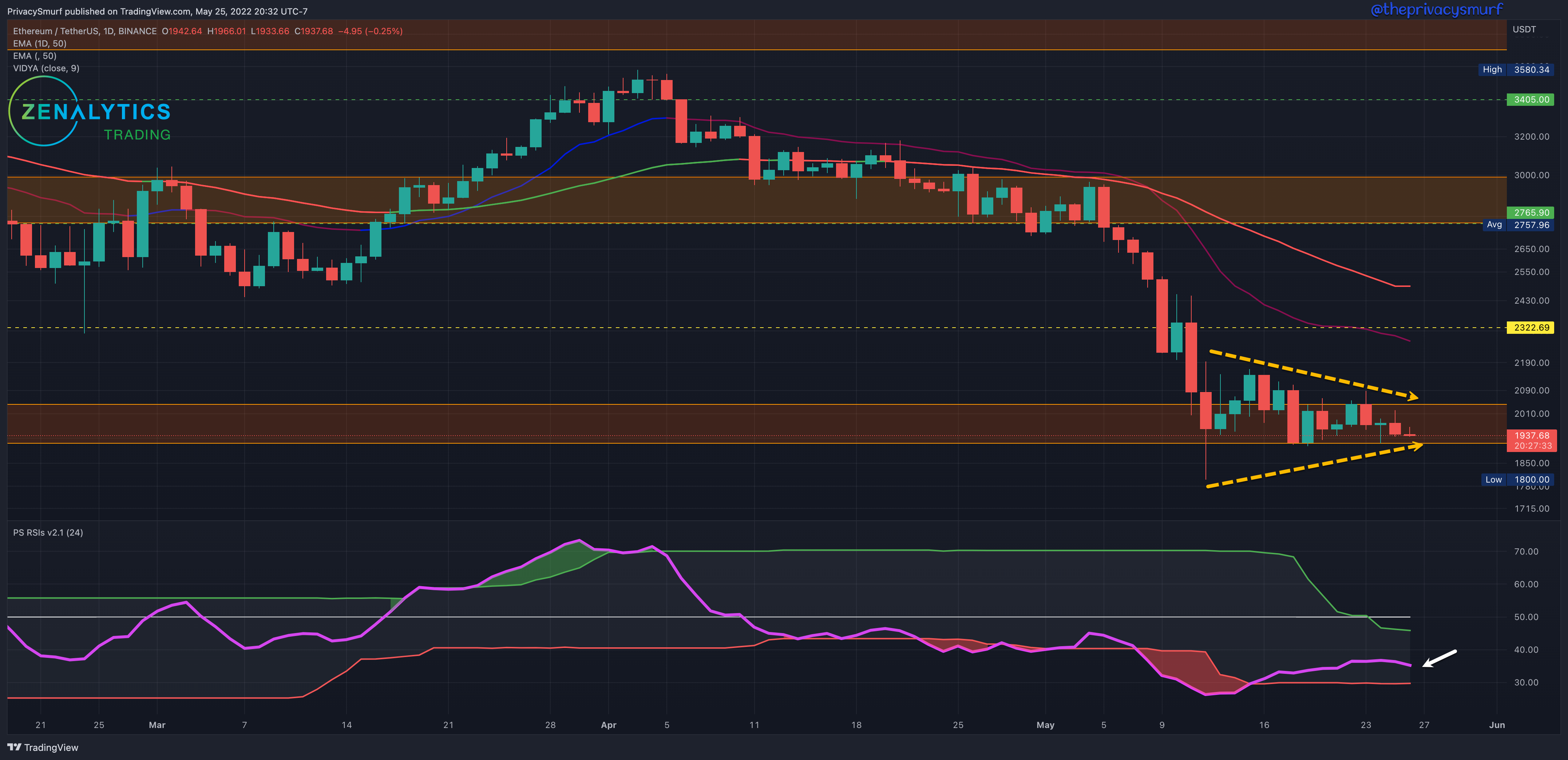
Same story with ETH on the daily chart. It is possible that it is building to some sort of break from this consolidation (yellow arrows) but unlike BTC the daily candles are dragging across the floor and there is more bearish pressure depicted by the RSI measuring in the lower ranges and curling down more (white arrow). The adaptive top band is below the midline and a break above both would suggest a higher probability of uncharacteristic movement to the topside leading to a test of at least $2200-$2300. This chart may see a test of a new lower low before BTC. I’m less inclined to expect a bullish break as strong as BTC when/if that comes.
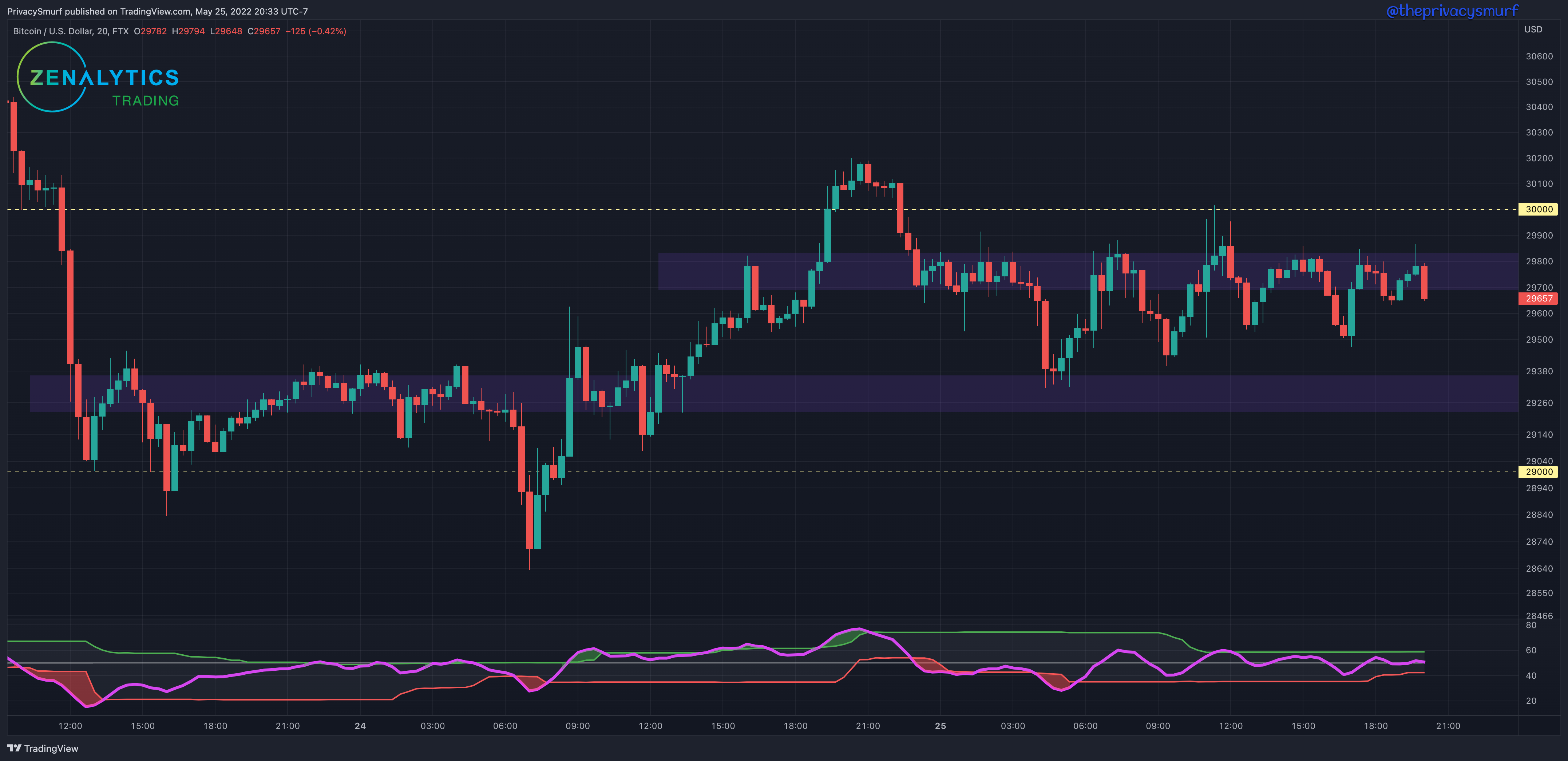
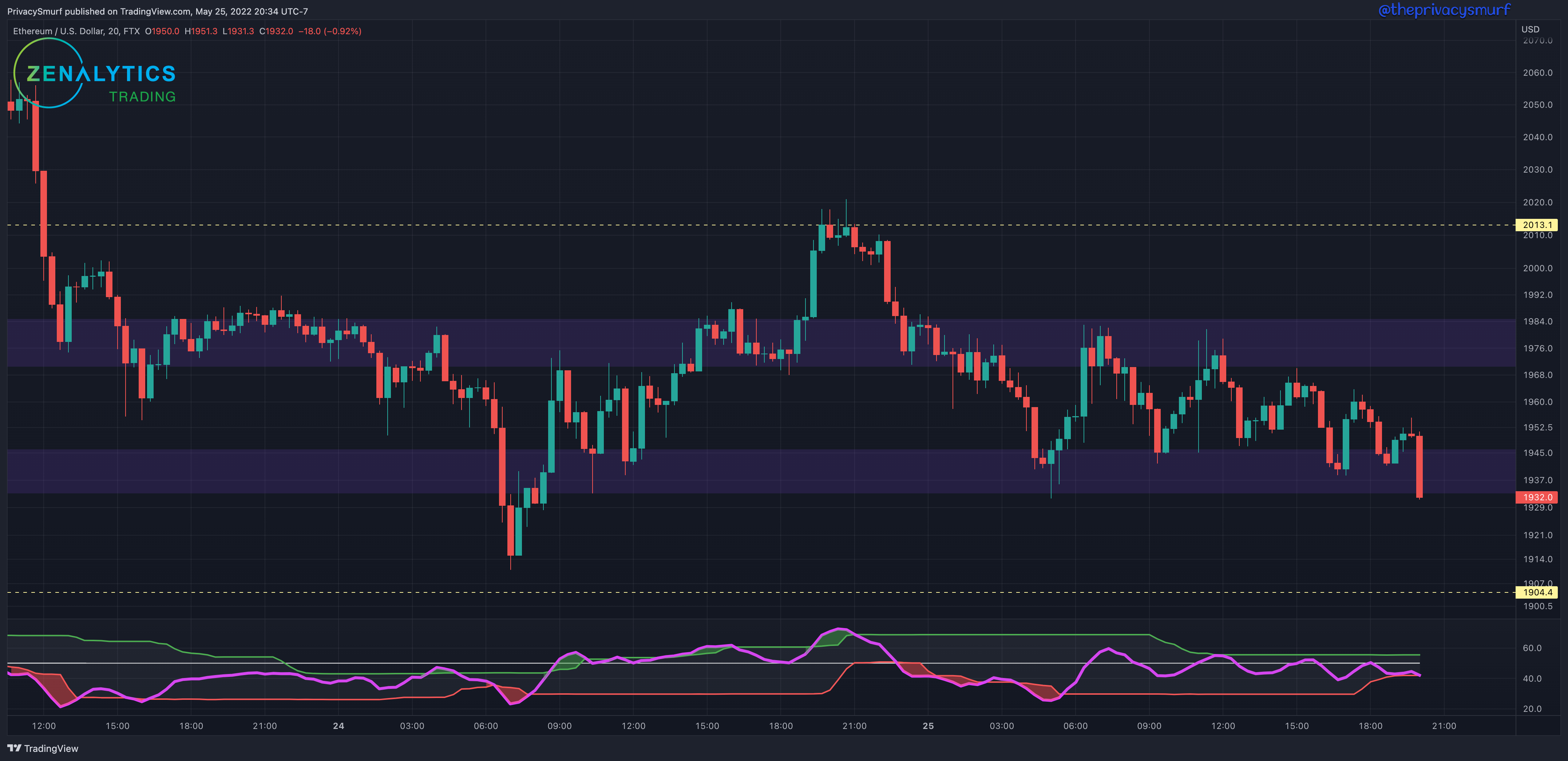
Here are a few extra charts. I’m playing around with different ideas for the intraday trading range posts for Tuesdays. Yellow lines would be the primary boundaries for stronger potential reversals. Blue zones would be secondary locations to start taking profits. If in a long I’d start considering taking profits at the higher zone. If in a short I’d start considering taking profits at the lower zone. They are also weak areas to consider trade entries.
BTC
ETH
I got my hands on the audio of the AMA I was invited to last week. It’s on how to learn as a trader. I linked to my show notes below.
See you soon.
@theprivacysmurf