

Wednesday Write-Up #14: Mornin'
Wednesday Write-Up #14: Mornin'
Sweet breeze in the summer time.

Our new place has a badass deck in the back. Today I cleaned up my smoker and made up some tasty chicken and sweet potato fries. In full summer mode, ‘just getting good’. Hope you are getting to enjoy something similar wherever you are.
This post is going to shift a little from how I used to do it. I’ll still drop an updated daily chart and 2 intraday timeframes but I’ll be a bit different on the intraday sections.
I’ll run through the intraday trade setups and analysis how I’ve come accustomed to trading, using my indicators off the Sunday Synopsis charts (both free and paid, PS RSI and Correction Strength Meter) on the 2HR chart. Then I’ll run through more scenarios according to the Trading Range Tuesday levels on the 20min chart simply based on price action if indicators and oscillators aren’t your jam.
Hope the different takes provide some added value to you. Let me know, it’s always ‘groovin when I hear’ from the readers.
BTC/USD
Daily Chart
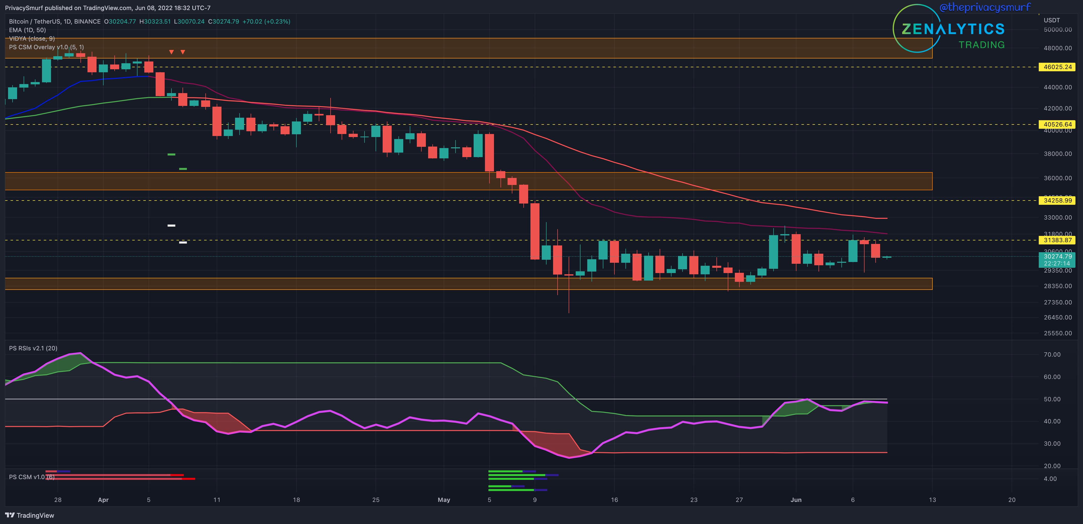
From Sunday’s post:
… consolidation is taking place higher than recent lows so a break above the 32k level will fit the mold of a new daily bullish trend (low, high, higher low, higher high). This would be likely if the RSI breaks back above the top band and the midline.
We got pretty close to that new higher high. BTC high ran up to $31.8k and the RSI broke above the top band BUT failed to breach the midline so bearish pressure remains on prices. We are consolidating into a tighter and tighter wedge so volatility will appear sooner than later. Intraday charts may provide some insight into potential directionality. Same expectations as Sundays post:
…ceiling likely around $36k… floor is still at $29k.
2HR Chart
We’ll play out how I’d approach this from left to right. Keep in mind even though this is the 2HR and next to the 20-minute chart the concepts and technicals apply and can be used in any timeframe since I’m just looking at price action, horizontal levels, the RSI, and divergences.
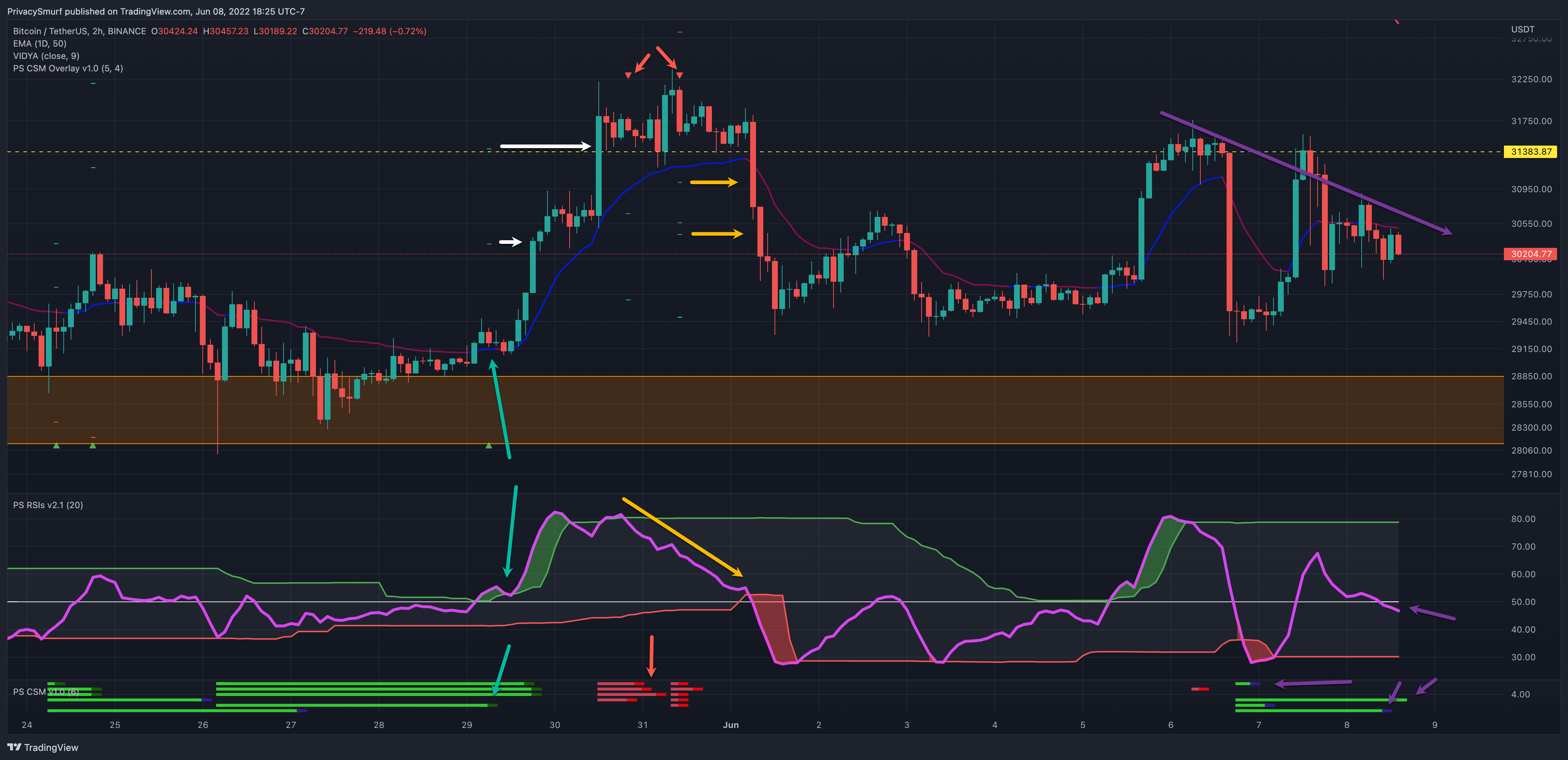
We’ll start with the green set of arrows. In my custom indicator, the Correction Strength Meter at the bottom of the chart, we see green lines plotted, highlighting the conditions for a potential bullish reversal on multiple oscillators. In conjunction with these conditions, I want the RSI to be under the midline with the adaptive top band either close or under the midline. This setup suggests upwards volatility on a breakout, beyond normal price fluctuations. The CSM signals a trade entry with the darker green spot and the overlay on the price chart prints the targets (white arrows). Being that the RSI was in an advantageous setup and the price is above the support zone I’d be comfortable taking this long entry. Both targets are achieved.
We’ll follow the red and yellow arrows now. After reaching the 2nd target BTC presents bearish divergence with the RSI plotting lower measurements (yellow arrow) while the price is printing higher measurements.
The CSM at the bottom plots red lines suggesting bearish corrections and two separate trades are signaled. The RSI bands are in the correct setup for an advantageous bearish trade since the bottom band is near the midline and the RSI is measuring above the midline. This setup suggests downwards volatility on a breakdown, beyond normal price fluctuations. This is where a bit of discretion comes into play. I’d choose to omit the first trade signal. The second trade signal is better IMO since we are still trading above the support and the RSI is measuring as extremely bullish at the time of the first trade. By the time the second signal comes in the RSI has trailed down close to the midline and is teasing bearishness plus the candle of the signal is a big bearish engulfing candle. It’s a moot point because in both setups the targets were hit, but I’d feel like the first setup was riskier and I’d avoid it for a better one.
Moving down the line a big bullish breakout comes with a top band/midline break but with no divergences on the CSM to alert me, I’d have missed this move most likely. Can’t catch them all.
On the right side now we have the purple arrows. The RSI is trending in line with prices and is breaking below the midline. This suggests bearish pressure on the market. The CSM below is also showing invalidation of the bullish reversal conditions which suggests bearish price continuation. I’d be watching for some potential bullish bounces and divergences in the lower support zone to trade. If the descending trendline is broken above before we move lower I’d be very hesitant to take a long because bearish pressure is greater and the gains may turn back sharply before hitting profit targets.
20min Chart
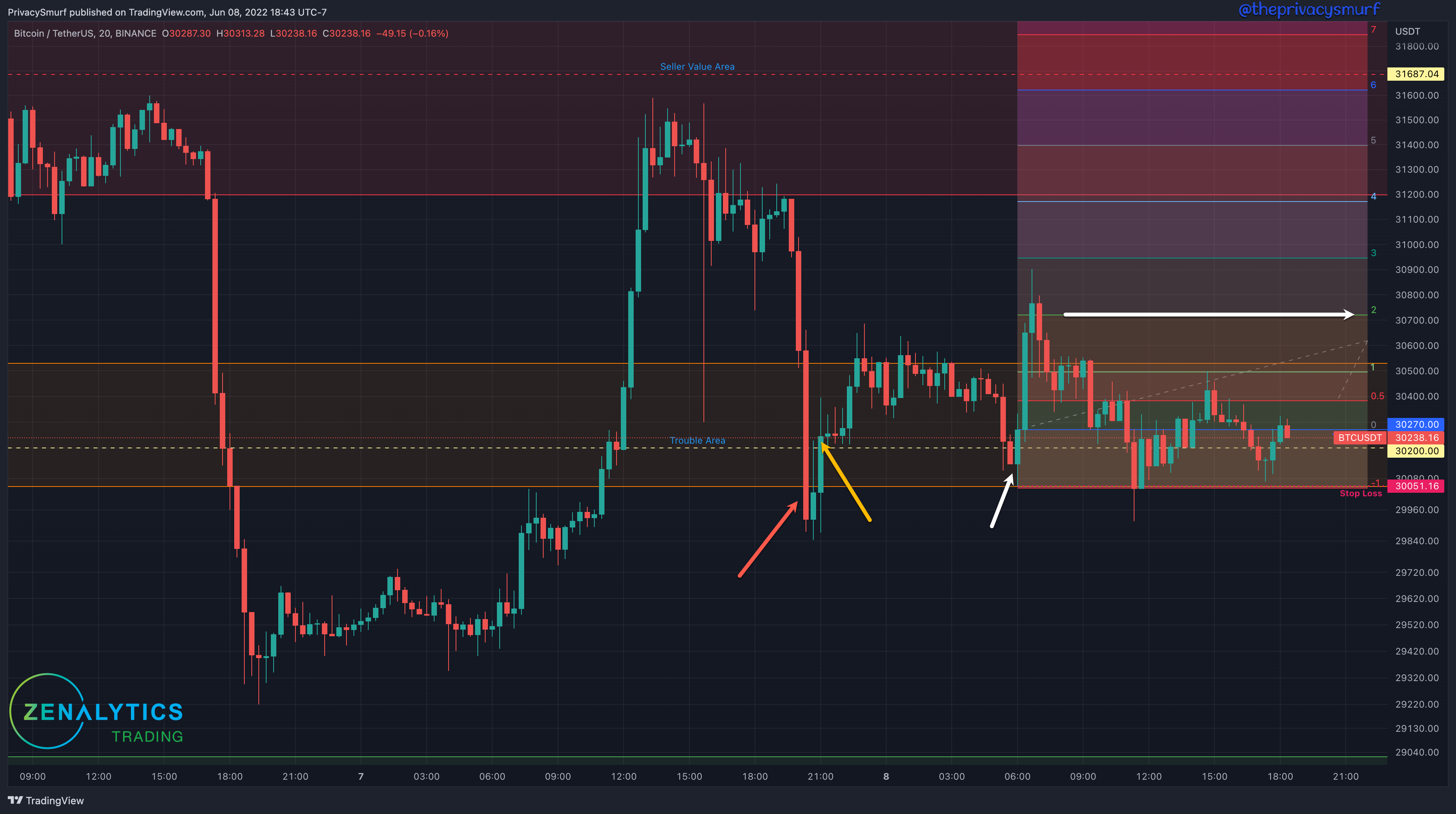
Getting back to basics we’ll look at horizontal levels, price action, and risk management. It doesn’t get much simpler than that. The support and resistance levels were drawn out on the 4hr chart and I’m not looking to do ANYTHING until the price gets into them. The “Trouble Area” is a great place to take scalps in between the major zones but I’m typically waiting for the cleanest setups. The big move down (red arrow) ends up closing below the trouble zone. I don’t want to long under a potentially broken support so I’m looking for a retest into the zone and a new lower close to take a short position. The first green bar after did a test back into the zone but didn’t give a lower close so I’m still waiting for an entry. The next bar (yellow arrow) ends up closing above the high of the prior candle suggesting support may be holding. If I want to still go short I’m waiting for a new lower close below the “Trouble Area”. If I want to go long I want a rally and test this potential support. Price moves up to the top of the “Trouble Area” and comes back down touches the bottom and plots a bullish engulfing candle. Here I’m comfortable entering at the close of the green bar. I’d put my stop loss under the low and below the “Trouble Area” and just let the chips fall where they may. Ideally, I’m aiming for the top “Seller Area” to close out completely but there are other methods I’ll also employ to make sure I keep my gains in this chop. Measuring the stop loss to my entry a 2:1 reward to risk ratio is attained at just over $30.7k. I'll sometimes take 60% out of my position and let the rest trail.
Moving backward in time we’ll look at the visit to the “Seller Value Area” and forgive me for cutting the chart some. My graphic got messed up and I’m not redrawing the chart. ☠️☠️
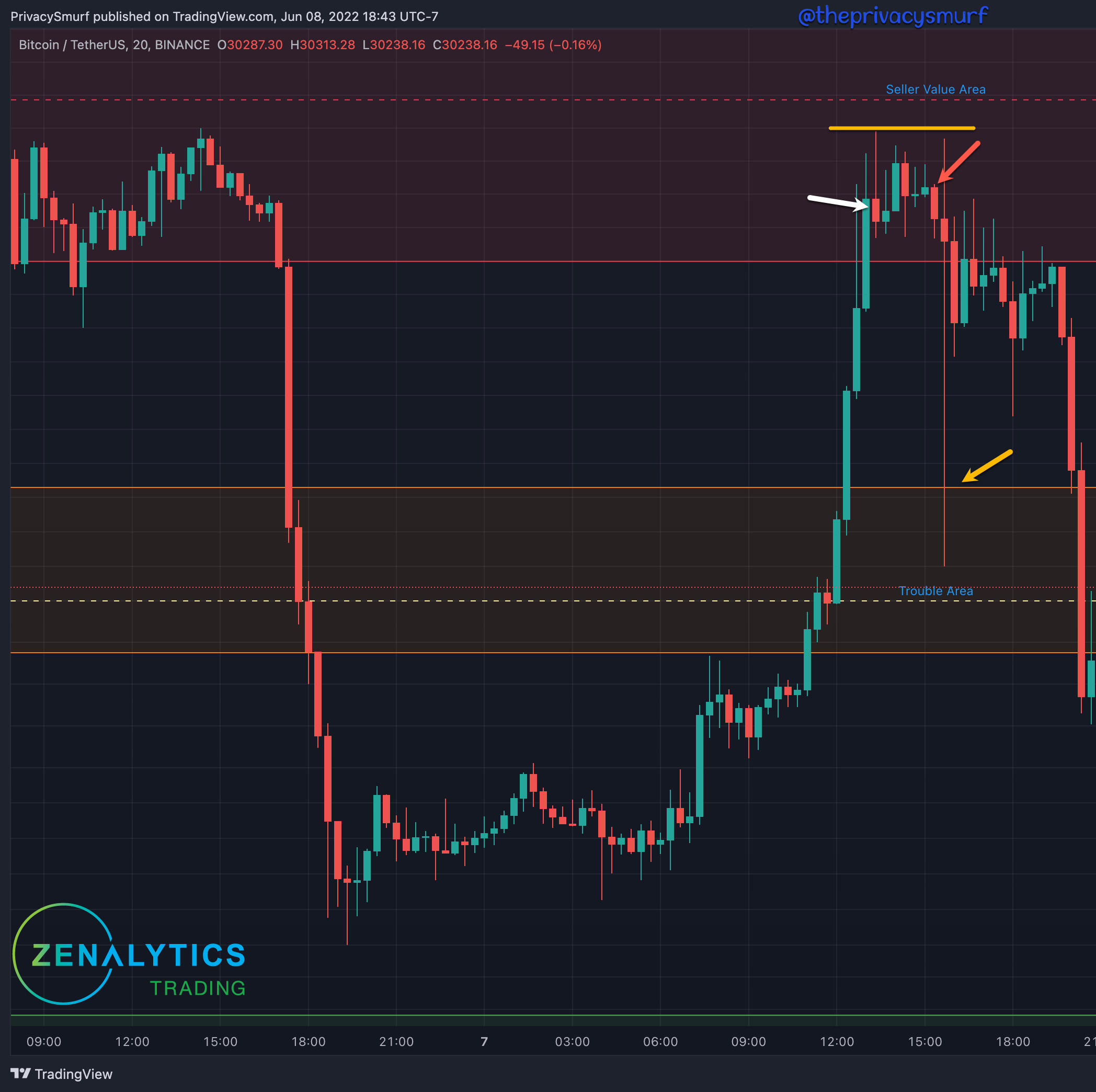
BTC moves up into the top resistance, the “Seller Value Area” so I’m looking for a reason to short. The first red candle (white arrow) and the prior green candle have longer wicks to the topside suggesting sellers are attempting to flip the momentum. I’m waiting for a bearish price action signal or a break of a level to take a short. A few candles later a bearish engulfing candle plots suggesting momentum to the downside and I can take a short. I put a stop loss above the recent highest high and let the chips fall where they may aiming for the top level of the trouble zone, which is hit promptly and I can completely exit the position.
In an effort not to make this too long I’m not going to break down ETH trades and just give the updated charts and intraday analysis (except to show off my indicators, proud papa moment, purple arrows).
ETH/USD
Daily Chart
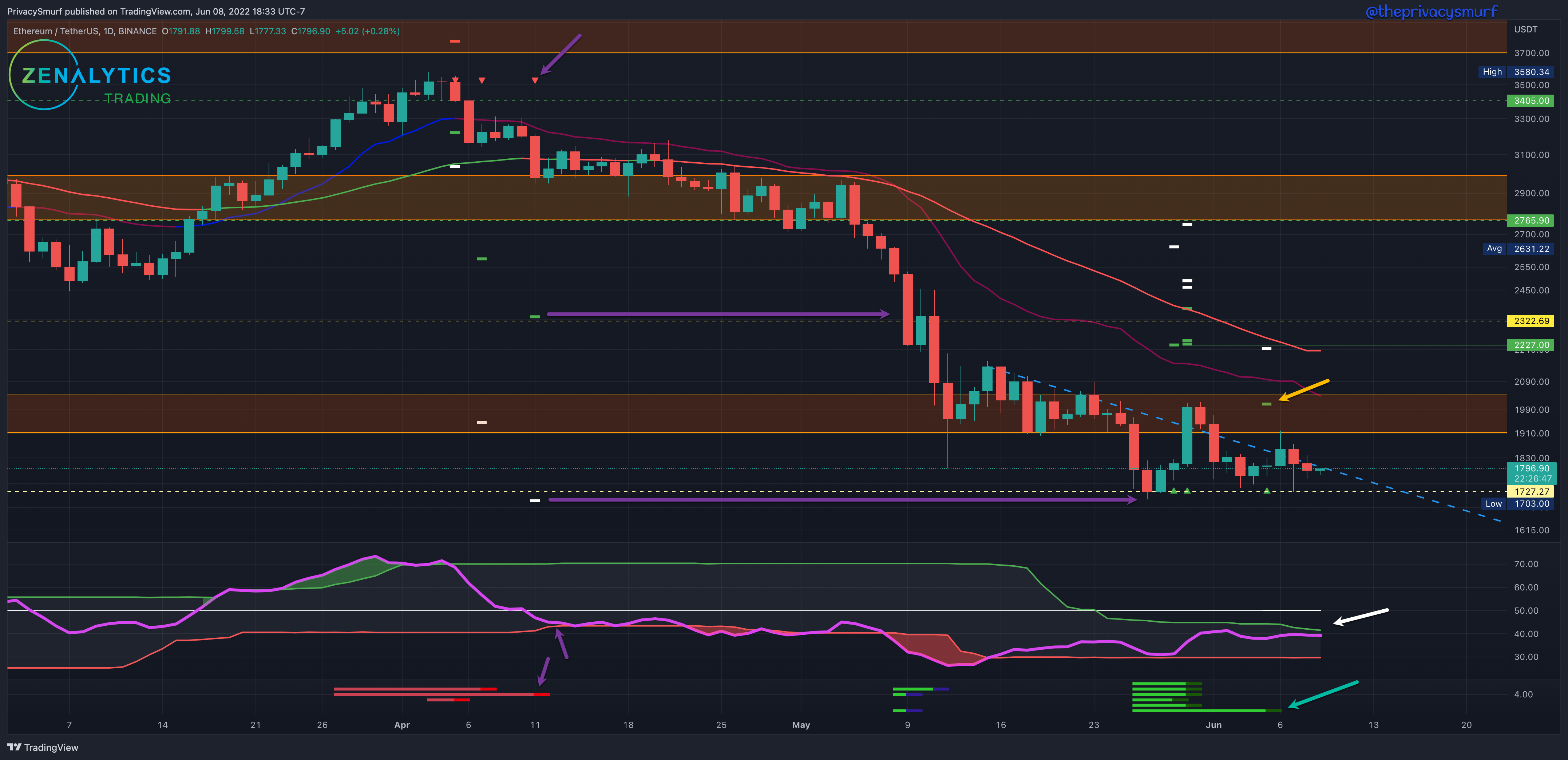
I’m just gonna repeat Sunday because it’s still on point in my opinion.
We are entering a point of confluence of the descending trendline and horizontal support. The odds of a bullish are slightly higher than bearish IMO with the RSI generally trending up with higher lows and higher highs and the bullish divergences and the placement of the adaptive top band below the midline. The trendline break may be a risky one but could be a profitable entry to the testing of the 50-Day EMA which is sitting about where the CSM target is ($2227)
The bearish pressure still exists but the adaptive bands are REAAAALLY squeezing down on the RSI (white arrow). When the upside breakout comes it could yield some nice bullish action. I’d still count that first target as in play but from a risk perspective I’d probably aim for the latest trade from the CSM (green arrow) with the target around $2000 (yellow arrow). That’s more likely money IMO.
…ceiling likely around $1960… floor is still at $1700.
2HR Chart
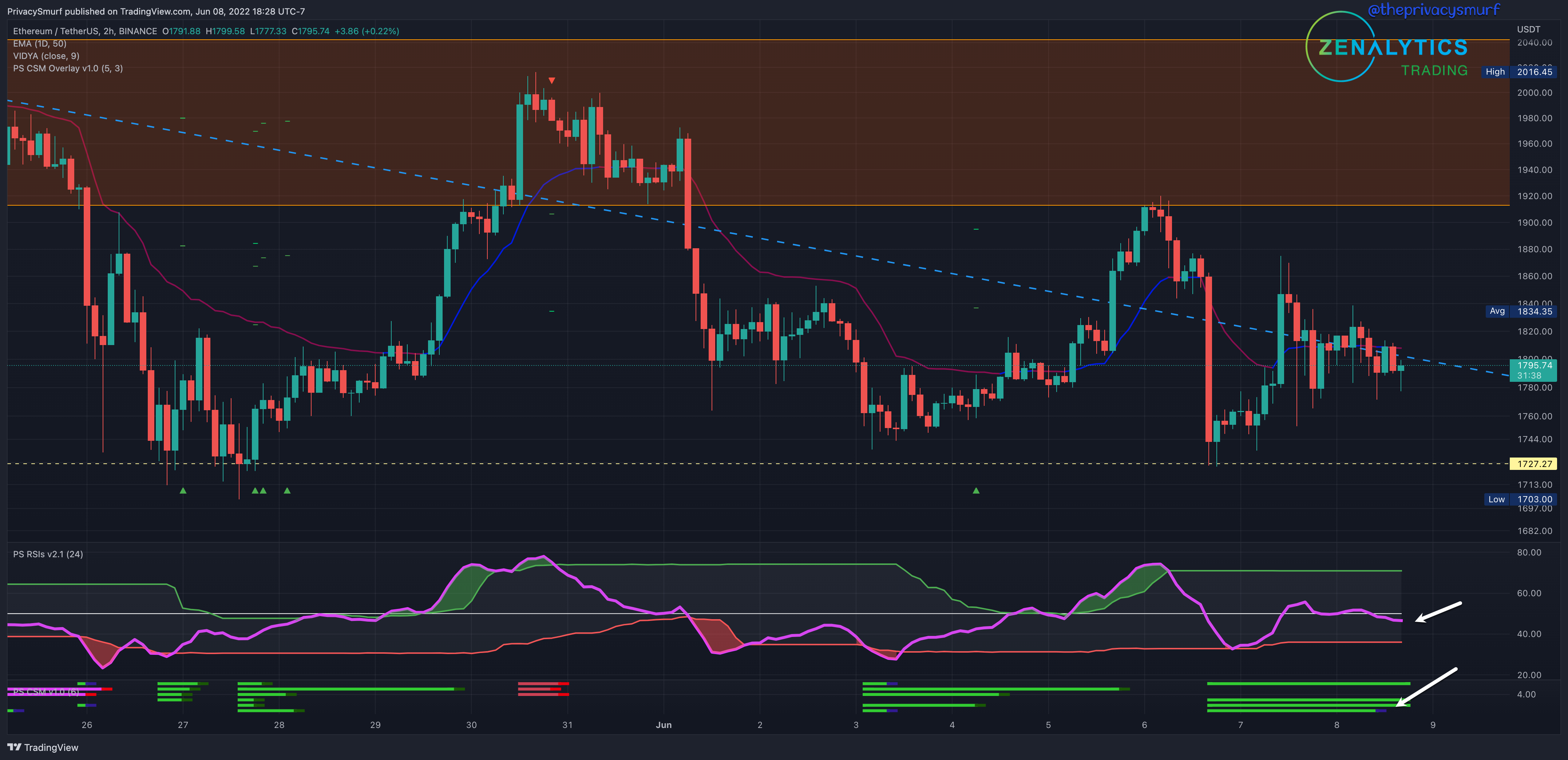
The intraday chart is presenting the same picture of bearish pressure existing predominantly with the RSI under the midline and bullish divergences being invalidated. This suggests price deprecation. The bands of the RSI are also wider off the midline so normal up and down price action (no stronger directional volatility) will likely continue. I’d be watching for the top band to start creeping down towards the midline to start evaluating an upside trendline breakout.
20min Chart
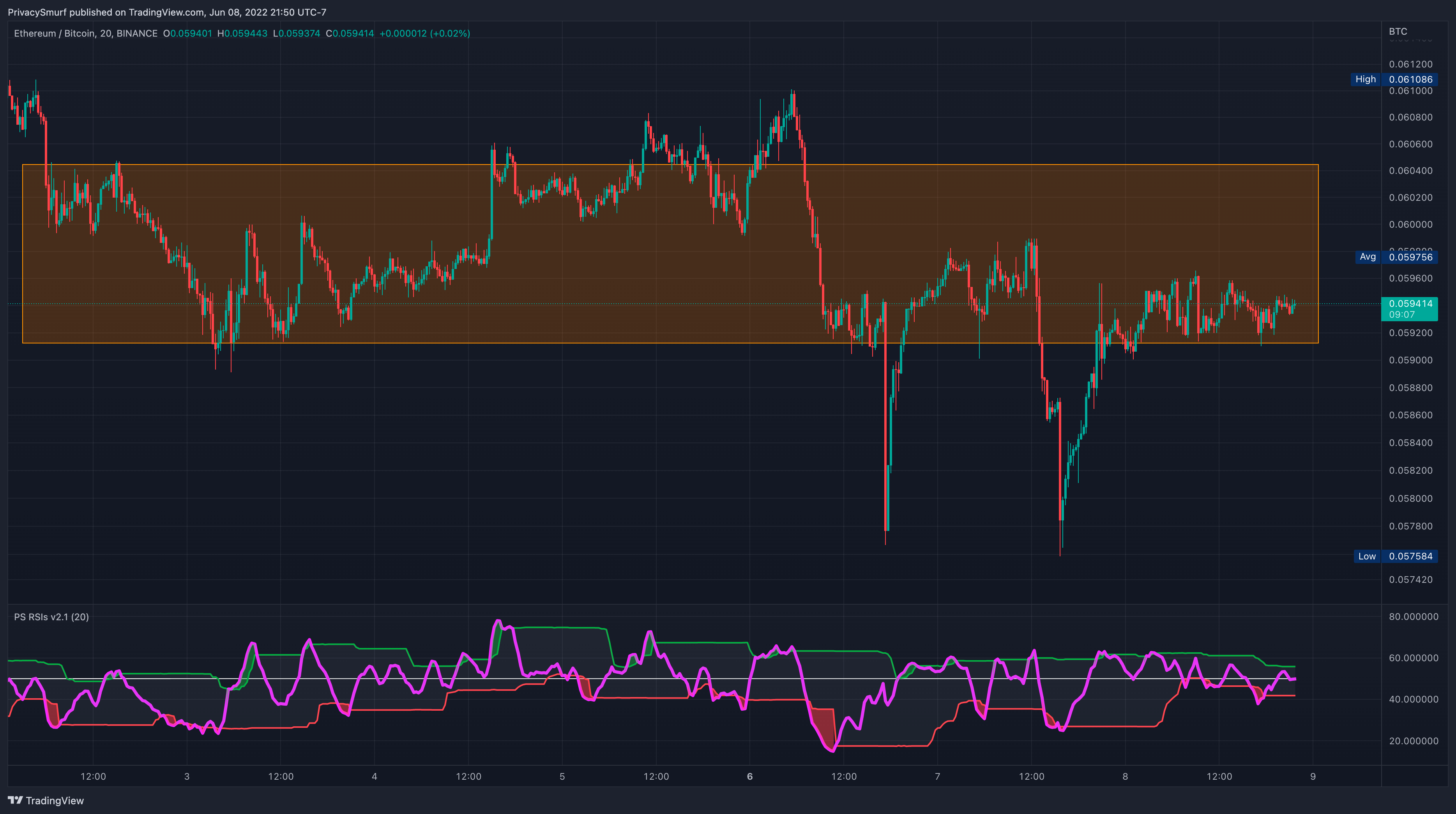
Skipping this chart today. The setups are almost identical to the BTC trading range setups. I’d just be making this longer needlessly. This mirroring will happen when ETH/BTC is ranging/flat. In these times you can pretty much trade both assets the exact same way. Miss one trade? Take the same one on the other asset. I’d just be making this longer needlessly.
Tomorrow I’ll be back on the Topical Thursday posts with my lesson on how I’m changing to a fib-based market structure definition. Don’t miss it.
@theprivacysmurf
Terry your charts with arrows and explanations are really evolving into clear, useful instruction. Eagerly anticipating your fib work. Cheers😉
Good stuff!!