


Quarterly Market Synthesis: Q1 2025
It's not over yet; we can at least celebrate one more time.

Last year’s expectations were met and exceeded, and the market broke $100K BTC, countering my price speculations. Considering the trade execution through the year was bullish, it was the best kind of wrong to be.
While the end of 2024 showed topping signs ‘, don’t stop the dancing’ because the market can still rally, at the least, ‘One More Time.’
TL;DR
Market Outlook:
Consolidation dominates the crypto market until February, with potential rallies from mid-February into March. The total crypto market cap may test lows before rebounding, and BTC could break out toward new highs in March if past patterns repeat.Key Insights:
1) Daily, weekly, and monthly data align on bearish to neutral trends for January, with potential bullish reversals mid-quarter.
2) BTC will likely lead any recovery, with altcoins lagging and facing more volatility.
3) On-chain metrics suggest fluctuations without a dominant trend, adding caution to market entries.
4) Macro indicators hint at external pressures potentially dampening rallies.Actionable Strategies:
1) Watch for buy signals, such as bullish divergences on BTC or altcoins in early February.
2) Consider accumulating on the middle intraday (4HR to 12HR) timeframes if bullish signals appear around mid-quarter.
3) In late February, monitor rotations into BTC. This historically precedes broader rallies.
4) Stay cautious with ALTs, prioritizing breakouts over dip buys until technical setups improve or BTC dominance weakens later in the quarter.
This quarter hinges on a pivot around February to March. Below, I’ll be reviewing six(ish) datasets that I believe, in combination, create a comprehensive and accurate picture of that possible future of the crypto market.
Total Crypto Market Capitalization
Market Cap of 125 top cryptocurrencies.
https://www.tradingview.com/chart/rrMDdQvq/

What’s on the Chart:
The monthly and weekly data, represented by the red and blue lines, are aligned and show a downward trajectory. The daily data, indicated by the yellow line, continues its bearish pattern into February but shifts to an upward trajectory by early March.
I would estimate the likelihood of price action aligning with all daily turning points at ~70%.
What This Chart Means to Me:
The total market capitalization growth will likely remain in consolidation until early March. If the detected patterns hold, the timing I would look for a buying signal is if we:
A) break down from the range low around 3T while momentum increases from late Feb to early March.
B) break out from the highs around 3.6T in early March.
Total Crypto Market Price Action
Looking at the market capitalization is only half of the picture. Price action is needed to complete the analysis of potential future movements. I have constructed an index of the top 200 symbols by market cap, excluding stablecoins and bridged assets. I’m still refining this index. It hasn’t met my current standards but can still be a helpful reference. Until I create a sharable chart link for this index, here is a reliable alternative if you wish to track crypto market price action.
https://www.marketvector.com/indexes/digital-assets/marketvector-digital-assets-100
What’s on the Chart:
The weekly and daily data, represented by the blue and yellow lines, are mixed in alignment. The weekly data in blue shows a downward directionality. The daily data, indicated by the yellow line, shows a brief period with upward directionality now into mid-January but shifts to a downward trajectory through early February. Afterward, it shifts upward through the rest of the quarter.
I would estimate the likelihood of price action aligning with all daily turning points at ~91%.
What This Chart Means to Me:
The collective price action for the crypto market as a whole will almost certainly consolidate, lacking bullish trending price action continuously extending above the ATH’s until early February. If the detected patterns hold, the timing I would look for a buying signal is if we:
A) break down from the range lows while momentum is increasing in early to mid-February
B) break out from the highs in mid to late-February
Linking This Chart with the TOTAL Market Capitalization Chart:
With market cap and price action patterns agreeing on downward directionality until later in the quarter, I’d not anticipate buying signals or the market starting a rally and continuously setting new ATHs until February.
I expect the market to consolidate or exhibit bearish behavior for the quarter's first half and bullish behavior for the second half.
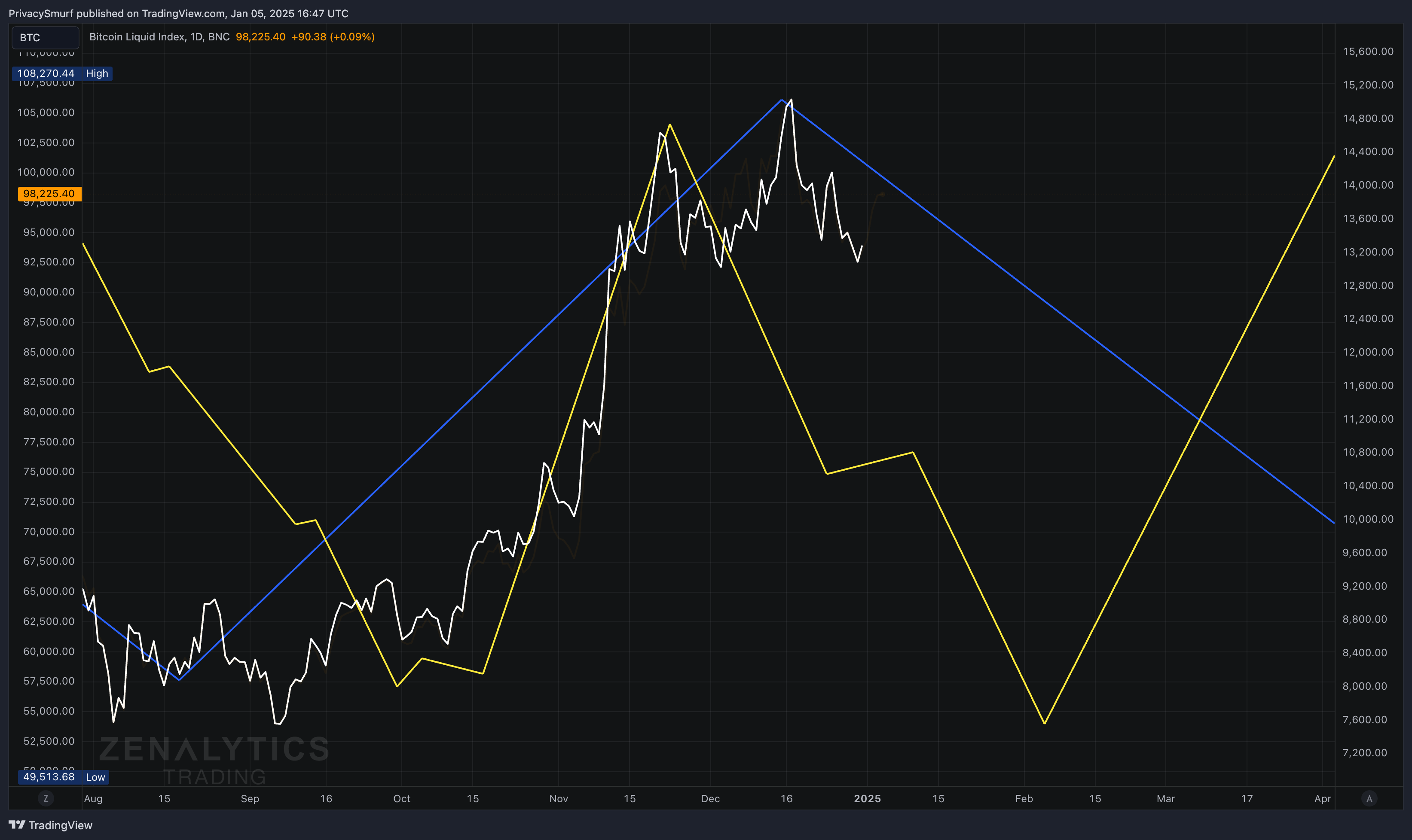
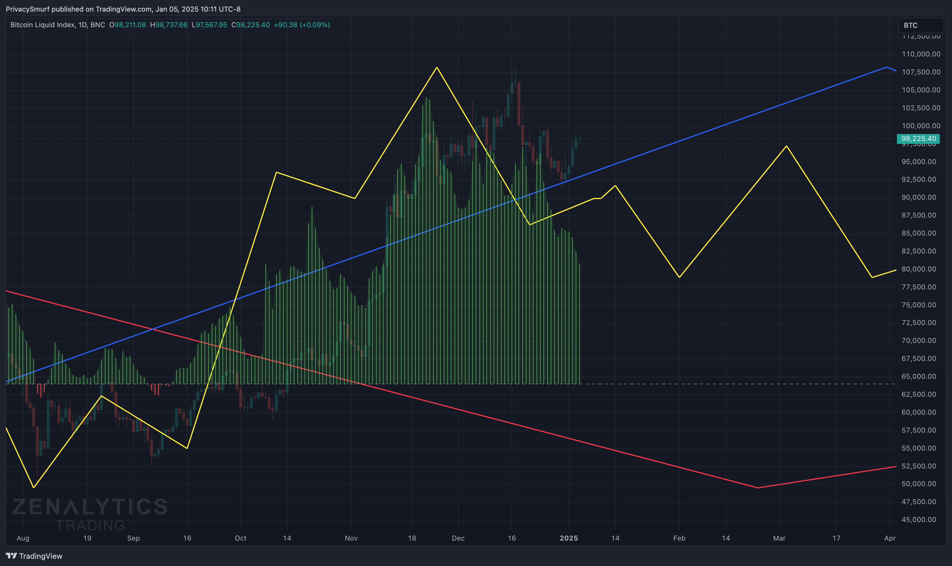
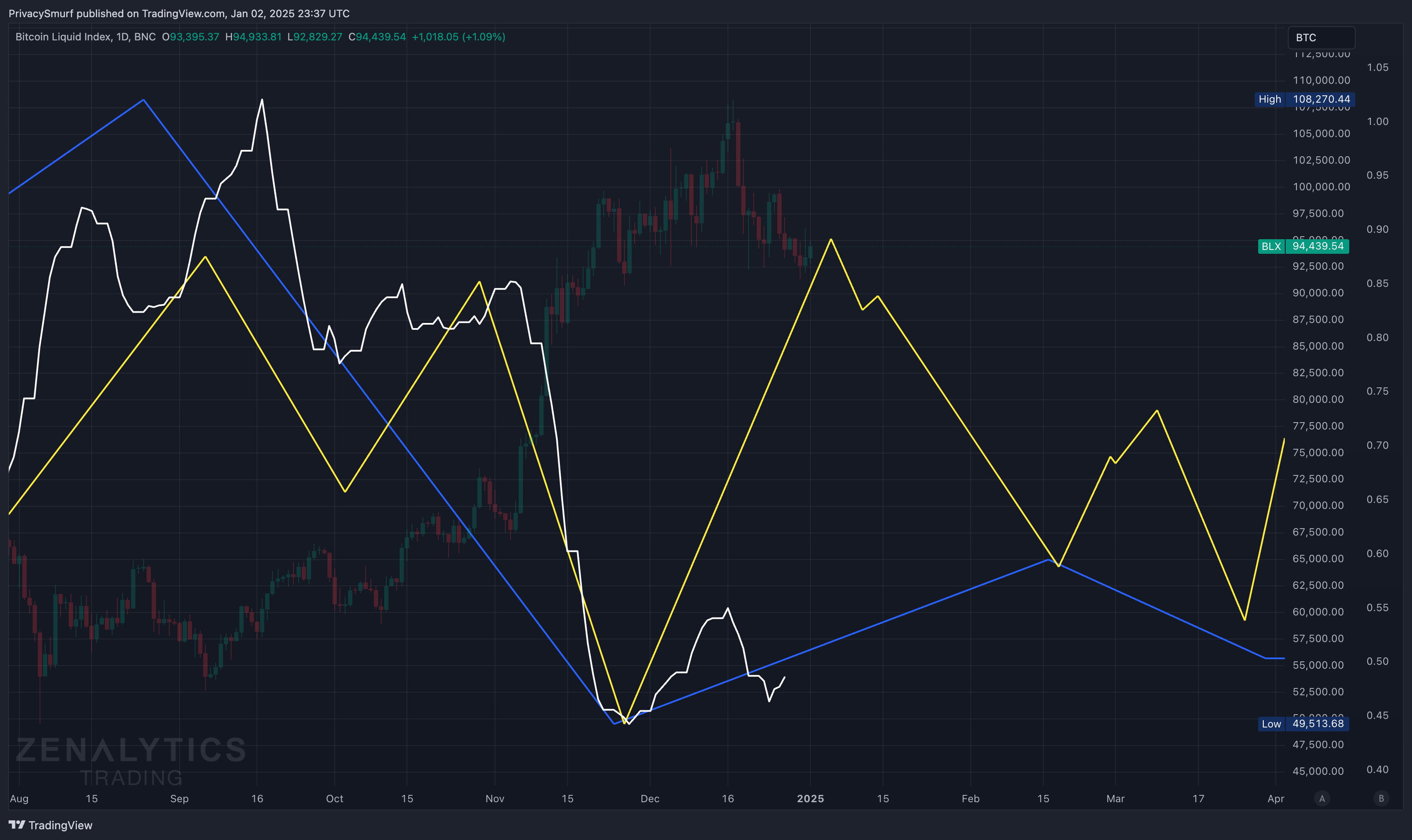
BTC/USD
https://www.tradingview.com/chart/KbJD0jzf/

What’s on the Chart:
The monthly and weekly data, represented by the red and blue lines, are aligned and show a downward trajectory. The daily data, indicated by the yellow line, continues its bearish pattern into February but shifts to an upward trajectory by early March.
I would estimate the likelihood of price action aligning with all daily turning points at ~63%.
What This Chart Means to Me:
BTC will likely remain in consolidation or see bearish price action until early to mid-February. If the detected patterns hold, the timing I would look for a buying signal is if we:
A) see a bullish divergence in early February. A low in early February to a lower low while momentum increases in early March.
B) a standard structure shift into a bullish trend starting early February. A low in early February, to a high in mid to late February, to a higher low in early March, followed by a higher high in mid-March.
C) break out from the ATHs in mid-February.
Linking This Chart with the TOTAL and Crypto Index Charts:
With market charts and BTC chart patterns agreeing on downward directionality until later in the quarter, I’d not anticipate buying signals or for BTC to start a rally and continuously setting new ATHs until February.
I expect BTC to consolidate or exhibit bearish behavior in the first half of the quarter and bullish behavior in the second half. I anticipate BTC making its moves before the rest of the crypto assets, but the market charts will likely respond in time with BTC, as BTC will make up most of the market cap at this point.
Spent Output Profit Ratio
https://www.tradingview.com/chart/5Dx7OviB/
I immensely enjoy this on-chain metric. It’s highly accurate in projecting into the future when a repeating pattern in the past is detected.
What’s on the Chart:
There are mixed alignments across timeframes. The monthly data represented in red is down until late February, the weekly data represented in blue is up until the end of the quarter, and the daily data represented in yellow fluctuates throughout the quarter, continuing upward into mid-January, downward into early February, upward into early March, and downward to finish the quarter.
I would estimate the likelihood of price action aligning with all daily turning points at ~72%
What This Chart Means to Me:
Bitcoin transactions are very likely to fluctuate in profitability over the quarter without a dominant trend appearing in the data.
Linking This Chart with the TOTAL and Crypto Index and BTC Charts:
The modeling in this on-chain metric reinforces the analysis presented on all the other charts, ranging consolidation for BTC prices with bearish overtones into early February, followed by a rally into March.
Speculating on the misalignment of the SOPR chart showing a downward trajectory in March through the end of the quarter with other charts showing upward trajectories could be represented by an impulsive bullish spike in BTC prices in early March that is quickly sold off. If this happens and prices fluctuate under those highs for the remainder of the quarter, it would account for BTC transactions occurring from a losing position, creating a declining SOPR and overall inclining price action.
Continuing this speculation, the data presents an intriguing scenario, with the monthly (red) bottom projected for late February. This suggests that this quarter's bearish lows could mark the lowest prices until late 2026. This could unfold as a volatile bearish movement this quarter before a rally in March or a high bullish breakout in mid-January that is sold off heavily into February. This is incredibly opinionated and speculative. If we see alignment with this in the future, it is pure guesswork, as specific price expectations cannot be determined by any information presented in this report. Success or failure in this regard does not reflect upon the analysis presented here. I am merely musing on one of infinite possible futures.
ALTCOINS/BTC
https://www.tradingview.com/chart/VPzsioc3/

What’s on the Chart:
Since the data is too young, there are no monthly patterns yet. The weekly data in blue is up until the end of the quarter, and the daily data in yellow fluctuates throughout the quarter, continuing upward into mid-January, downward into early February, upward into early March, and downward to finish the quarter.
I would estimate the likelihood of price action aligning with all daily turning points at ~42%. The decreased confidence in the modeling is due to excessive noise in the recent past. The wild fluctuations in price action will distort and hide the underlying price action patterns. While the turning points may end up timed correctly, it is unlikely to be exact on them all. That being said, the analysis must be made with the expectation that they will be correct since it’s the only information we have to go off of.
What This Chart Means to Me:
While it is unlikely, ALTs may see a brief rally into mid-January and consolidate or sell off into mid-February. If the detected patterns are to be believed, the timing I would look for a buying signal is if we:
A) see a bullish divergence in mid-February on middle intraday timeframes (4HR to 12HR). A low in early to mid-February followed by a lower low while momentum increases in mid-February.
B) a standard structure shift into a bullish trend starting early to mid-February. A low in early to mid-February, to a high in early March, to a higher low in mid to late March, followed by a higher high at the end of the quarter or early Q2.
C) break out from an ALT chart’s December highs in mid-February.
Linking This Chart with the TOTAL and Crypto Index and BTC Charts:
This modeling also plays into familiar patterns of market rotations. TOTAL market capitalization and BTC show a slightly cleaner picture of consolidation and the resumption of an uptrend, while ALTs show more bearish intentions and less consolidation. This would align with the thinking that ALTs would depreciate relative to BTC as BTC takes market share, consolidating before and at the start of a bullish move.
Zenalytics Stress Composite
https://www.tradingview.com/chart/LCGPETQb/
What’s on the Chart:
Since the data is too young, there are no monthly patterns yet. The weekly data in blue is up until the middle of the quarter, and the daily data in yellow fluctuates throughout the quarter, peaking now continuing downward into mid-February, upward into mid-March, and downward to finish the quarter.
I would estimate the likelihood of price action aligning with all daily turning points at ~35%. My confidence in the model is low due to the lower statistical reliability of the detected patterns. Likely, the detected patterns don’t represent the underlying market dynamics. That being said, the analysis must be made with the expectation that they will be correct since it’s the only information we have to go off of. By combining the detected patterns and looking to the left half of the chart, the yellow daily model's correlation to the overall turning points of the ZT Stress Composite in white is moderately correlated, and that’s helpful, considering I have low confidence in the model. Still, alone, that’s not the best baseline for timing possible future turning points.
What This Chart Means to Me:
I’m pretty sure I modified the calculations, did not update the analysis on this metric for last quarter, and posted the inverse rationale, so I apologize. The decreasing values on this chart early in the quarter suggest easing financial conditions, increasing financial stress from mid-February to mid-March, followed by decreasing stress to finish the quarter.
Linking This Chart with Crypto in general:
This macro stress indicator doesn’t necessarily speak directly to the crypto market but more to the availability of spendable capital, market sentiments, and macro-financial conditions. In general, the downward phases on this chart suggest that market participants may put money into risky assets, crypto being one of those, more so earlier in the quarter than later.
30Y Treasury Bonds
https://www.tradingview.com/chart/TpDKcuJg/
I’m about ready to ditch this metric. It’s becoming a poor comparison to BTC. Its effectiveness as an alternative signal generator without one from BTC is waning. Too many macro factors may be influencing this asset right now, making signal detection and generation unreliable. I’m currently doing some testing on other possible replacements.
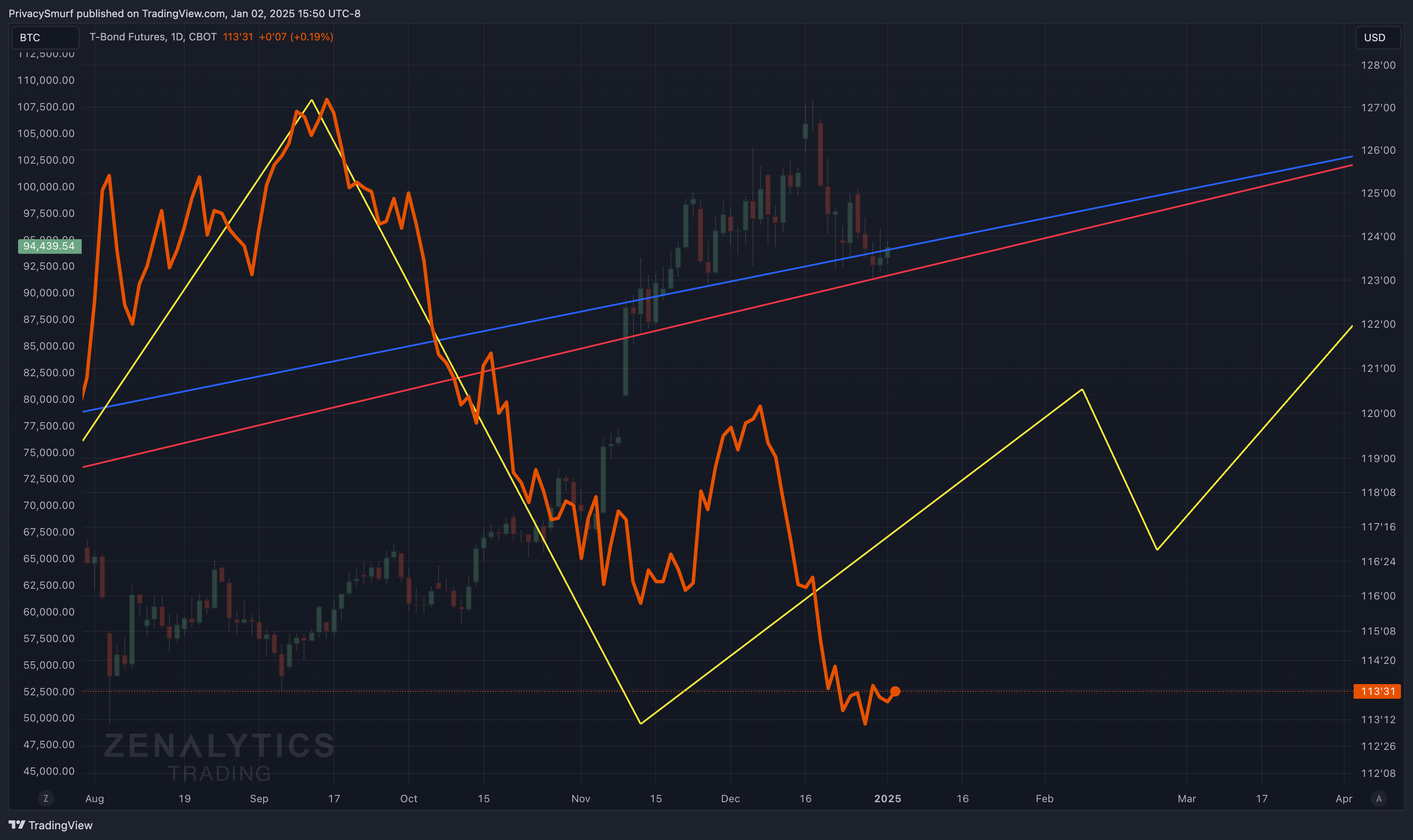
What’s on the Chart:
The monthly and weekly data, represented by the red and blue lines, are aligned and show an upward trajectory. The daily data, indicated by the yellow line, continues an upward trajectory into February, turns down in early February, but shifts back to an upward trajectory by early March.
I would estimate the likelihood of price action aligning with all daily turning points at ~47%. While confidence in this is decreased, it’s still moderately reliable. A detected pattern that extends 300 days into the past is one element affecting the potential reliability. While it’s a statistically reliable signal, it introduces uncertainty because it may be influenced in the short term, and this longer-term pattern hides that potential. By combining the detected patterns and looking to the left half of the chart, the yellow daily model's correlation to the overall turning points of the ZT Stress Composite in white is relatively accurate, and that’s helpful, considering we have a decreased confidence in the model. Still, alone, that’s not the best baseline for possible future turning points.
What This Chart Means to Me:
While it’s unlikely, bond prices may increase into early February, consolidate or pull back into late February, and rebound through the end of the quarter.
Linking This Chart with BTC/crypto in general:
Typically, these two markets show similar trends, but recent macro events may have contributed to a reduced correlation between Bonds and BTC regarding price action. However, monitoring the daily correlation could prove valuable. This may be the case as the detected patterns show a similar picture of bullish behavior into the middle of the quarter. If the pattern holds, this would confirm that bonds can be used as proxies for trading signals in the crypto market or, the inverse, crypto signals for bond purchases. Cues for action could be sought in either market—but only if the correlation is high (either negative or positive).
Beyond the Quarter:
As discussed in an earlier piece linked below. The data above suggests we are still closer to the end of the bull market than the beginning. I will write a new piece updating the metrics discussed below and commentary on what would occur to invalidate this thesis.

How the price behaves over the next two months will be crucial in determining the final shape of the 2023 to 2025 bull market AND validating the theory that Bitcoin's price action follows a shorter fluctuation rather than a four-year pattern, which I expanded on in this piece.

Over the following weeks, I’ll have some companion pieces in the ANALYZE section discussing the new stats and “confidence” language you see in this post and the accuracy metrics I’ll be putting out later. Please check out this post if you do not know what I mean when referring to the “analyze” section.

As a quick reminder, all of this analysis is free. If you’d like to support my work, consider upgrading to a paid membership. Additionally, sharing this analysis helps me and the entire trading community. Too often, unreliable forecasts flood the market with little to no accountability for inaccuracies. I aim to cut through the noise by providing thoughtful, data-driven insights that empower traders to make informed decisions.
By sharing this analysis, you’re amplifying a resource rooted in reliability and data integrity. Together, we can build a community of more intelligent, more confident market participants and raise the standard for credible market analysis. Let’s elevate the conversation and create a lasting impact in the trading world.
See you again soon,
@ThePrivacySmurf